Get this email packed with useful links for people interested in improving their Tableau knowledge and skills.
Subscribe now and get your free download packed with 171 Top Charts and Tips for Tableau.
Every week, I read blogs and articles written by more than 380 Tableau experts and updates from 13,291 enthusiasts.Sign up below and I’ll send you links to the best posts (100% free).
You will receive 6 articles, twice a month. See below for articles from previous editions.
“I think this is a brilliant newsletter, there’s always so much going on in the Tableau community it can be hard to keep up.”
Nai Louza, Data Analyst, UBS
“I just wanted to say what a superb feature this is, some fabulous content.”
Simon Beaumont, Head of Information, Southern Health NHS
“Thanks for the newsletter, this is a really useful resource. I look forward to future editions.”
Colin W, Datawoj Ltd
“Steve is a highly skilled trainer in Software products especially in Tableau. He has in depth knowledge from his time consulting with clients and his deep knowledge of the product.
He is able to gauge the experience of the group and react accordingly. Steve should be your #1 choice for independent Tableau training in the UK.”Daniel Ruthenberg, Account Manager, Tableau Software
The newsletter you’ll be waiting for.
Every week I read articles from news sites, blogs and new Tableau articles. I also look through new posts on Tableau Public, Twitter, LinkedIn, Tableau partner websites and in the Tableau Community, looking for the best and most useful pieces of content about Tableau and data visualisation practices. You’ll get the best ones, for free.
Here are some articles that have been included in recent editions of Tableau Bites:
Tableau QT: KPI Text Indicator
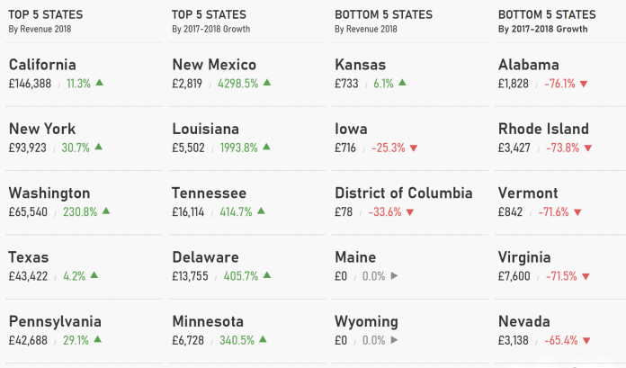
Tableau dashboard designers create certain types of dashboard in their line of work, which includes healthcare, & sales dashboards. Another type of dashboard that is common among the Tableau community is KPI dashboards.
Toan Hoang has another Tableau Quick Tip up his sleeve as he shows you how to create a KPI Text Indicator. By creating a simple KPI dashboard, Toan uses Unicode characters to illustrate which US States are above the line and which ones are not.
Read MoreHow to Create Halos Around Bar Charts
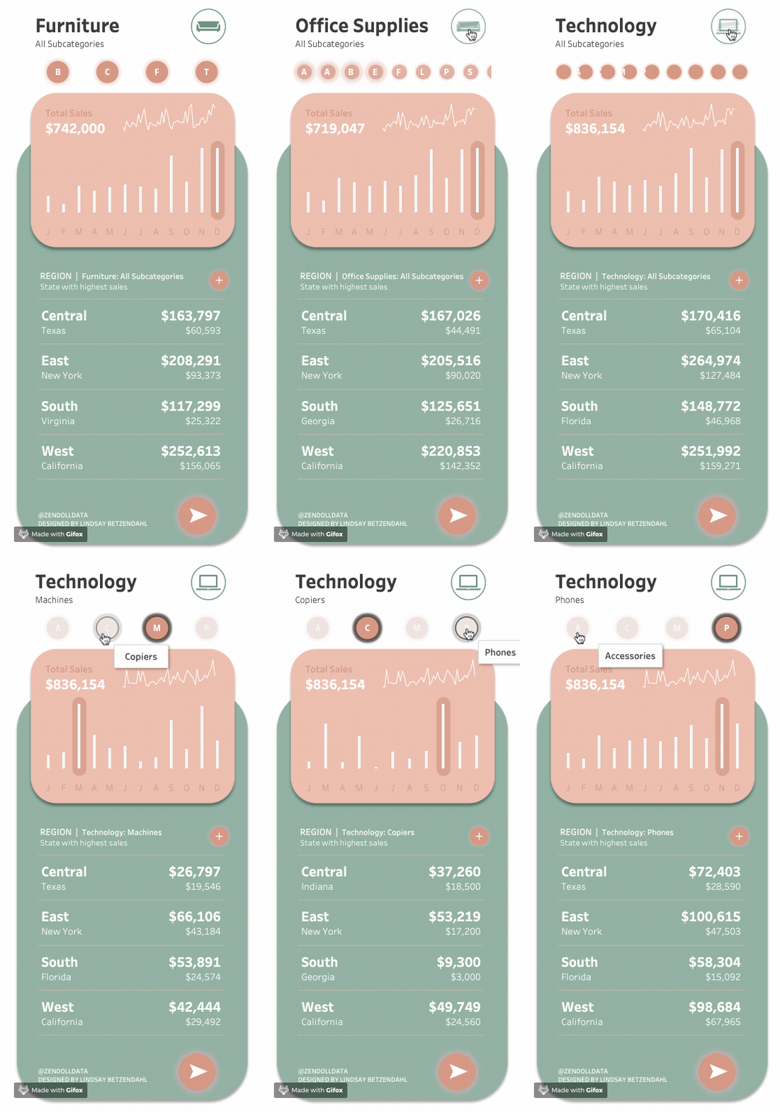 Lindsay Betzendahl shows you how you can create halos around your bar charts, which highlights the largest value in the visualisation.
This is a great way of highlighting the largest value in a bar chart. By using a mixture of set actions, a dual-axis chart and synchronise axis, Lindsay creates a modern dashboard design that uses a halo to highlight the biggest bar in a sales or healthcare dashboard.
Read More
How to show grouped bars in a Bar Chart
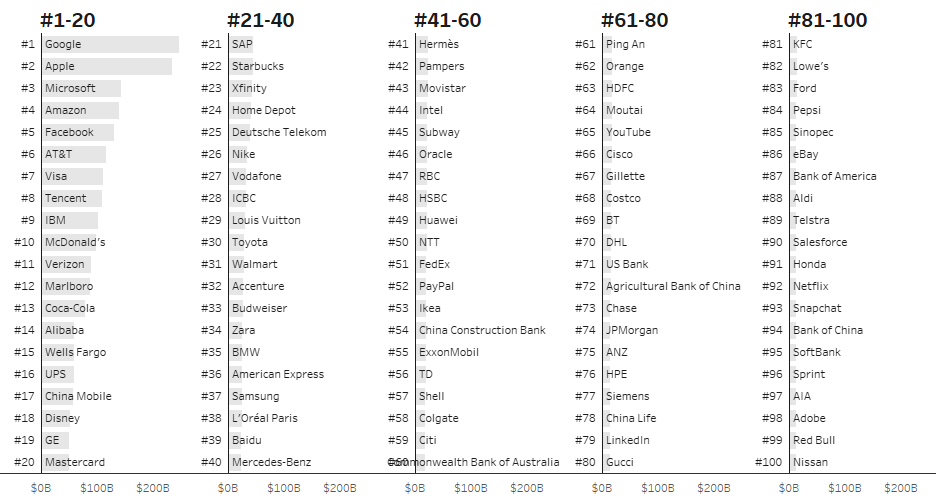 Adolfo Hernandez demonstrates how you can show grouped bars in a Bar Chart by using the Modulo operator to achieve this result.
Using grouped bar charts in a view is a great way of showing several bars in a view without taking up so much screen real estate. This is particularly useful for users who want to see all the information in the view without having to scroll down or restrict the data from the view.
Read More
Parameter Actions for Add / Remove (Select / Deselect) Values
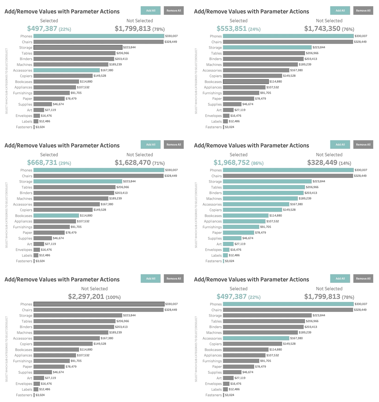 Zen Master Rosario Gauna demonstrates how you can use Parameter Actions to select or deselect values in a view using the recent Set Controls feature in Tableau 2020.2.
This simple, but effective approach is a great way of looking at financial accounts within a company or consultancy to identify what sections are being spent within certain departments. I hope you can find a use case for this in your Tableau dashboards at work?
Read More
Five Solutions to Highlight an Entire Table Row in Tableau
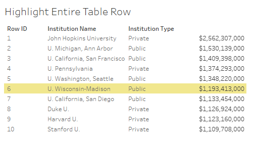 Jeffrey Shaffer shows you five different solutions to highlighting an entire table row in Tableau. This approach is particularly useful if you want to select a row in the table that you want to see the values in the dataset.
The five solutions Jeffrey demonstrates to highlight an entire table row in Tableau include creating spacers, the multiple marks card, multiple marks card with variable width columns, row banding with a parameter, and row banding with a set.
Read More
Using Shapes in Tableau
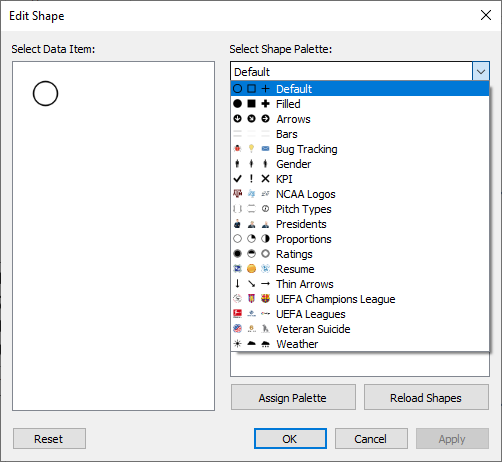 Dashboard designers can integrate into their dashboards shapes in all sorts of ways in their dashboards, but how can shapes be used effectively in Tableau?
Spencer Bauke demonstrates three techniques to using shapes in Tableau. This includes Default Shapes, Custom Shapes, and Text Shapes. This is useful if you are creating a dashboard that focuses on the main KPI’s and you need shapes to illustrate whether the figures are above or below zero in the view.
Read More
Set Control in 2020.2 – Three Main Configurations

With the recent release of Tableau 2020.2, there are a whole raft of new features in this latest update in Tableau. This includes Tableau Metrics, and Relationships to name but a few features in this update.
The introduction of Set Control is a powerful addition to Sets in Tableau. Zen Master Kevin Flerlage shows you the three main configurations for using Set Control, which includes Add and Clear All, Remove and Add All, and Add & Remove on Menu.
Read MoreUltimate Guide to Tables in Tableau: Pagination
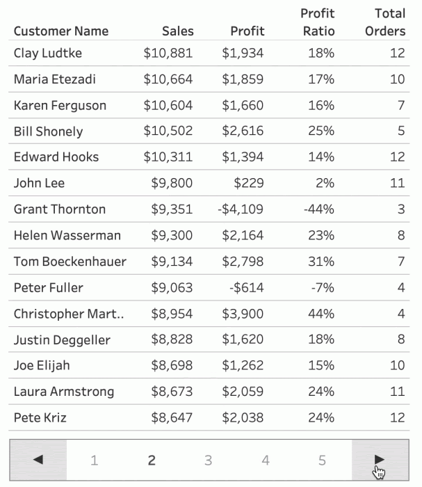
In Tessellation’s Ultimate Guide to Tables in Tableau series, the first part covers how you can use pagination in your tables in Tableau.
Zen Master Luke Stanke explains his approach to pagination with tables in Tableau. By combining several calculated fields, Parameters and Parameter Actions and sheets together, Luke creates a single table that uses pagination to go backwards and forwards with a table in Tableau.
Read MoreHow to Add Top and Bottom Borders to Gantt Charts in Tableau
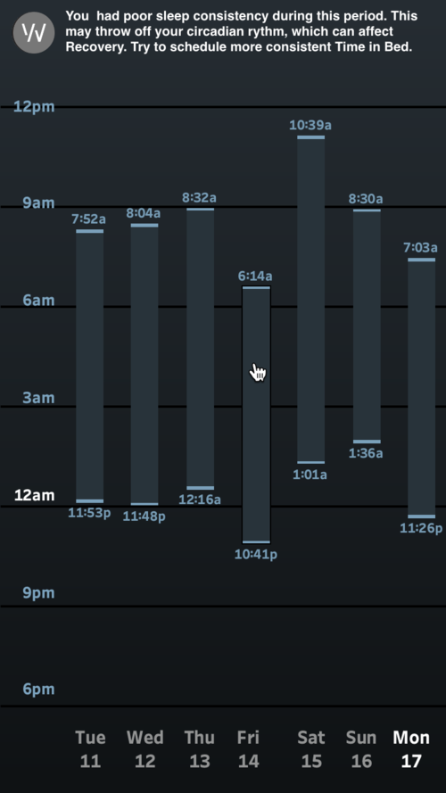
Wondering how to add top and bottom borders to your Gantt charts in Tableau? Robert Crocker has found a solution to applying top and bottom borders to your Gantt charts.
Robert uses the approach that is used by the WHOOP team of their visualisation that visualises an individual’s sleeping pattern. Using this approach is a great way of visualising one employee’s own weekly schedule. Maybe you can find some use cases for this?
Read MoreHow to action filter when using set/parameter action drill-downs in Tableau
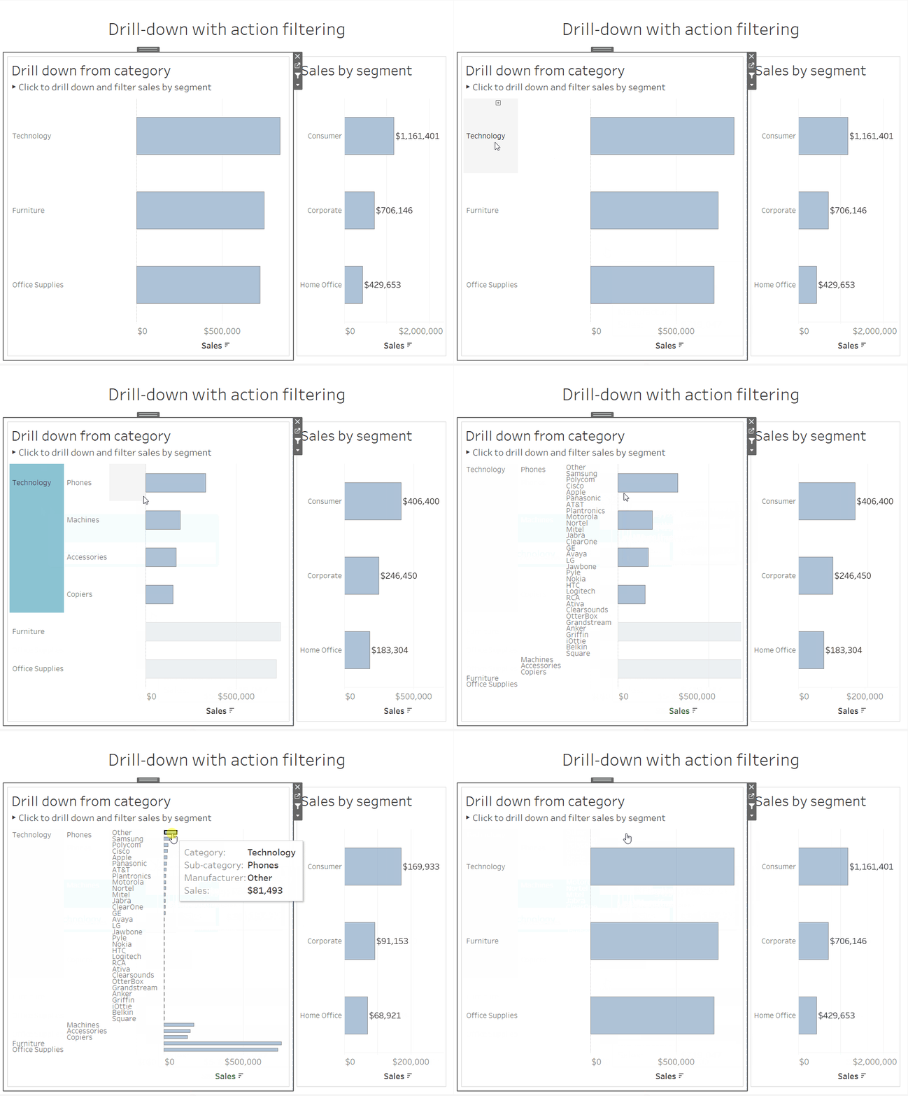
The Information Lab’s Andrew Lehm demonstrates how you can use an action filter when using Set and Parameter Action drill-downs in Tableau.
The approach Andrew uses combines an action filter with set actions drill down into the dataset. This technique creates a clean filtering method between worksheets while using set actions to drill down into the data on the dashboard.
Read MoreHow to Use Annotations in Tableau
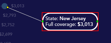
Zen Master Sarah Bartlett shows you how you can use and customise your annotations in Tableau.
Sarah explains the three annotation types used in Tableau for annotating dashboards (Mark, Point, and Area), as well as the formatting and box options available for Tableau analysts, as well as how she has used annotations in her work.
Read MoreSwitch an Image with a Selection in a Tableau Dashboard
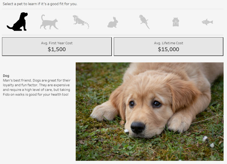
Eric Parker shows you how can switch an image with a selection in a Tableau Dashboard. This approach is a visually appealing way of switching an image you want to see in your dashboard while using a Filter Action to ensure that the image itself will switch in a dashboard.
Read MoreAn Apply Button for Your Parameters
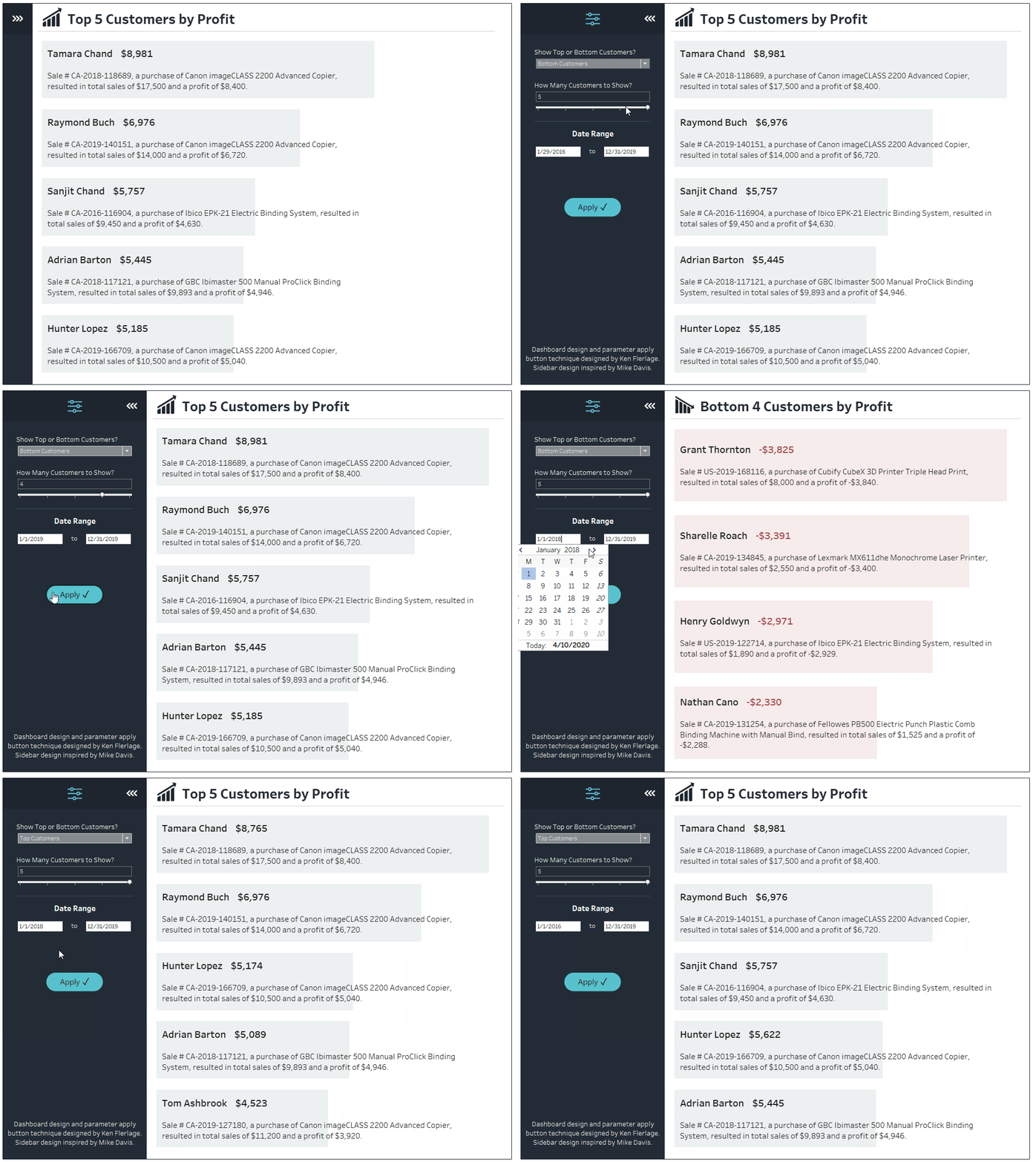
Starting off the latest edition of Tableau Bites is one half of the Zen Master Flerlage Twins, Ken Flerlage who has come up with a clever solution for your Parameters by using Parameter Actions to create an apply button.
Adding an Apply Button to a Parameter is a great way of ensuring that the user interacting with the dashboard has more control over adjusting the parameters. The application of parameter actions as an apply button has many use cases so I hope you can find one applicable to your dashboard?
Read MoreCreating Two Colour Area Charts
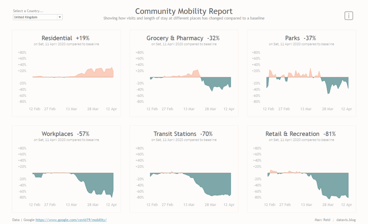
Zen Master Marc Reid shows you how you can create two colour area charts in Tableau, which are similar to the Google area charts used to track movement trends of people during COVID-19.
Two Colour Area Charts are a great way of displaying company profit or sales over a certain period of time. Whether if it’s looking at product or employee profitability within an organisation, the two colours will make it easy to identify which dates were profitable or not profitable.
Read MoreExploration Dashboards with Multiple Drill-Downs in Tableau
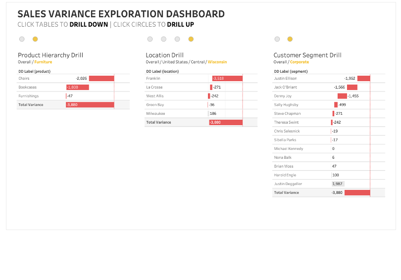
Zen Masters Klaus Schulte and Rosario Gauna have come together to explain how you can create exploration dashboards that have multiple drill-downs and drill-ups in Tableau.
This kind of dashboard works very well for Tableau analysts working in the financial sector. Accountants and analysts need to analyse the variances in each sub-category to find out which products and categories are profitable, not profitable or loss-making to a company or organisation.
Read MoreHow to calculate percent-of-total in Tableau: Four Ways
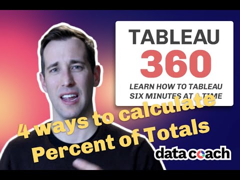 Tessellation’s Zen Master Luke Stanke takes you through how you can calculate percent-of-total in four different ways in Tableau.
By calculating each segment by sales with the Superstore dataset, Luke highlights the four ways that you can calculate percent-of-total in Tableau, which includes TOTAL(), WINDOW_SUM() as well as {FIXED} and {EXCLUDE} level-of-detail calculations.
Read More
Create an Expanding Sidebar on Hover in Tableau
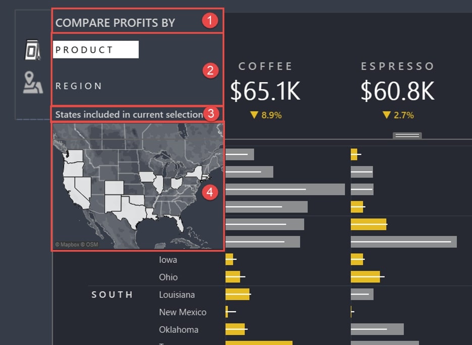
Interworks’ Keith Dykstra demonstrates how you can create an expanding sidebar on hover in Tableau by using a Parameter Action to achieve this result.
An expanding sidebar on hover is an excellent workaround for displaying additional information in your dashboard without adding additional visual clutter to your dashboard. The use of an expanding sidebar is particularly useful for dashboard creators working in the sales and healthcare industries.
Read MoreHow to create a simple 4-colour quadrant in Tableau
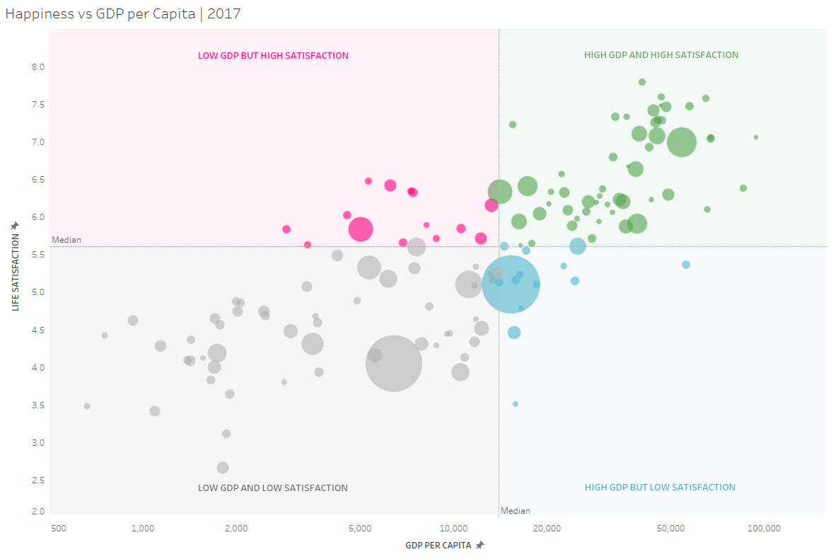
The Information Lab’s Natalia Mineva takes you through how to create a simple four-colour quadrant chart in Tableau. For data that involves student engagement within higher education to comparing employee satisfaction, this chart is an excellent way of visualising that kind of data onto a quadrant chart.
Read MoreA Journey to Custom Subtotals with Table Calculations
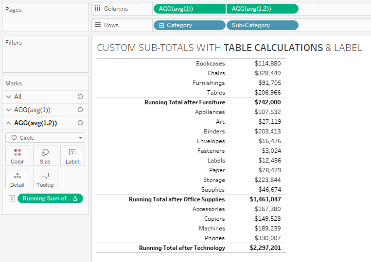
There have been a couple of approaches to tackling custom subtotals in Tableau using various calculations and methods. Jeffrey Shaffer has identified a simpler approach to custom subtotals by using Table Calculations.
Jeffrey builds on the approach taken by fellow Zen Masters Klaus Schulte and Rody Zakovich by using Table Calculations to display the custom subtotals and labels to achieve this in a cross-tab.
Read MoreColouring marks using Highlight, Set and Parameter Actions
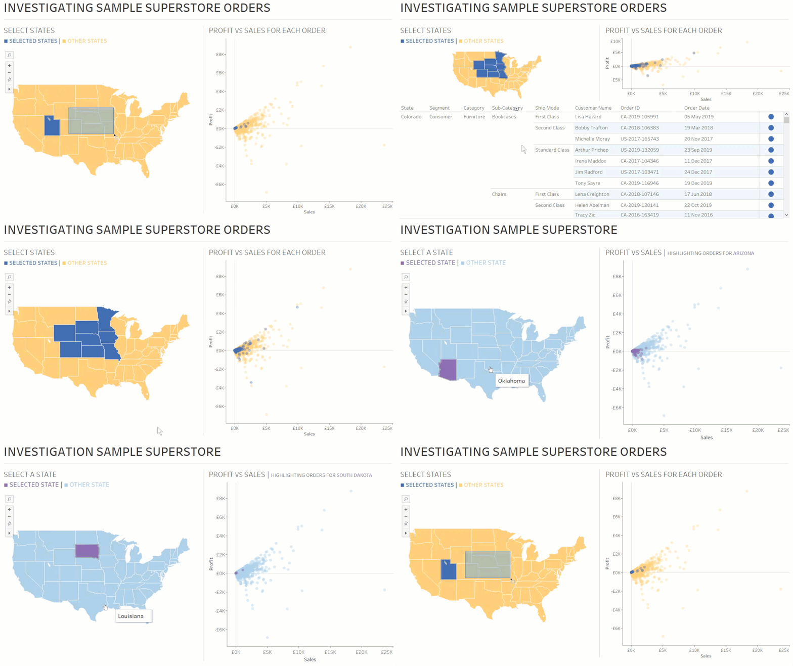
Wondered how to colour marks using Tableau? Seffana Mohamed-Ajaz has three different approaches to colouring marks, using either Highlight, Set and Parameter Actions to do it. This is great for selecting the marks you want to view in the visualisation displayed in your worksheet or dashboard.
Read MoreHow to create an interactive legend in Tableau
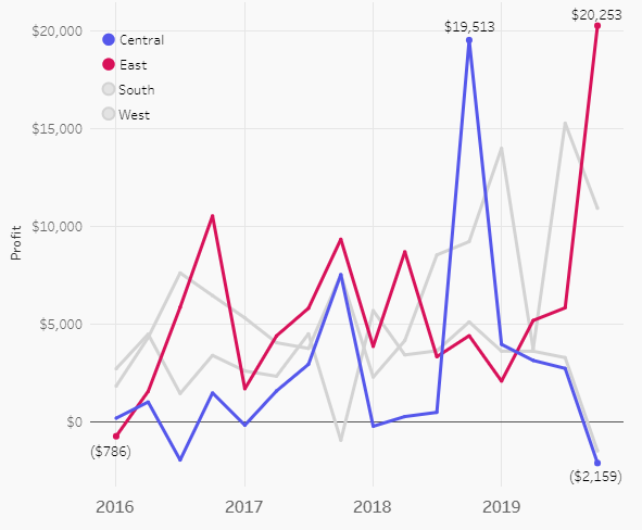
Tessellation’s Luke Stanke demonstrates how you can make your legends more interactive in your dashboard by using a Parameter Action to create an interactive legend in Tableau.
This is a great alternative to the default static legends that we have come to expect in Tableau dashboards. By creating an interactive legend, it allows you to select or deselect the marks you want to look at in your organisation’s regional sales dashboard.
Read MoreHow to Improve Your Tableau Work with Documentation
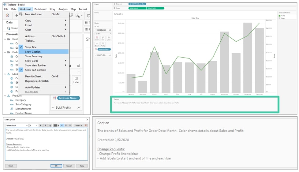
Interworks’ Kendra Allenspach explains how you can improve your Tableau work by using documentation to document the dashboard creation process.
This is a great way of applying best practice for Tableau analysts to document how they build dashboards within an organisation. This includes adding descriptions to dimensions and measures, adding comments to calculations as well as adding a change log dashboard tab and much more.
Read MoreBar Charts: Colour-Coding the Top X using the Index function
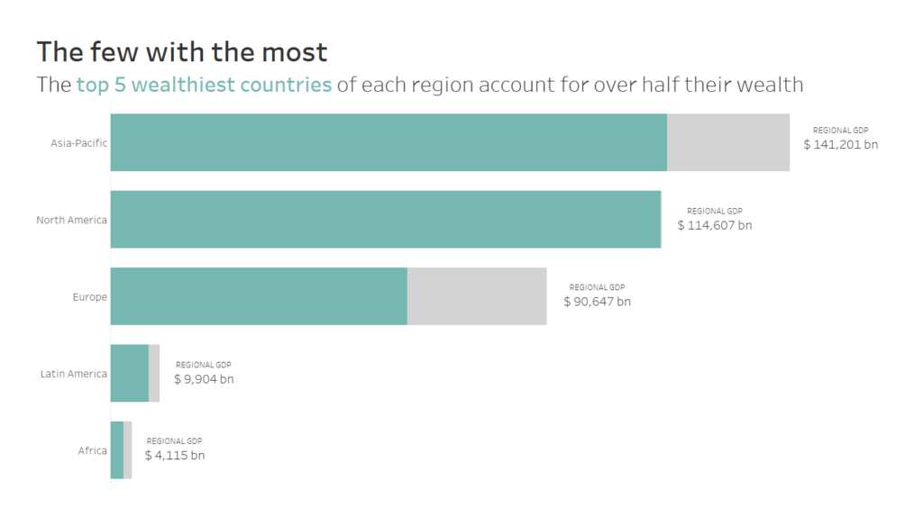
Jess Hancock from The Information Lab’s Data School shows you a simple, but effective tip with colour coding the top X of bar charts using the INDEX function.
This is a clever workaround when it comes to looking at which top X of regions within the sales or healthcare bar chart have performed or under performed when it comes to hitting their budget targets set within the organisation. I hope you can find some relevant use cases for this?
Read MoreTableau QT: Completion Gantt Charts
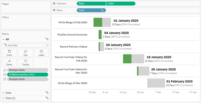
Toan Hoang is back with another Tableau Quick Tip as he shows you how to build a completion gantt chart in Tableau. For managers who are working on dashboard projects, this is a good way of ensuring certain tasks of a project are on-track to be completed on time and on budget.
Read MoreThe Key to Dynamic Parameters & Some Good Use Cases
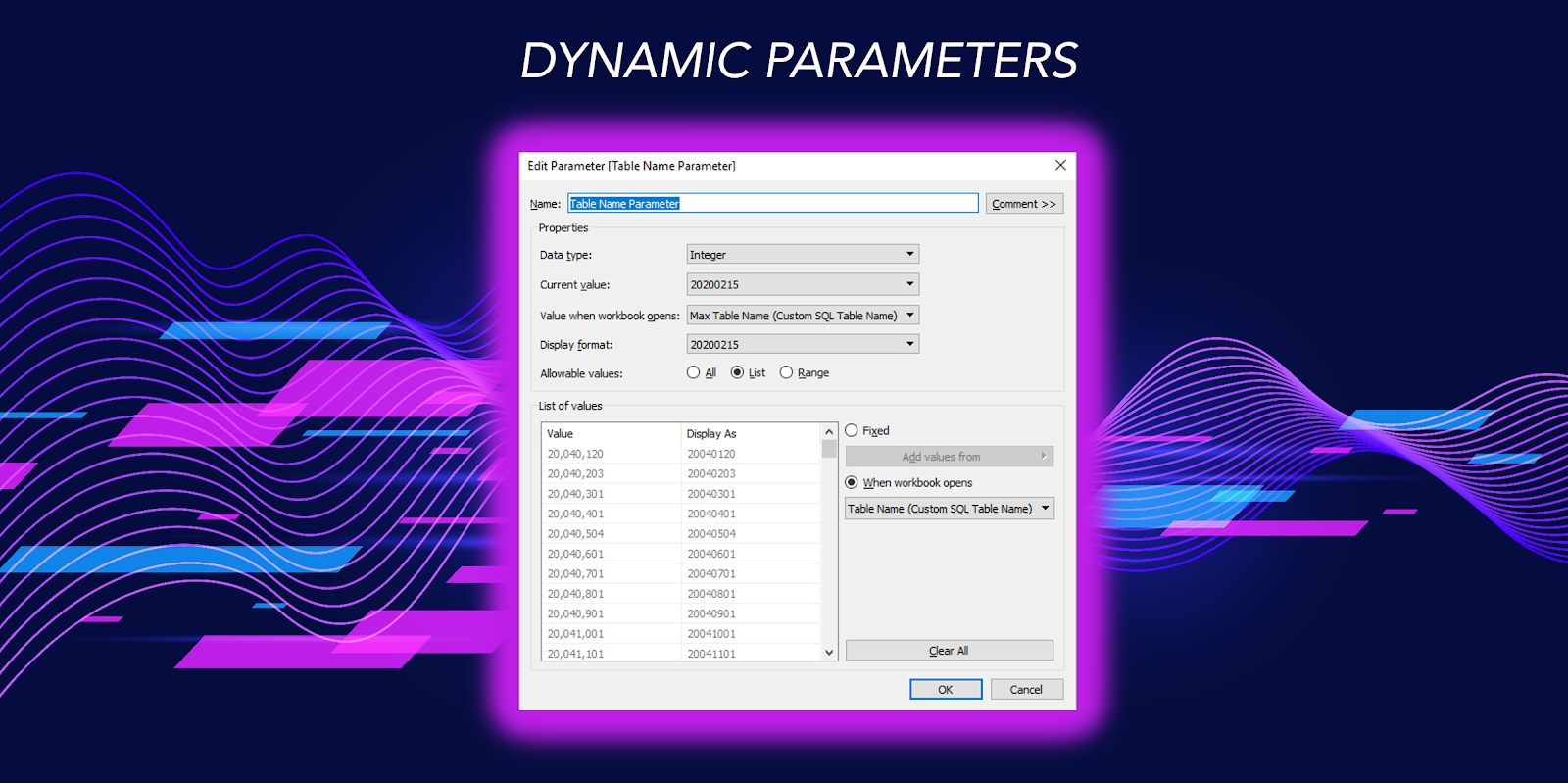
With the release of Tableau 2020.1. Dynamic Parameters are now available in Tableau. Zen Master Kevin Flerlage takes you through the keys to using Dynamic Parameters and it’s use cases.
Dynamic Parameters allow you to update your chosen field values from a data source when opening a workbook, as well as automatically setting a parameter to a value you have selected. The use cases Kevin demonstrates with the feature are date range and dynamically pulling different tables from a database.
Read MoreBuffer Spatial Calculations
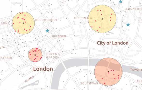
If Dynamic Parameters was not enough to whet your appetite, another new feature that has emerged in Tableau 2020.1 is the introduction of the Buffer Spatial Calculation for mapping.
Zen Master Marc Reid shows you how to use the Buffer spatial calculation by explaining the various use cases, including looking at areas a company would look at for trading opportunities. There are endless use cases for using Buffer spatial calculations in your maps in Tableau.
Read MoreThe Dashboard Requirements Worst-Case Survival Handbook

Mark Bradbourne has a dashboard requirements worst-case survival handbook to help you navigate through the challenges dashboard designers are likely to face when creating company and client dashboards.
Some of the usual challenges Mark explains are centred around exporting dashboards to Excel, using a pie chart and stop light dashboards. For Tableau analysts, they are likely to face these challenges on a regular basis so this handbook may help you get out of a stressful dashboard building process.
Read MoreDeselect Marks with a Highlight Action
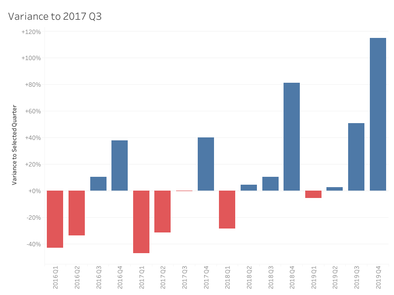
Andy Kriebel is back with another useful Tableau tip up his sleeve as he shows you how to deselect marks on a worksheet with a Highlight Action.
For this tip, Andy combines the Highlight Action with Set Actions for two use cases, focusing on deselecting the quarter selected in the quarterly sales worksheet and deselecting a part of the stacked bar chart selected for a Region. There are many use cases for using this tip in your dashboards.
Read MoreFilter between blended data sources in Tableau using Set Actions
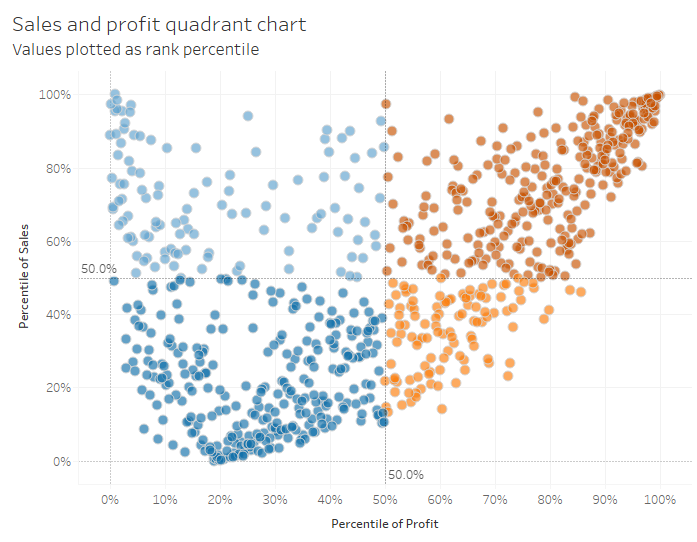
Andrew Lehm from The Information Lab demonstrates how to filter between blended data sources in Tableau using Set Actions. This is a great workaround when it comes to filtering particular types of charts (i.e. Quadrant Charts) that would be filtered by a quadrant or segment within a secondary data source.
Read MoreGrouping Options in Tableau
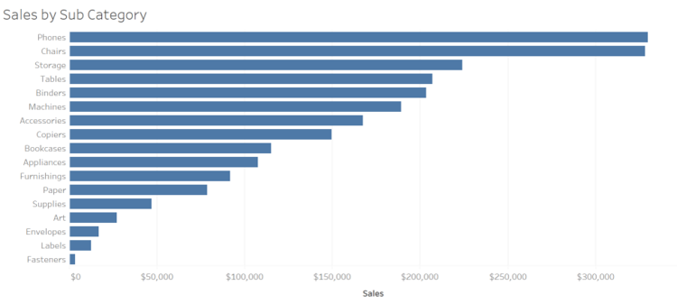
Eric Parker explains the three methods for creating group options in Tableau. The three grouping options include header grouping, visual grouping and geographic grouping.
Header grouping focuses on allowing users to combine header values, which is particularly useful with bar charts. With visual grouping, the user can select data points to a group (e.g. Quadrant charts) whereas geographic grouping (e.g. Maps) is focused on the user selecting geographic entities in a group.
Read MoreSimple Synchronized Scrolling in Tableau
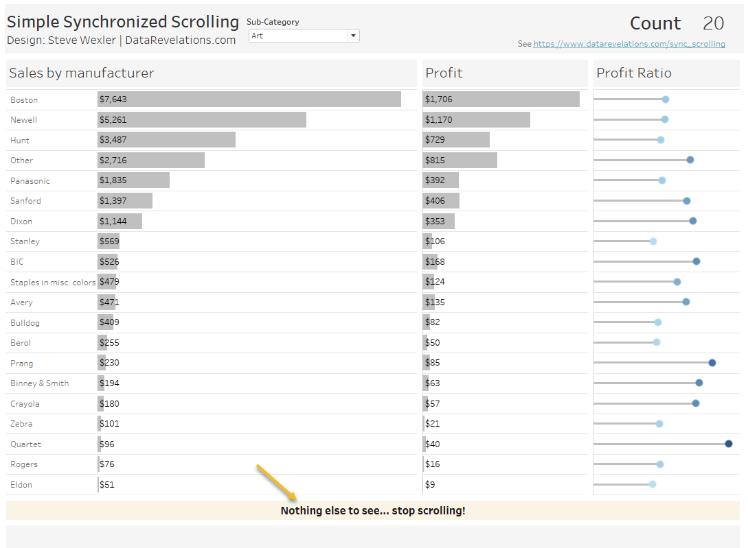
The first Tableau Zen Master to feature in this edition is Steve Wexler, who shows you a different approach to the scroll bars we have come to expect in our Tableau dashboards.
Steve highlights a different approach to synchronized scrolling by creating a big ass dashboard (BAD). This means creating a dashboard so tall that you do not see individual scroll bars in the view. Instead, you have one scroll bar on the right-hand side of the dashboard instead of several scroll bars in the view.
Read MoreUse filter action fields to update sheet titles
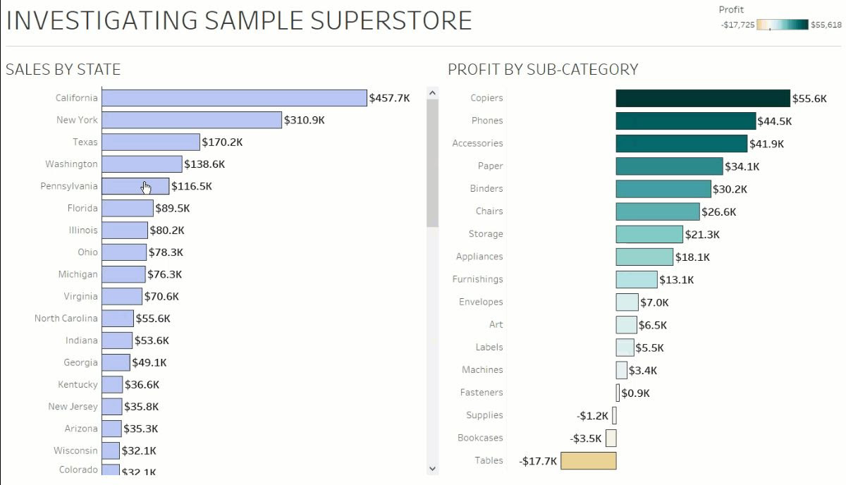
Seffana Mohamed-Ajaz from The Information Lab explains how you can use filter actions to update sheet titles on your dashboards.
This tip is a great way of filtering the information you want to see in the dashboard while creating a dynamic title that updates itself. Seffana demonstrates the use of filter actions to update sheet titles by using the Superstore dataset.
Read MoreBuild a Voronoi Treemap in Tableau with two steps
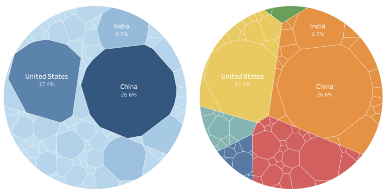
Zen Master Tristan Guillevin demonstrates how you can build a Voronoi Treemap in Tableau with two simple steps. This involves generating the Voronoi data as a text file and visualising it in Tableau using the Extract Data function. I hope you can find some use cases for using a Voronoi treemap in your work?
Read MoreBuilding a custom colour palette for Tableau
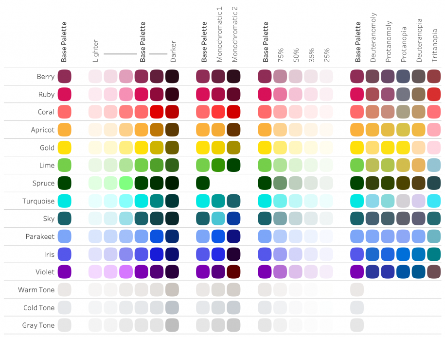
Luke Stanke from Tessellation demonstrates how you can build custom colour palettes for your real-world dashboards in Tableau.
The Zen Master highlights some tips to consider when building custom colour palettes for Tableau dashboards, including obtaining access to official brand standards documents, colour blindness and testing the colour palette with basic visualisations to make your dashboards accessible to everyone.
Read More4 Tips for Organizing Your Tableau Workbooks
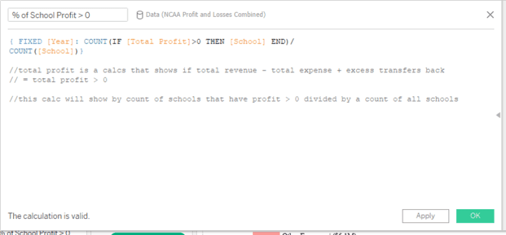
Spencer Bauke has four tips that will help make organizing your Tableau workbooks more easier for dashboard designers.
He explains that by using comments, folders, as well as annotating calculations and default formatting, it will streamline the process for dashboard designers who are creating and designing dashboards in Tableau for clients and organisations.
Read MoreDynamically Control Formatting Using Multiple Calcs
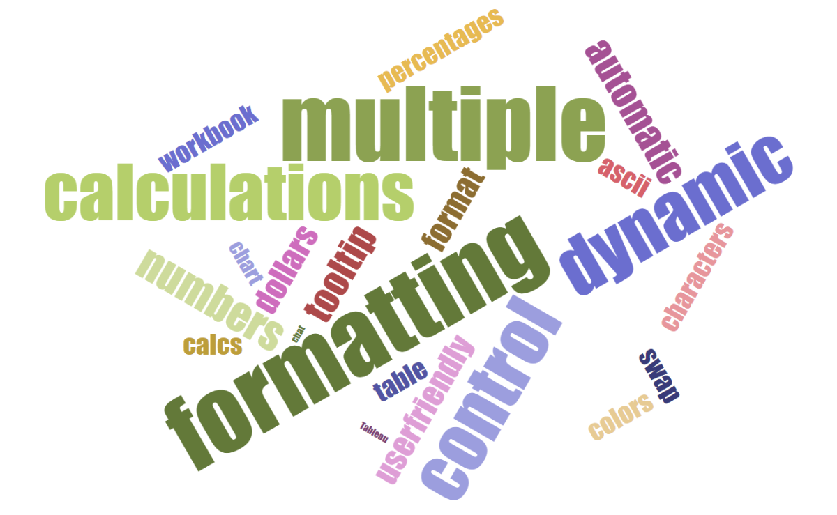
Last, but not least is new Zen Master Kevin Flerlage, from the Flerlage Twins who shows you how to dynamically control the formatting of various elements in Tableau by using multiple calculations to do this.
Kevin demonstrates this through a couple of simple use cases where he uses multiple calculations to change colour within the tooltip to swapping measures with parameters. There’s plenty of ways that you can use multiple calculations to dynamically control the formatting of your dashboards.
Read MoreAnimations vs transitions: what’s the difference?
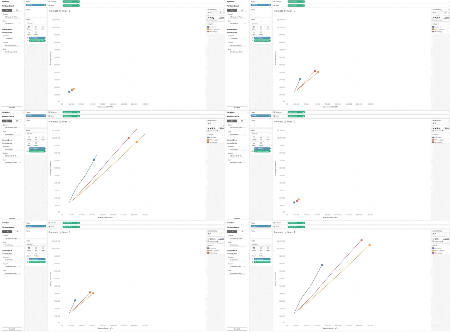
One of the most talked about features in Tableau 2020.1 is the introduction of animations in Tableau, but you’re wondering what’s the difference between animations and transitions?
Tim Ngwena highlights the differences between animations and transitions by demonstrating the feature with a use case of the running total of profit and sales over four years. Tim argues that animations should be called “transitions” but I will leave it you to decide if you want to call it animations or transitions?
Read MoreRethinking Slider Parameter Formatting in Tableau
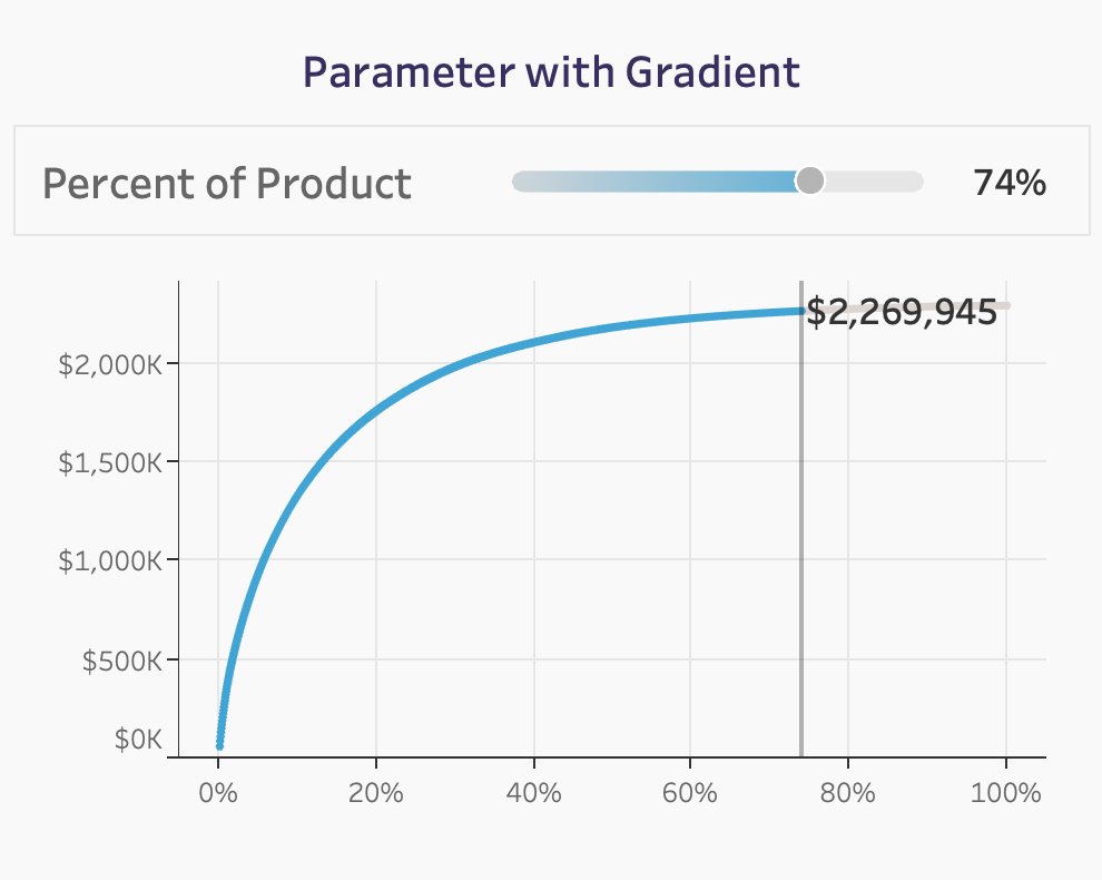
Zen Master Luke Stanke rethinks how you should format the Parameter slider in Tableau by using a separate sheet to replicate Tableau’s default Parameter slider. This is a great workaround for giving a different look and feel to the usual Parameter slider we’re familiar with in our worksheets and dashboards.
Read MoreCreating UpSet Plots in Tableau
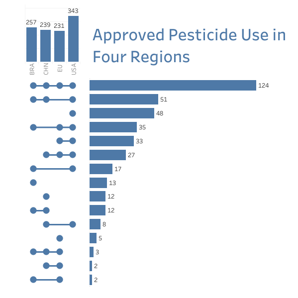
Zen Master Chris Love shows you how to build UpSet Plots, which is an alternative chart type to building venn diagrams, which are difficult to build in Tableau.
UpSet Plots allows you to bring more insights into your data in a much smaller space, compared with a venn diagram. Chris uses the Week 2 dataset for Makeover Monday on approved pesticide use in four regions to build the UpSet Plot. I hope you can find a use case for using UpSet Plots in your dashboard?
Read MoreThe 6 Month Blues
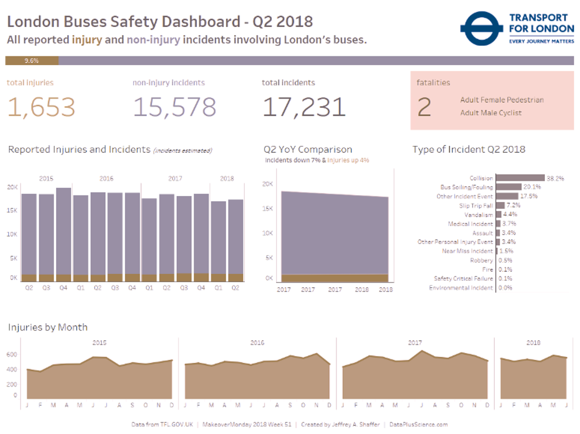
Jeffrey Shaffer highlights a common issue dashboard designers in organisations face when gaining user adoption and changing culture in which Jeffrey plays “The 6 Month Blues” with one of his Makeover Monday dashboards on London Bus Safety.
Jeffrey explains that change should be introduced slowly when organisations design dashboards that they should gradually steer away from using the standard red and green colours in a dashboard, particularly for users who are colourblind.
Read MoreTableau QT: Volume Dial Chart in Tableau
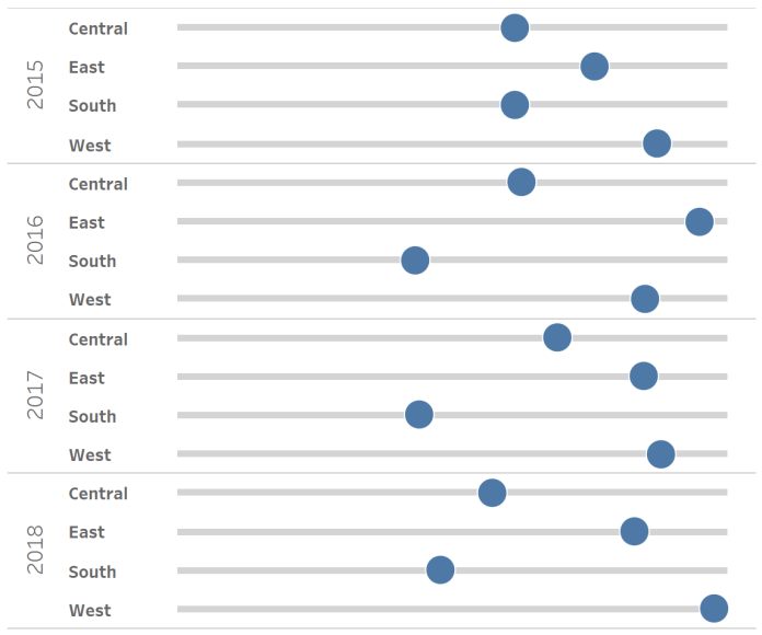
The Tableau Magic continues to spread from Toan Hoang as he shows you how to create a volume dial chart in Tableau. Volume dial charts are great for showing which regions have generated the most percent of sales or healthcare providers are reaching their goals over a set period of time.
Read MoreUnit Bar Charts that aren’t
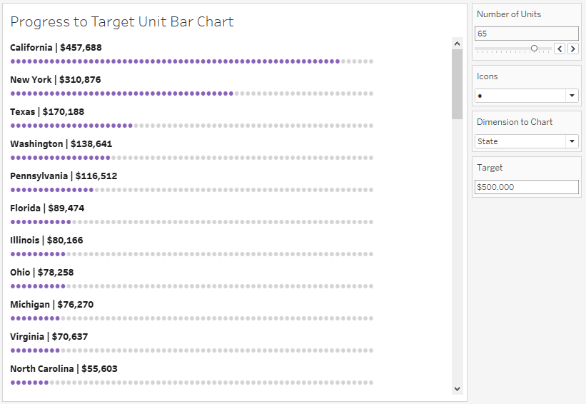
Adolfo Hernandez demonstrates how to create unit bar charts that don’t look like bar charts. Adolfo uses Parameters and calculations to create a unit bar chart which shows which US states are progressing in terms of hitting the $500,000 sales goal.
Read MoreHiding Selection Borders in Tableau
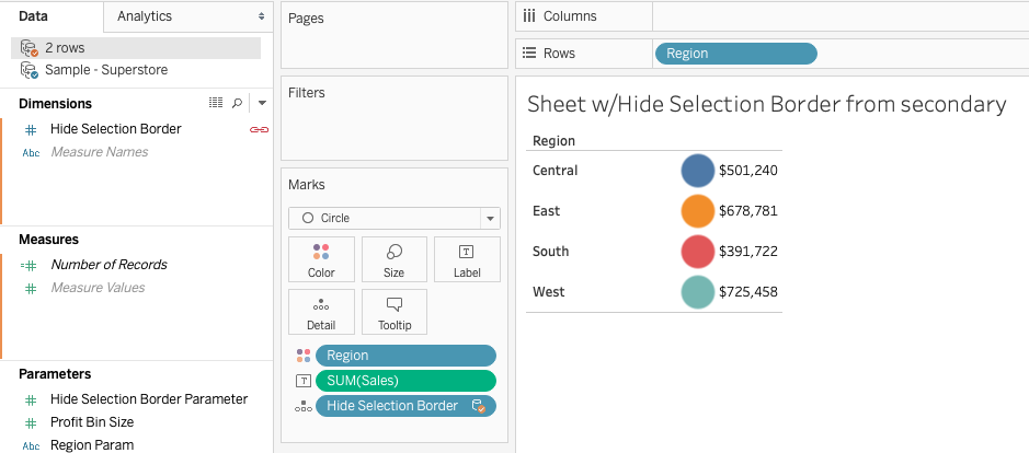
From the Zen Master Hall of Fame, Jonathan Drummey shows you how to hide Selection Borders in Tableau, using both Parameter and Highlight Actions. This tip is great for allowing the user to select the insights they want to see in the dashboard while ensuring that the selected border is hidden from the view.
Read MoreHow To: Row and Column Highlighter using Set Actions with Tableau
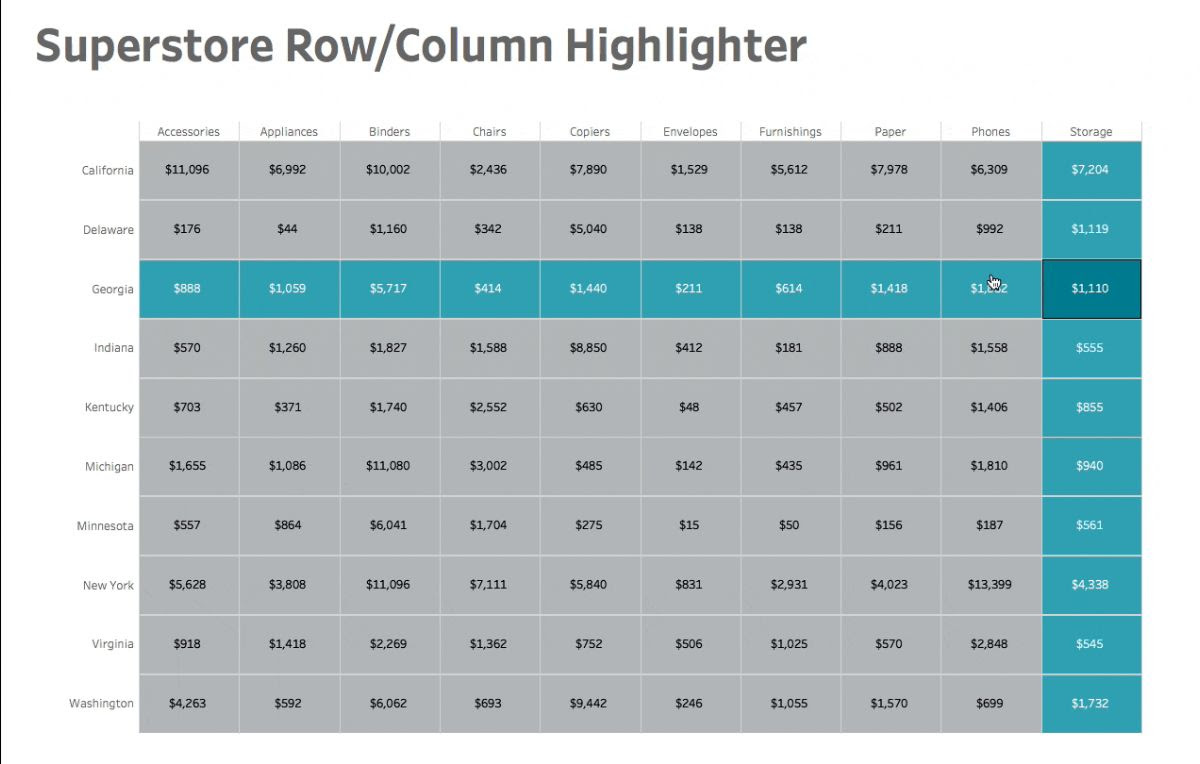
The Zen Masters keep coming in this edition of Tableau Bites as Matt Chambers demonstrates how to create a row and column highlighter using Set Actions in Tableau.
Adding a row and column highlighter to a crosstab is a great way of highlighting which regions are generating the most sales for a retailer or which hospitals are providing a good level healthcare within their respective dashboards.
Read MoreGrouping Data into Custom Time Bins
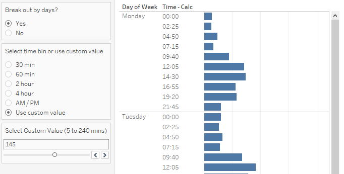
Advanced Tableau users! Marc Reid has you covered as he explains how you can group timed data using Custom Time Bins. Working with timed data can be challenging in Tableau but Marc’s approach enables you to group timed data into custom bins by using Parameter Actions and Calculations to do this.
Read MoreColor Me Shocked: 5 Secrets to Improve Color Use in your Tableau Dashboards
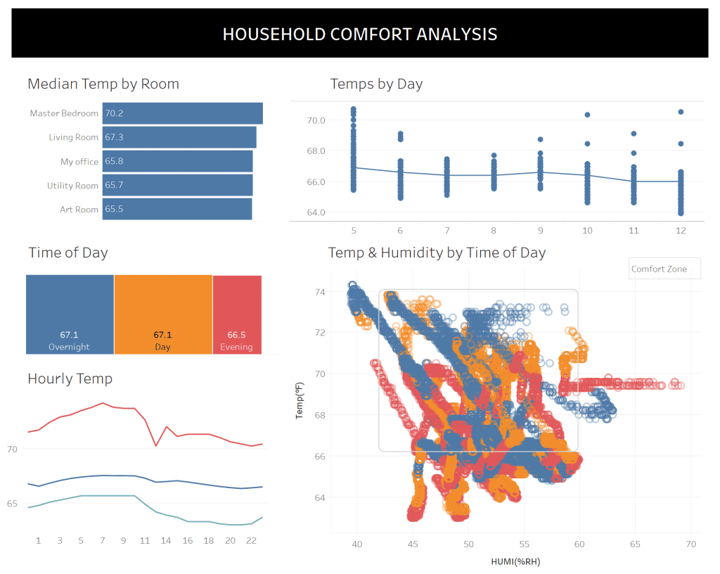
It’s not often we have three Zen Masters in one edition of Tableau Bites, but we do and Bridget Cogley has five secrets to share with you on improving colour usage in your Tableau dashboards.
Colour is one of the most challenging things to get right in a dashboard. Bridget explains a few things that dashboard designers should do with colouring dashboards, including using a monochrome design as well as building the dashboard before adding colour in.
Read MoreTableau Tip: the INDEX trick
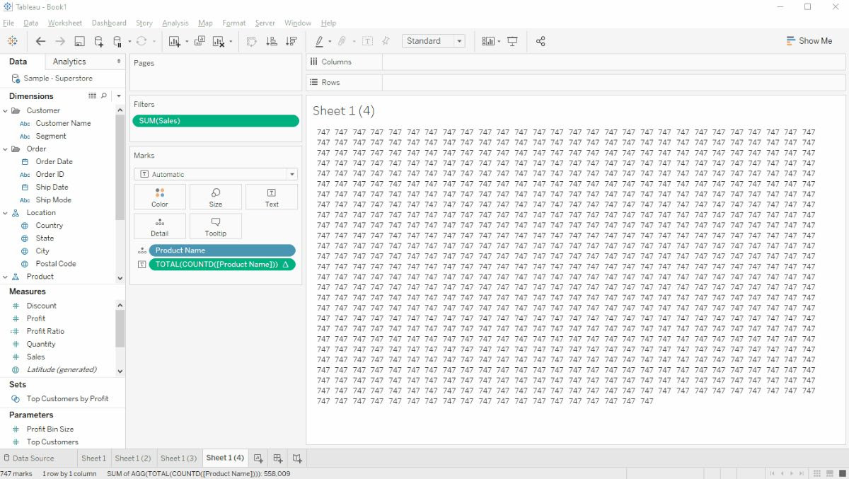
Hanna Nykowska from The Information Lab has a Tableau tip up her sleeve in the form of the INDEX trick, which is using the INDEX() function as a filter.
This tip has some incredibly useful use cases. It includes making hidden values visible, instead of hiding them from the dashboard view while also combining the INDEX() function with other Table Calculations to get rid of repeated values in the dashboard itself.
Read MoreHow to Label Both Ends of the % of Total Bars
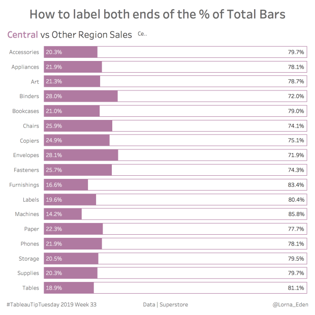
Lorna Eden demonstrates how you can label both end of the % of total bars in a bar chart.
Labelling both ends of the total bars using a % of total by using a Parameter is a great way of showing which product categories in certain regions are selling well or whether employees are hitting their allotted sales targets compared with the company average.
Read MoreHow to make a span chart in Tableau
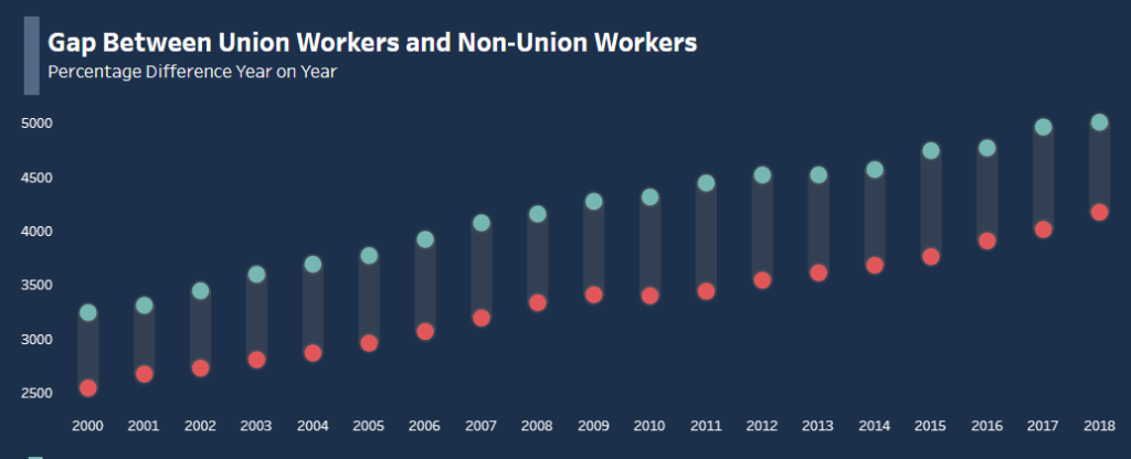
Kicking off the first Tableau Bites of the new decade is Christopher Marland from The Information Lab’s Data School as he demonstrates how to make a span chart in Tableau.
A span chart can be used to display data across a minimum and maximum range. Whether if it’s looking at company department productivity or annual employee wages, a span chart is great for Tableau dashboard designers working in the human resources industry.
Read MoreHow to Create a Subtitle in Tableau that Highlights Which Fields Have Been Filtered
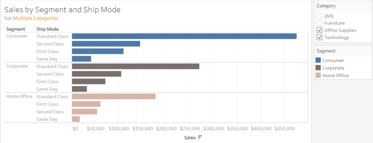
OneNumber’s Eric Parker explains how to create a subtitle in Tableau that highlights which fields have been filtered in your dashboard.
This is useful if you have created a dashboard in Tableau that has a lot going on, which makes it difficult to find which filters are being used. Eric’s approach by creating a subtitle below the main title makes it clear what filters are being used in the dashboard itself.
Read MoreCustom Dropdown with Parameter Actions & Show/Hide Container
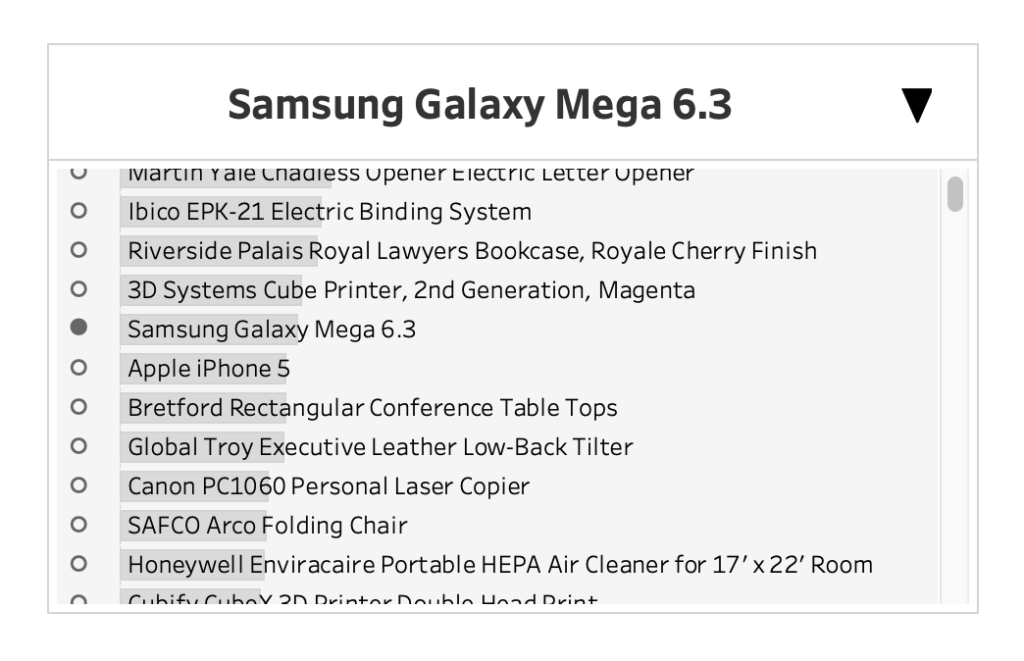
For the advanced Tableau user, 2019 IronViz runner-up participant Lindsey Poulter focuses on how you can create a custom dropdown in Tableau that uses both Parameter Actions and Show/Hide Container. This is great for looking at how various product departments are performing over the year.
Read MoreText Alignment on Dashboards
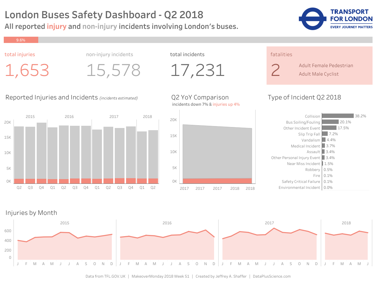
Zen Master Jeffrey Shaffer highlights some best practices for text alignment on your Tableau dashboards. Jeffrey explains how text alignment in Tableau can be used appropriately while identifying different scenarios of using left-aligning, centre-aligning and right-aligning text in a dashboard.
I hope you can find a use case for this in your real-world dashboard?
Read MoreUsing Distribution Lines to Provide Space for Labels
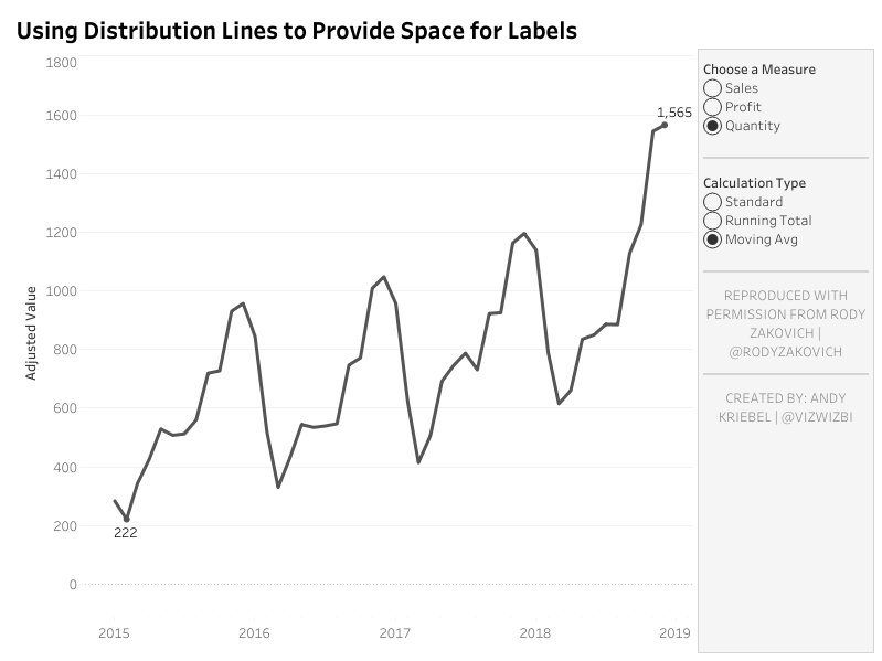
The second of two Zen Masters to feature in the first Tableau Bites of 2020 is Andy Kriebel, who has another Tableau Tip up his sleeve with using distribution lines to create space for labels in a dashboard.
Andy shows you how you can use distribution lines to provide space for labels in your dashboard. If you have a sales dashboard that already has a filter for your audience to use, using distribution lines is a great way of creating space for labels in the dashboard while reducing the visual clutter in your dashboard.
Read MoreAn Intro to Basic String Calculations: Left, Mid and Right functions

Ross Easton from The Information Lab’s Data School gives you a basic introduction into string calculations in Tableau. Ross focuses on the left, mid and right functions of string calculations, which allows you to separate merged bits of information in your dataset into separate columns.
This is useful if you have data that has been merged together in certain cells and you need to separate the information into individual columns.
Read MoreHow to build a candlestick chart in Tableau
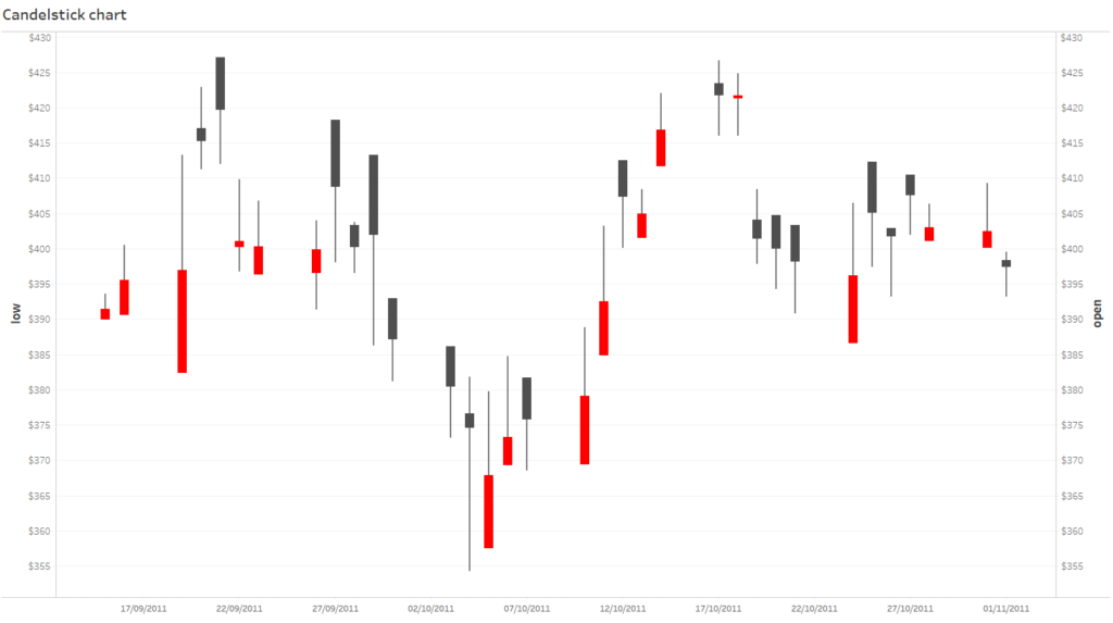
Starting off the final Tableau Bites of 2019 is Anna Prosvetova from The Information Lab’s Data School, who shows you how to build a candlestick chart in Tableau.
A candlestick chart is great for showing the fluctuating price changes in stocks and currency data, showing which days or months have shown a rise or decrease in prices. This is particularly useful for Tableau dashboard designers who work in the banking and stock market industries.
Read MoreDealing with common Scatter Plot issues in Tableau
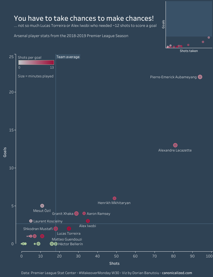
Dorian Banutoiu from Canonicalized highlights the most common issues that you are likely to deal with when using a scatter plot in Tableau. A scatter plot is great for showing which employees are generating the most sales within their department or how many customers are visiting your store.
It is worth taking into consideration when using this chart type in Tableau that you are going to deal with common issues, which includes dealing with NULL values or synchronised axes. Dorian explains some approaches to dealing with these common scatter plot issues in Tableau.
Read MoreUsing Parameter Actions to Compare Time Periods
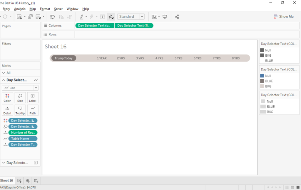
If you are an advanced Tableau user, Tessellation’s Spencer Bauke shows you how to use Parameter Actions to compare time periods. This is a very useful tip to use if you are working with data relating to time periods and need to select which time period on your dashboard to look at, whether that’s product sales or employee retention.
Read MoreHow to Track the Usage of Tableau Dashboards via URL Actions
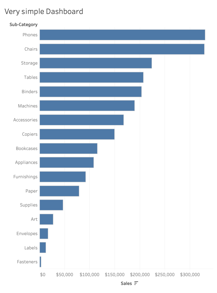
Rodrigo Calloni explains how you can track the usage of dashboards created in Tableau through URL actions. This simple tip could be useful for dashboard creators and designers who want to track the user behaviour of interacting and engaging with the dashboard they have created in Tableau.
Read MoreHow to create a printable table with multiple pages
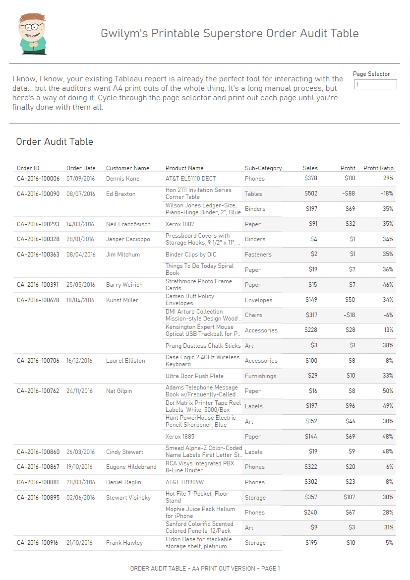
Gwilym Lockwood from The Information Lab has a tip up his sleeve for creating a printable table with multiple pages in Tableau. Gwilym uses a Parameter and running total calculation to create a table that can be printed across multiple pages.
Read MoreZoomable Charts in Tableau
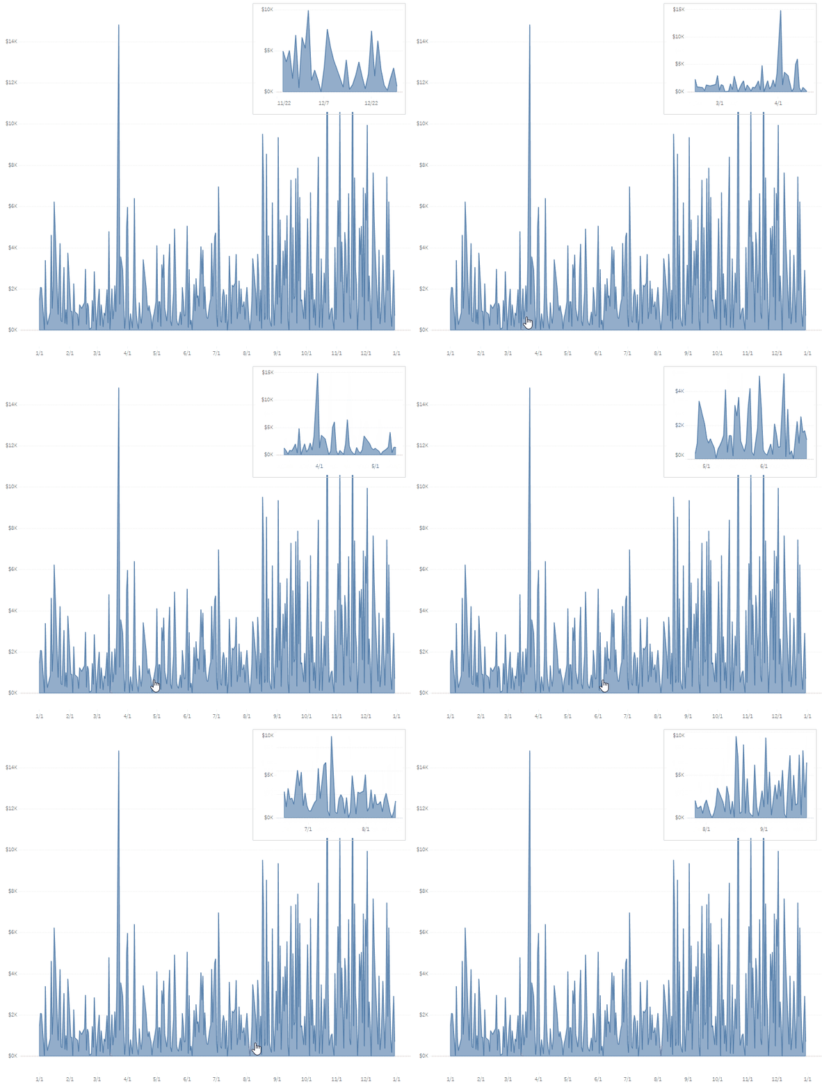
We’ve saved the best for last as Zen Master Ken Flerlage shows you how to use Zoomable Charts in Tableau. This sort of chart is useful for zooming into a particular area within the chart you want to look at whether if it’s the increase or decrease in medical sales or product sales over a certain time period.
Read MoreHow To: Sheet Selector Using Set Actions in Tableau
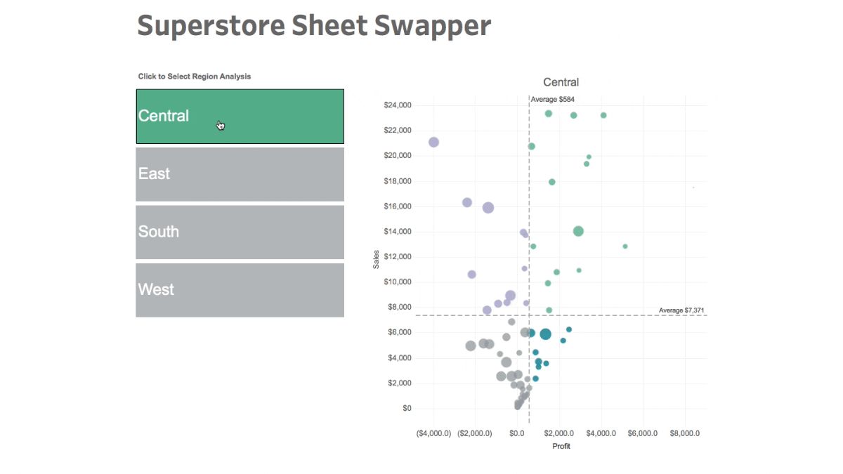
Zen Master Matt Chambers shows you how to utilise the power of Set Actions to create a sheet selector in Tableau.
Matt walks you through step-by-step on creating the sheet selector using Set Actions, which is designed to create user interactions that can change the visualisations shown on a dashboard.
Read More5 Categories of Tableau Deliverables

Toan Hoang spreads his Tableau Magic once more, highlighting the flexibility and output the tool can bring to analytics and business intelligence professionals using Tableau in five categories.
The five categories Toan highlights are centred around presentation and print, interactive dashboards, infographics, data extracts and embedded analytics. Depending on how you use Tableau, it’s important to know how you can use the platform to it’s full potential to benefit your analytics department or consultancy.
Read MoreUsing LODs to Compare Max/Min Year Values
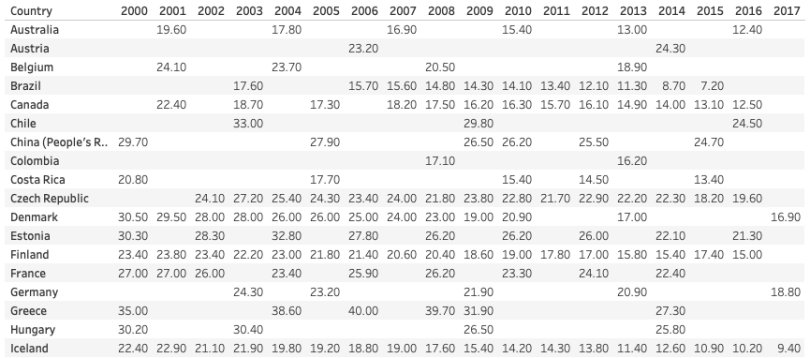
For the more advanced Tableau user, Lindsay Betzendahl has a tip up her sleeve using level of detail (LOD) expressions to compare max/min year values. The LOD expression for max/min year values is great if there are missing values in the dataset that affect the quality of the dashboard or visualisation and need to be filled in.
Read MoreVisualizing P&L Statements
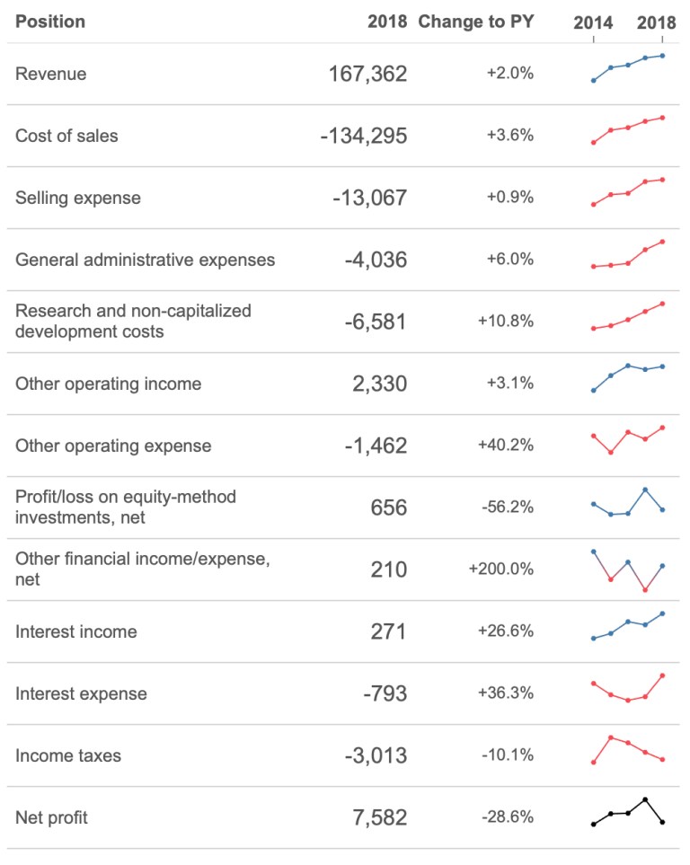
Klaus Schulte explains how you can visualise one of the most important documents for an accountant, a profit and loss statement. The Zen Master mentions using the scorecard approach to creating a P&L statement in Tableau while using different approaches to bring context for your statements.
Read MoreParameter Actions
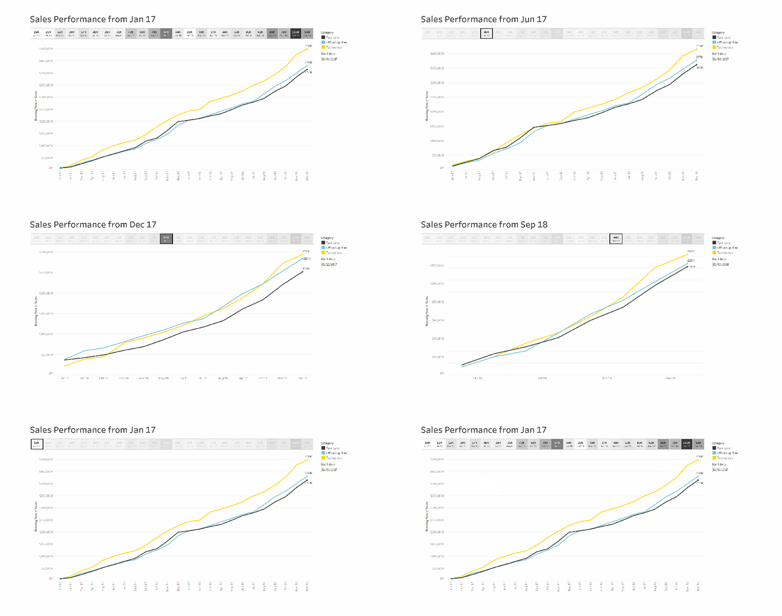
Expedia’s David Pires provides six different user cases for using Parameter Actions in Tableau, which was released in Tableau 2019.2 earlier on in 2019. It includes using Parameter Actions for running total start date, sort it with 1 click, combined scroll, drill-down, sync references and before and after.
Maybe you can find one that is useful for your product sales or employee engagement dashboard? There are many different use cases…
Read MoreHow to Dynamically Colour Tooltip Text in Tableau
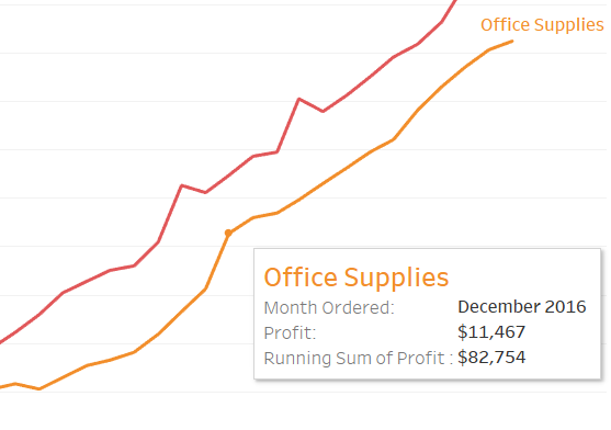
Slalom’s Sarah Bartlett shows you how to dynamically colour your tooltip text in Tableau. This is a great way of turning an ordinary-looking tooltip into something that enhances and improves the user experience for users and managers who are interacting with the visualisation or dashboard.
Read MoreCases for Collapsible Containers
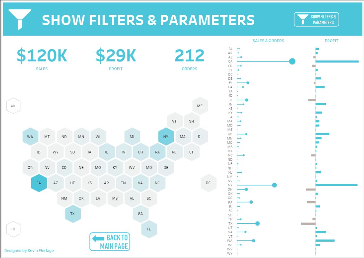
Kevin Flerlage highlights one of the less-promoted features when Tableau 2019.2 was released in May 2019, collapsible containers.
Collapsible containers can be utilised in several ways on a dashboard. Whether if it’s to show and hide filters or parameters, sheet swapping, creating stackable charts or modifying the background colour of a visualisation, you’ll find a way of applying a collapsible container in your own work! Kevin walks you through step-by-step on 12 different use cases.
Read MoreRemoving values from quick filters using Tableau’s Order of Operations
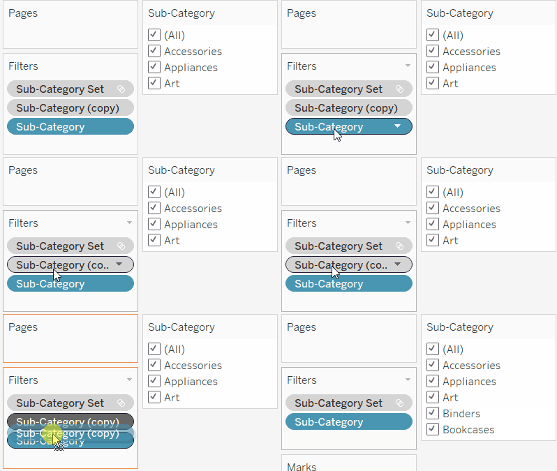
Nick Jastrzebski from The Information Lab shows you how to level up your dashboards with an overview of removing values from quick filters by using Tableau’s Order of Operations.
There are three ways of doing this through the Order of Operations. The first approach includes duplicating a field that you are using and then excluding it. The second approach uses a set filter to filter out unwanted values and the last approach combines both approaches to remove values from quick filters.
Read MoreHow to Make Ranged Dot Plots in Tableau
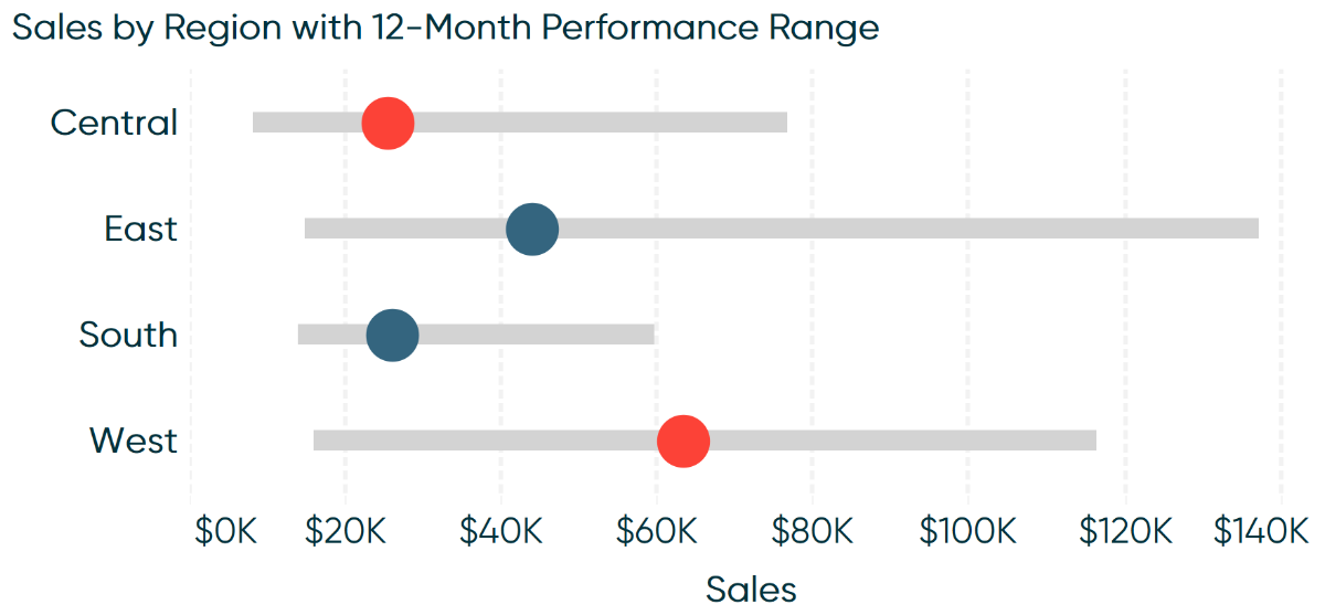
The Principal of Playfair Data is back with another excellent how to article. Ryan Sleeper guides you through how to make ranged dot plots in Tableau. A ranged dot plot is great for identifying which regions have generated more sales within your business over a 12-month window.
Read MoreStyle your KPIs – Displaying positive or negative change
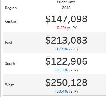
Want to make your KPIs stand out? The Data School’s Joe Stokes demonstrates how to style your KPIs in Tableau to display positive or negative change. This can be incredibly useful for businesses who want to look at if the number of sales or orders has increased or decreased year-on-year.
Read MoreDesigning Tableau Dashboards in the Age of Digital Distraction
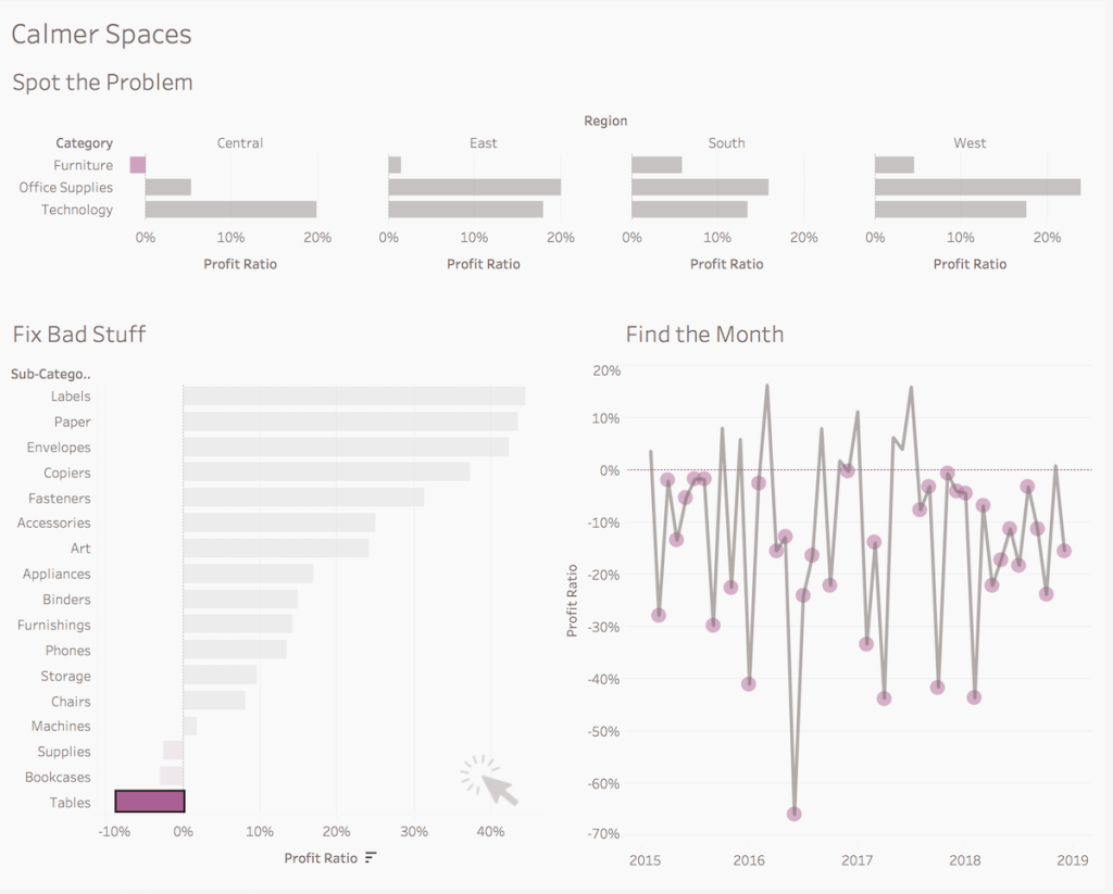
In this age of digital distraction, designing accessible dashboards in Tableau that does its job for your department manager or business is essential. Bridget Cogley mentions why its important to create calm spaces for users to engage in your company sales or healthcare dashboard.
Read MoreDifference From Average Set Action
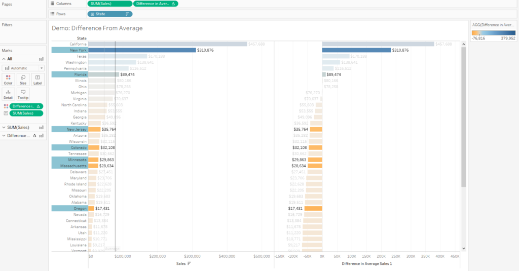
If one Data School post was not enough, let’s make it two! Georgie Grgec explains how to use a Set Action to show the difference from the average by using a difference in average chart to show which states are performing above the average state in the Sample Superstore dataset.
Read MoreTableau QT: Thermometer Chart
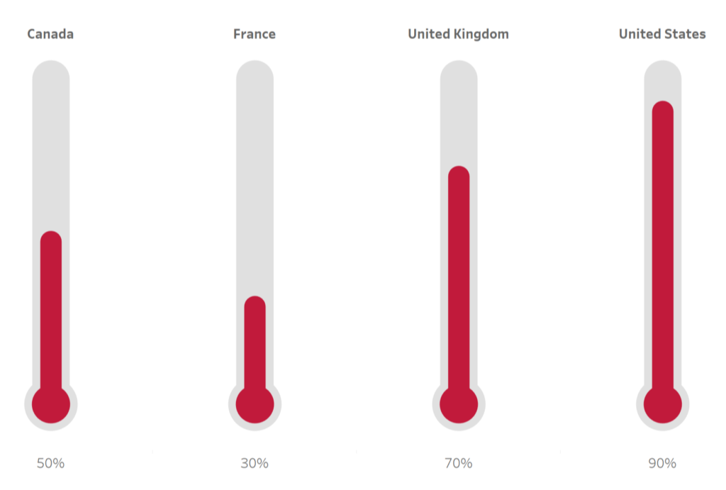
Toan Hoang is back with another of his Tableau Quick Tips as he shows you how to build a thermometer chart in Tableau in five minutes or less. A thermometer chart is great for showing the progress of where certain markets have performed better than others or different department performances within a company.
Read MoreHow to Colour Scale a Map Using Set Actions!
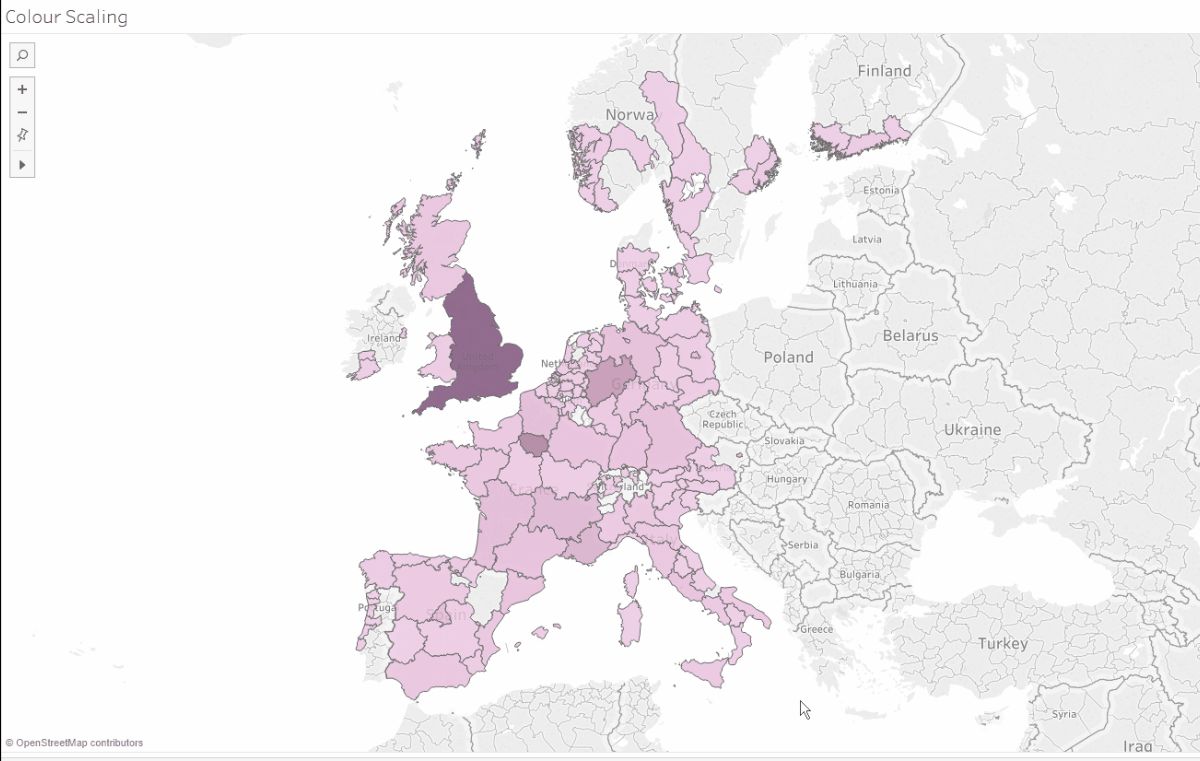
Figuring out where to start with Set Actions in Tableau? Viz Queen Louise Le from The Information Lab has a lovely little tip on changing the selection that impacts the colour scaling on a map using Set Actions.
The tip can be used if you’re looking into what regions are providing the highest number of product sales within a company to identify which products are popular within a certain region.
Read MoreHow to Make Hub and Spoke Maps in Tableau
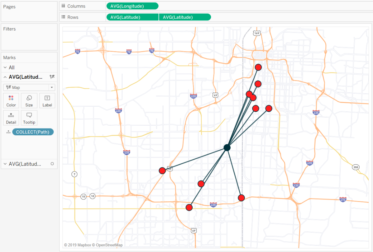
Ryan Sleeper shows you how to make hub and spoke maps in Tableau by using the MakePoint and MakeLine functions to show the location path between Ryan’s 10 favourite barbecue restaurants and the Playfair Data offices in Kansas City, Missouri! I am sure you can come up with some more useful use cases?
Read MoreAdvance with Assist: Nested IF Calculations in Tableau
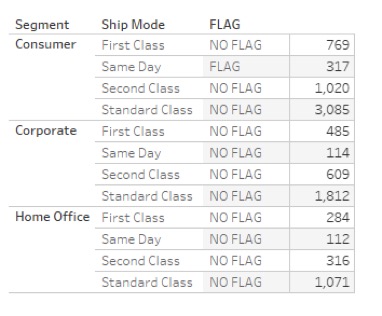
Interworks’ Dustin Wyers shows you how to use nested IF calculations in Tableau. Dustin uses this approach by using a nested IF calculation to identify which Segments and Ship Modes have been flagged or not flagged in the Sample Superstore dataset.
Read MoreUsing Measure Names to Update a Parameter
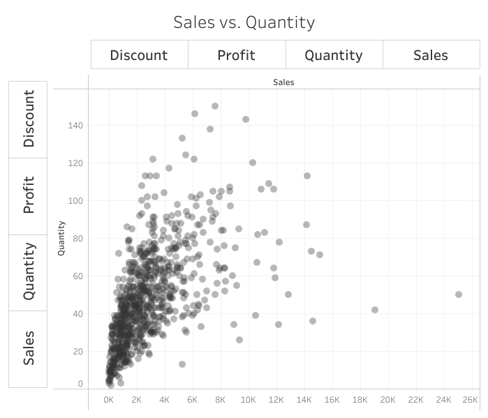
Andy Kriebel has another Tableau Tip up his sleeve as he delves into his handy tips and tricks toolbox to show you how to create a dynamic scatterplot and dynamic line chart which uses Parameter Actions to pass the Measure Names field to a parameter, and a calculation to achieve the result. This approach overcomes the fact that you cannot refer to “Measure Names” in a calculated field.
Read MoreTabbed Navigation With Parameter Actions
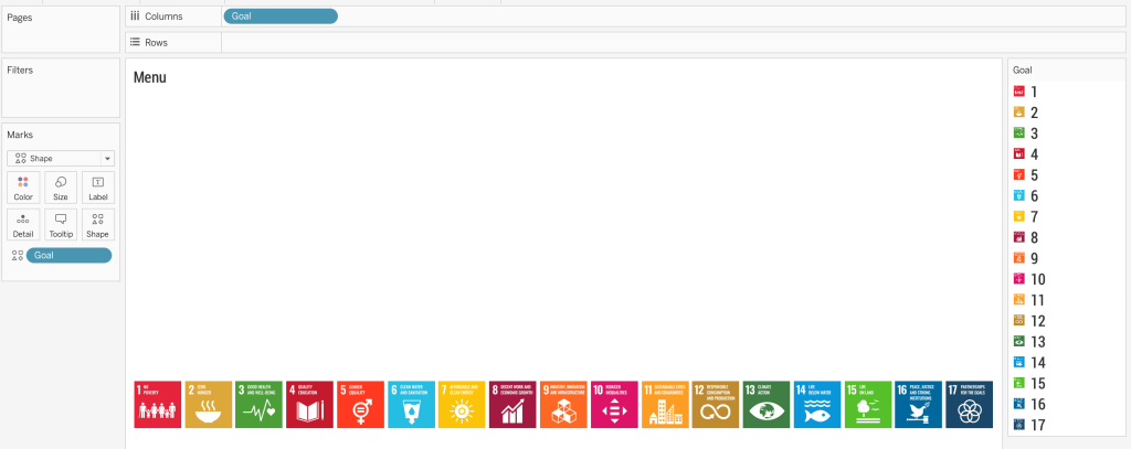
Trying to create a dashboard that looks like a webpage for a client? Rodrigo Calloni replicates this approach by using Parameter Actions to create a tabbed navigation-style menu in Tableau.
This approach can be useful if you’re looking to create a dashboard that looks and feels like a webpage in terms of identifying certain performance fields (i.e. healthcare and sales targets).
Read MoreTableau QT: Calendar Table
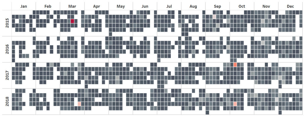
Toan Hoang has spread some of his Tableau Magic again as he shows you how to build a Calendar Table in Tableau that will take as much time as making a cup of tea or coffee.
This is great for showing what months and days have performed well for product sales or department performance and displaying it in a Calendar Table.
Read MoreTableau 2019.3: Explain Data, Tableau Catalog and Tableau Server Management add-on
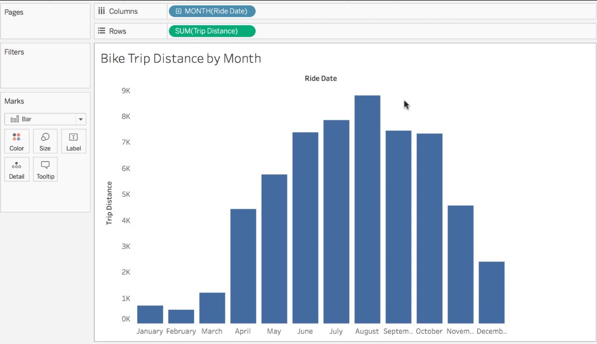
Tableau has brought out Tableau 2019.3, releasing a raft of new features to data professionals. Ryan McShane, Senior Manager, Product Marketing highlights the three main features in the update, including the AI-powered Explain Data, Tableau Catalog and the Tableau Server Management add-on.
Read MoreTableau Tip: How to do Better Sheet Swapping
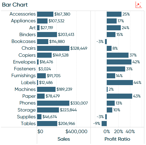
Ryan Sleeper has yet another how-to as he shows you how to make Sheet Swapping better in Tableau by using layout containers. The Principal of Playfair Data demonstrates this approach to sheet swapping by giving the user a chance to go back and forth between the scatter plot and bar chart.
Read MoreEncoding Change in Tableau Line Charts
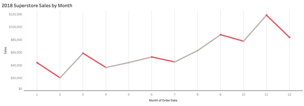
Zen Master Klaus Schulte highlights two ways of encoding change in Tableau-created line charts.
Klaus uses the Step Line Type approach where he builds his line chart manually in Tableau and creates a dual axis to encode change in the chart. He also mentions that you can use this approach with a Regular Line Type by using Parameters to achieve this result.
Read MoreMap Marker Clustering Using Parameter Actions
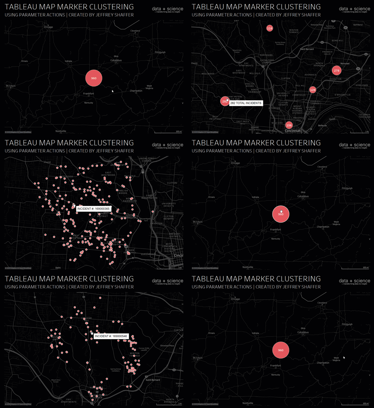
Figuring out how to make your maps look more clearer to read? Jeffrey Shaffer has a way of doing this clustering the marks together in your map by using Parameter Actions.
It’s useful if you’re working with incident data to find out which areas in a region or city have the most incidents within a specific geographic area.
Read MoreDonut charts and dynamic reference banding
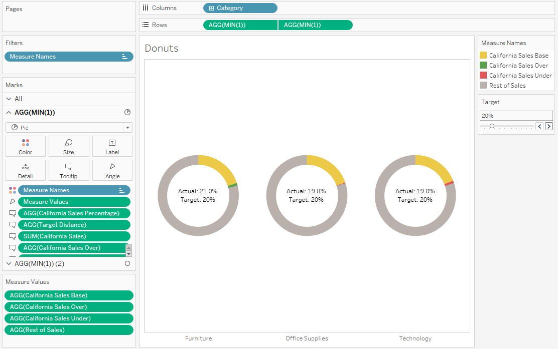
Donuts! Gwilym Lockwood shows you how to create dynamic reference banding in your donut charts in Tableau.
These donut charts could show the percentage of support tickets being answered by your team or whether your analytics department has under or over performed for monthly sales or healthcare performance.
Read MoreDynamic Number Formatting
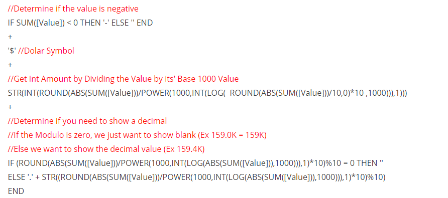
Zen Master Rody Zakovich starts off the 20th edition of Tableau Bites with a simple, but effective tip using basic maths to do dynamic number formatting in Tableau.
This is useful for labels and tooltips when using a parameter to select from a list of measures with different magnitudes, for example.
Read MoreDesigning a great dashboard extension
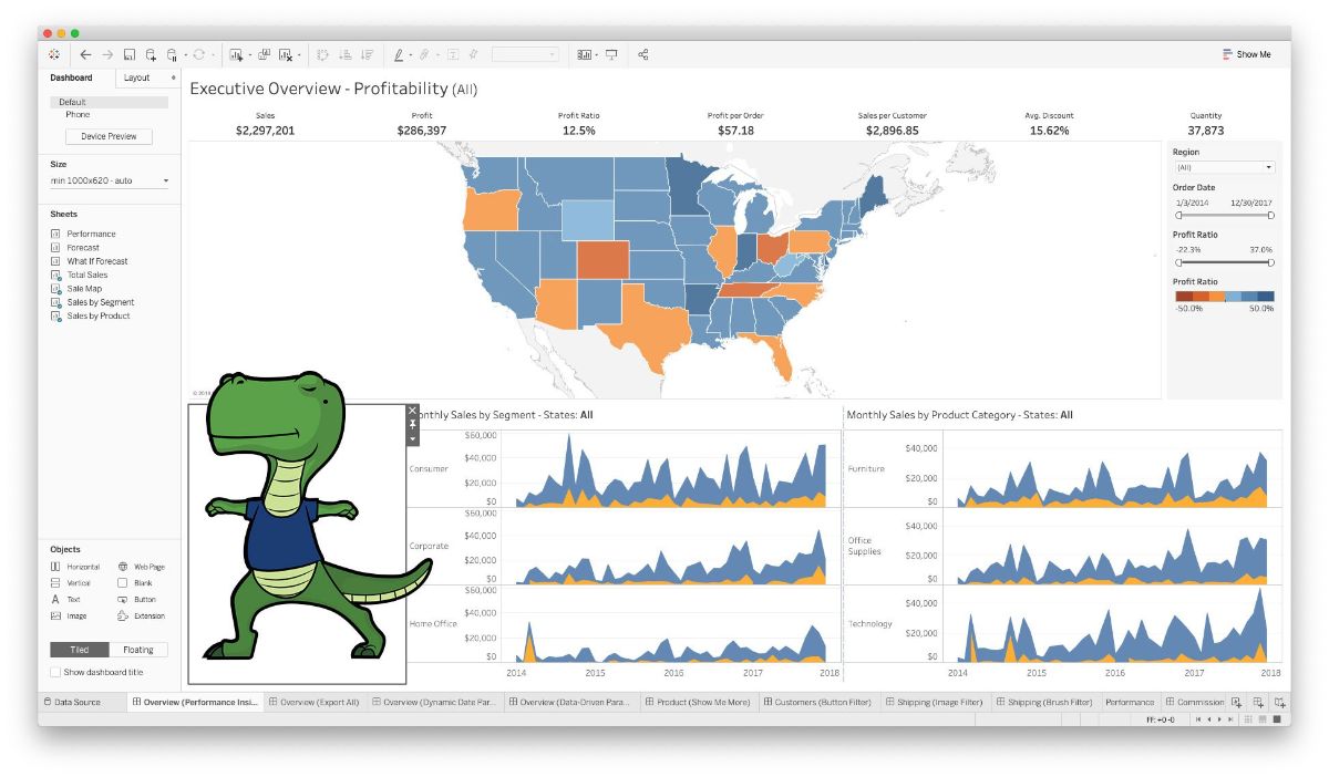
Want to build and design a dashboard extension in Tableau? Tableau’s User Experience Designer Jen Wong explains why its important to not only create a dashboard extension that works, but offers the user a great experience with the extension on offer.
Read MoreIntroducing Leapfrog Charts
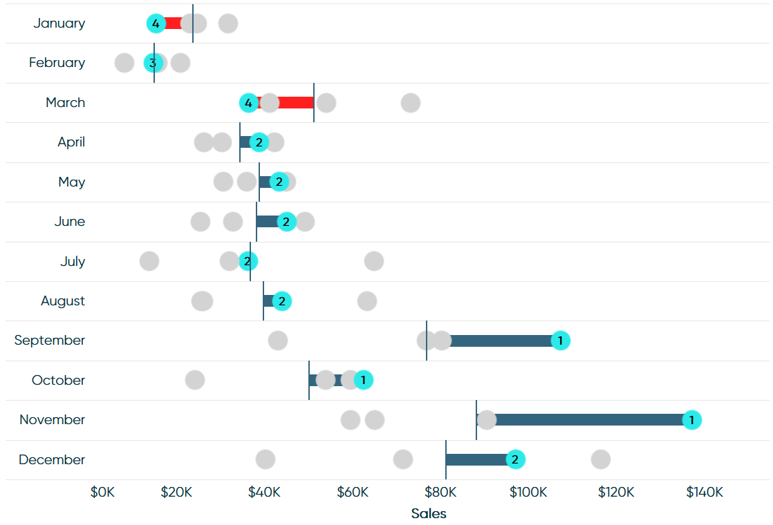
Tableau Bites would not be the newsletter it is without having one of Ryan Sleeper’s excellent how-to articles. Ryan introduces a new chart in Tableau, the leapfrog chart, which are a variation of a minimalist dot plot that allows the user to focus on the performance of one element in a dimension against the others and the overall average.
Read More5 questions to ask when designing a mobile dashboard
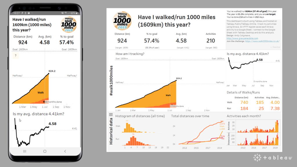
Tableau’s Technical Evangelist Andy Cotgreave highlights the five questions that you should be asking as an analyst when designing a mobile dashboard. Andy explains that you should be building your dashboard for mobile in the same way that you would build it for desktop.
Read MoreDrill Down of Date with Parameter Actions
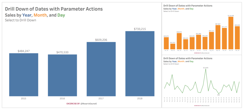
The third and final Zen Master to be included in the 20th edition is Rosario Gauna as she shows you how to drill down of a date while utilising Tableau’s recent new feature, Parameter Actions.
This technique allows you to drill into a single member in any chart or table – which has been a much-missed feature in Tableau.
Read MoreHow to Make Connected Scatter Plots in Tableau
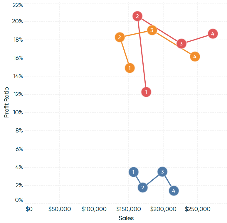
While one article was not enough, we have a second how-to from Playfair Data’s Ryan Sleeper. Ryan shows you how to make the connected scatter plot by connecting the marks by year to the dots in Tableau.
Read MoreMap Zoom with Radial Distance and Increasing Mark Size in Tableau
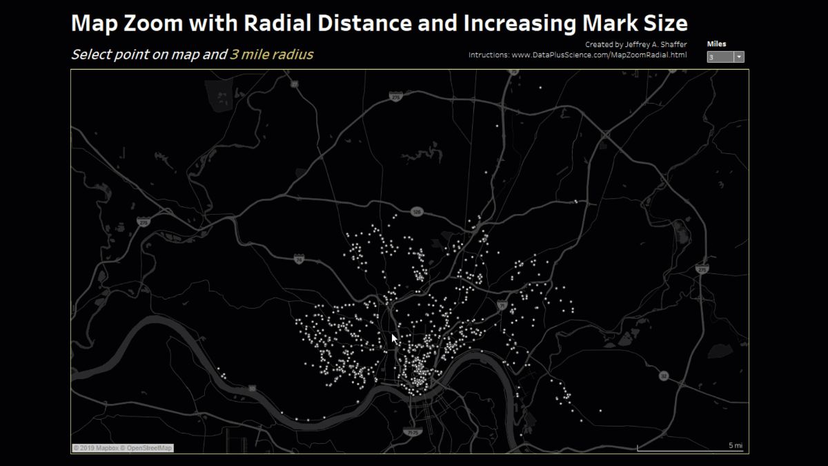
Zen Master Jeffrey Shaffer demonstrates how to create a map that can zoom in, filter, control, show and increase the radial distance, as well as increasing the mark size of the map as it zooms in utilising a mixture of Set, Worksheet and Dashboard Actions.
Read MoreHow to Switch Metrics (or Dimensions) Using Set Actions
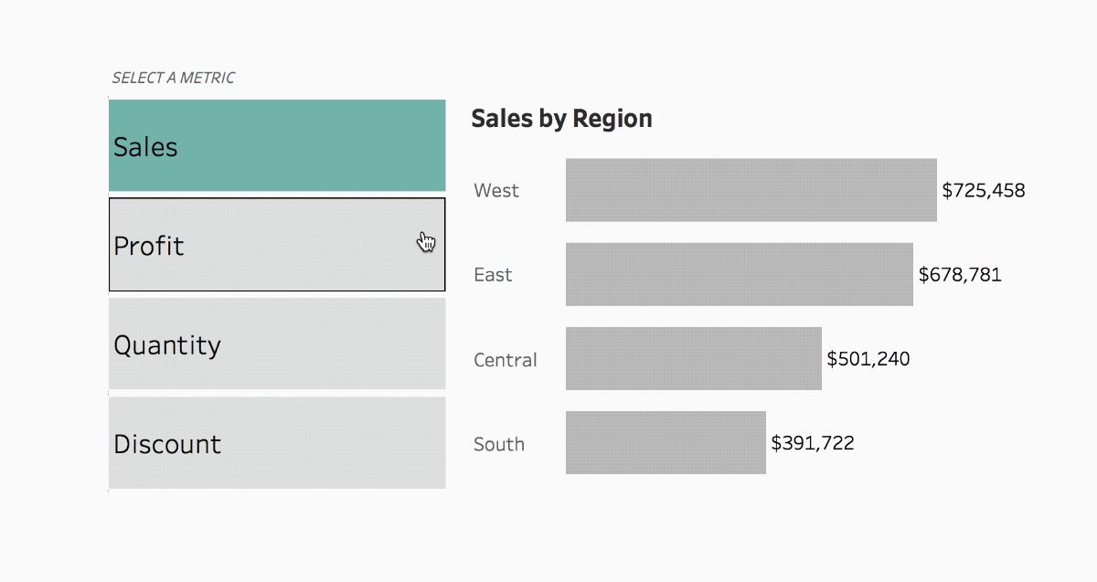
Tableau’s Queen of Set Actions, Lindsey Poulter shows you how to use Set Actions to switch either metrics or dimensions in your dashboard using the tried and trusted Superstore dataset.
Read MoreHow to Make Better Relative Date Filters
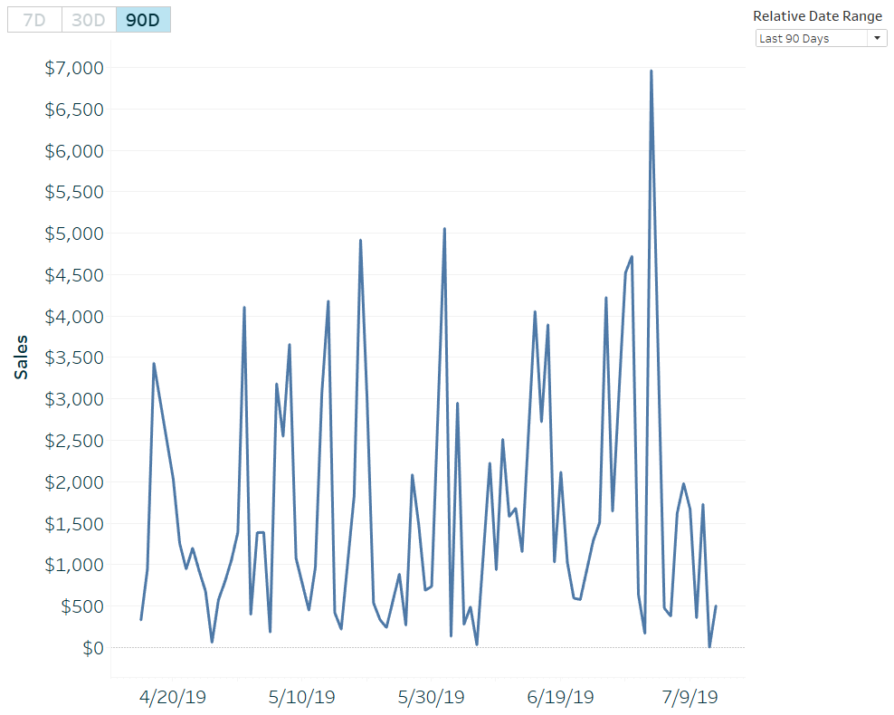
The Zen Masters keep coming as Ryan Sleeper has yet another clever tip up his sleeve towards creating better relative date filters over 7, 30 and 90 days in Tableau. This tip can be used in all sorts of ways for the user to select the relative date range they want from the data.
Read MoreTidying Up Tableau Chart Labels With Secret Reference Lines
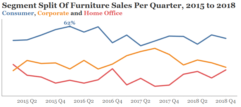
Points of Viz’ Mark Edwards shows you how to tidy up your Tableau chart labels with secret reference lines. Mark demonstrates how to create space for your labels in your visualisation without having to fix an axis, giving your labels inside your viz the space they need to be readable to your users.
Read MoreAccelerating understanding with the Executive KPI Dashboard Starter Kit
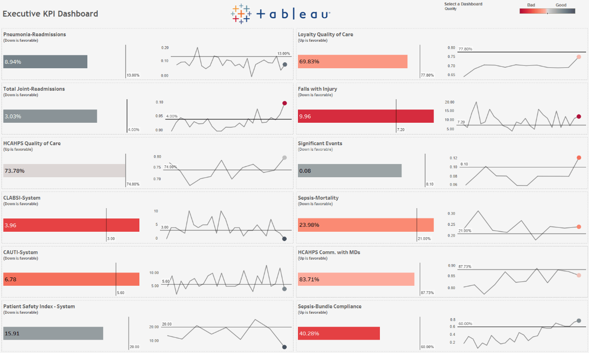
Tableau has released an Executive KPI Dashboard Starter Kit for healthcare professionals. Derek Cyr explains how the starter kit can help hospitals deploy a solution to see and understand the hospital’s most critical performance indicators.
Read MoreTableau Tip: highlight table with info icons
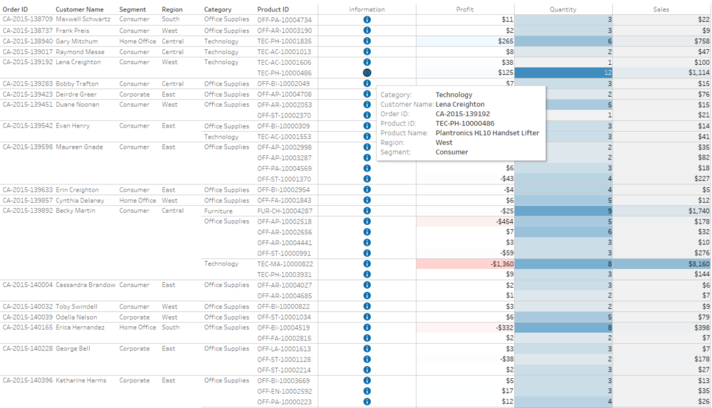
Hanna Nyskowska from The Information Lab has a way to give your tables some added colour by demonstrating how to do this in Tableau, as well as adding information icons to highlight the section you want to hover over on the table.
Read MoreVisually analysing the answers to why?
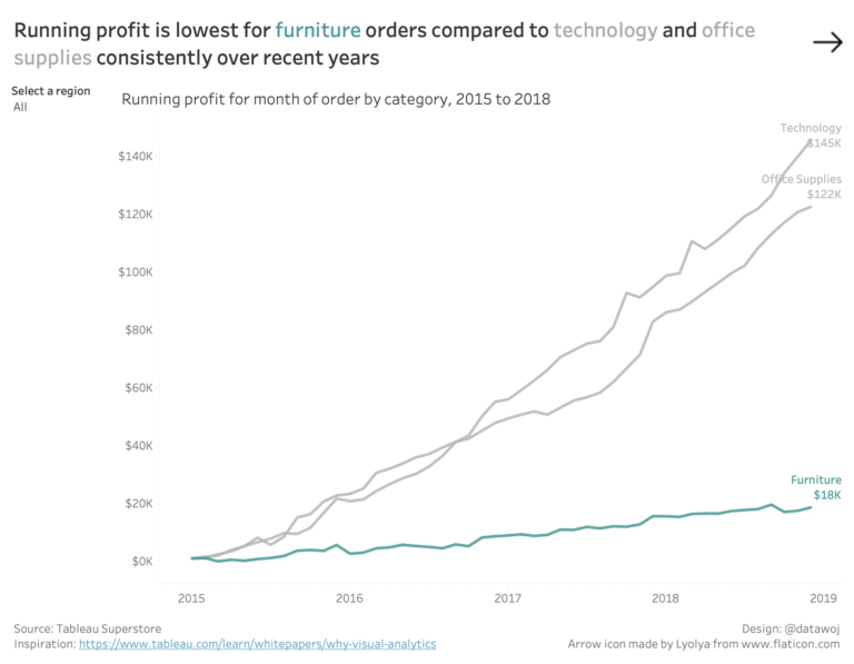
Colin Wojtowycz visually analyses the questions to ‘why’, by using Tableau’s new dedicated dashboard buttons. Colin explains how having different views enables the audience to see different insights from the same data, which enables them to be able to ask and answer business questions quickly.
Read MoreTableau QT: Connected Bar Charts
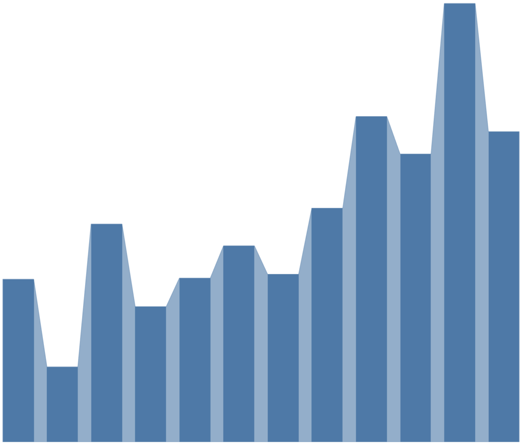
Tableau Magic’s Toan Hoang has a quick tip that will show you how to build a connected bar chart in Tableau in five minutes or less. He uses the Orders section of the Superstore dataset to create a quick and easy connected bar chart.
Read MoreHow to Drill into a Single Row of a Text Table in Tableau
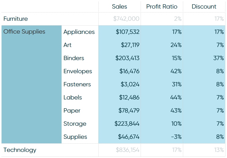
Playfair Data’s Ryan Sleeper explains how to drill into a single row of a text table in Tableau, utilising the trusty Superstore dataset. The trick to click into a single row to expand and find more detail can be done through Set Actions or Parameter Actions.
Read MoreHow to make your population pyramids POP! in Tableau
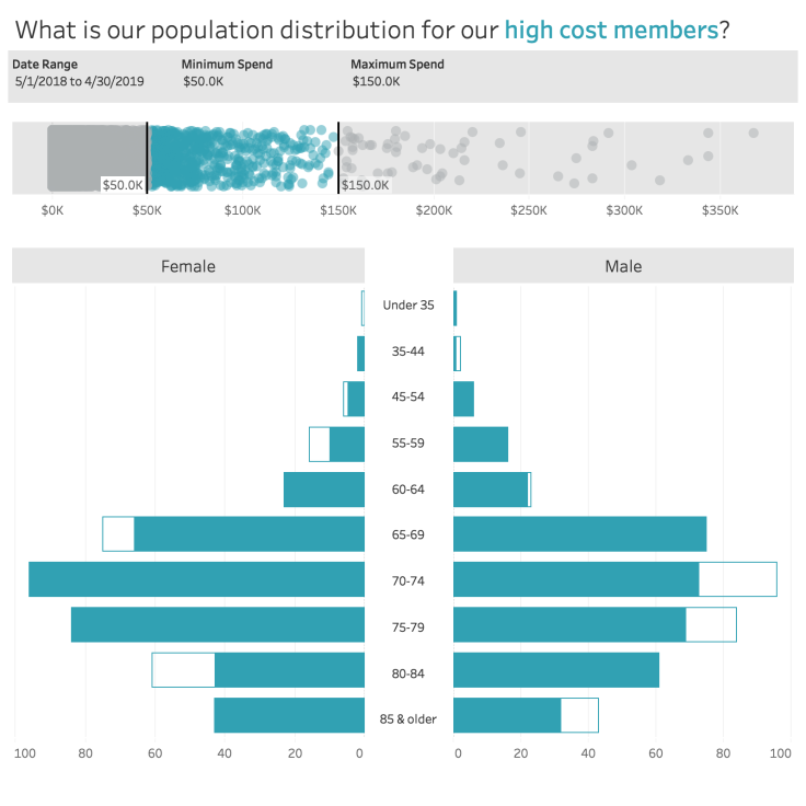
Cerner’s Sean Miller goes through the process of how to make your population pyramids POP! in Tableau by creating a chart using diverging bar charts to look at the population distribution for a client’s high cost members.
Read MoreThe Logic of Dashboards: Designing for the Whole Picture
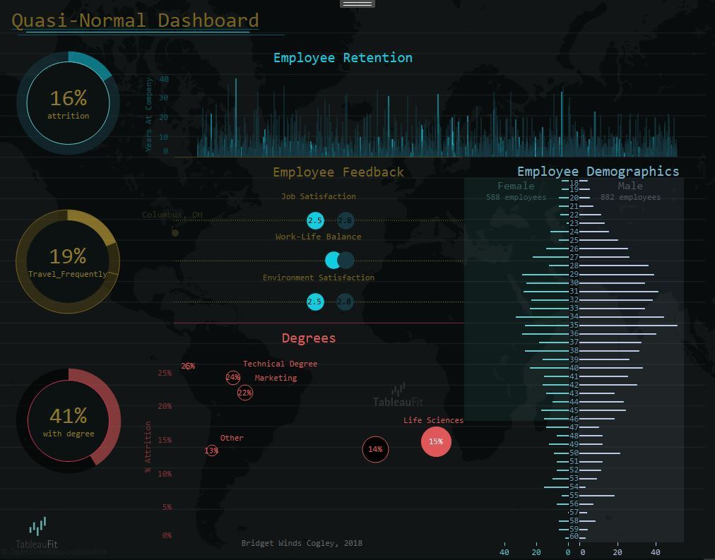
Zen Master Bridget Cogley highlights how we should be designing dashboards for the whole picture. By working together through the charts that make up the dashboard, Bridget emphasises that it helps to think beyond the chart and encourage interaction for the user whether if it’s focused on sales, profit or HR efforts.
Read MoreWhen can a line be a bar?
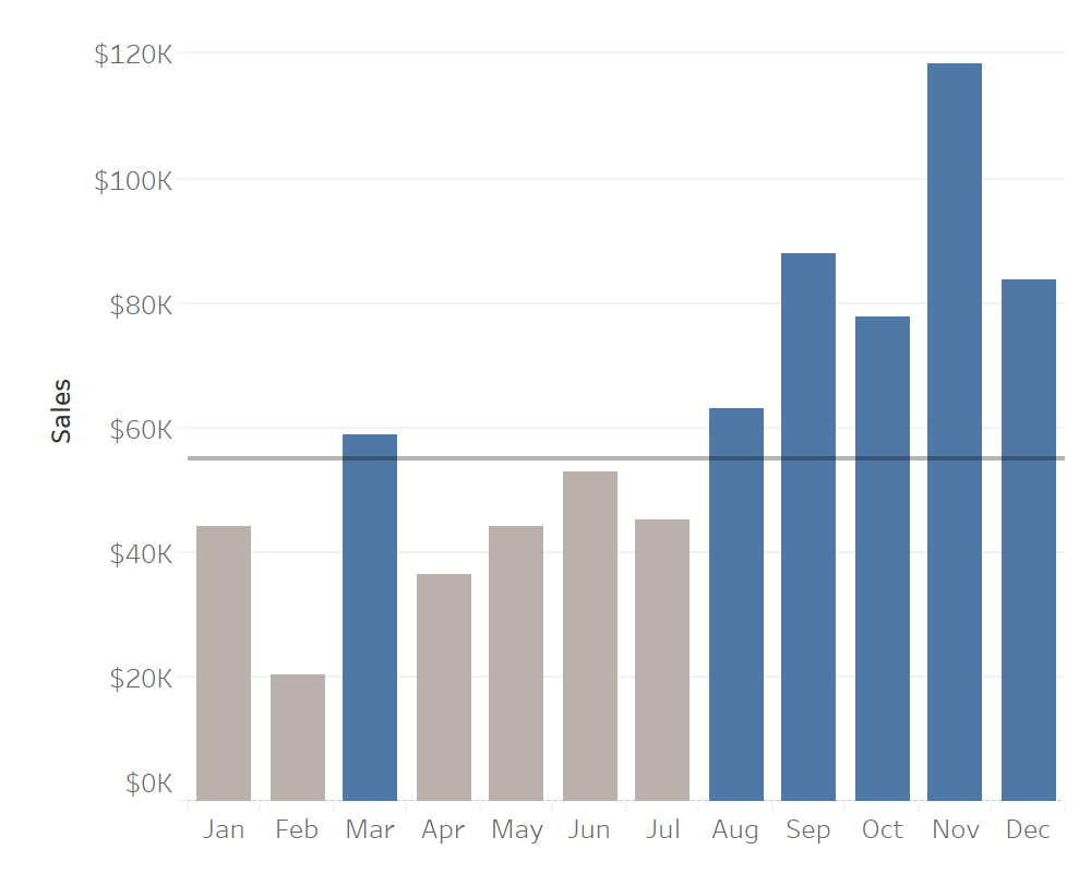
Webranz’s Alex Waleczek questions the use of line charts and bar charts by looking at which chart you should use across different issues such as the usage of ink, the number of categories being used and the importance of NULL values as this depends on the question you are trying to answer in the chart.
Read MoreHow to label the longest of a Dual Axis Bar Chart?
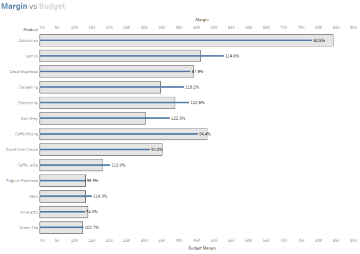
The Information Lab’s Tom Pilgrem uses a bar-in-bar chart to demonstrate how to label the longest of a dual-axis bar chart by using some calculations to make your bar-in-bar charts more easier to read.
Read MoreFeeding the screen-time beast with shifting mobile metrics
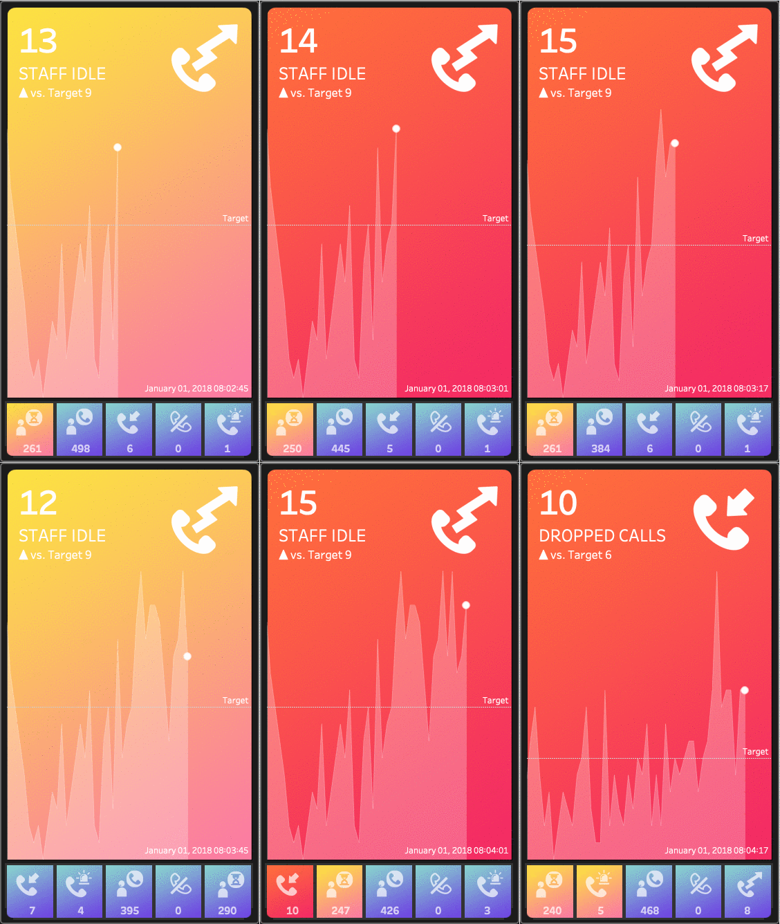
DataBlick’s Anya A’Hearn explains how Tableau users could modify their desktop dashboards to become more mobile-friendly, as well as highlighting how it could make the traditional KPI dashboard more modern.
Read MoreFilling in Null Records Without Filtering

Interworks’ Dustin Wyers explains how in Tableau you can fill in null records without needing to use a filter by applying a table calculation to show or hide the data you want your team to see.
Read More3 Creative Ways to Use Tableau Parameter Actions
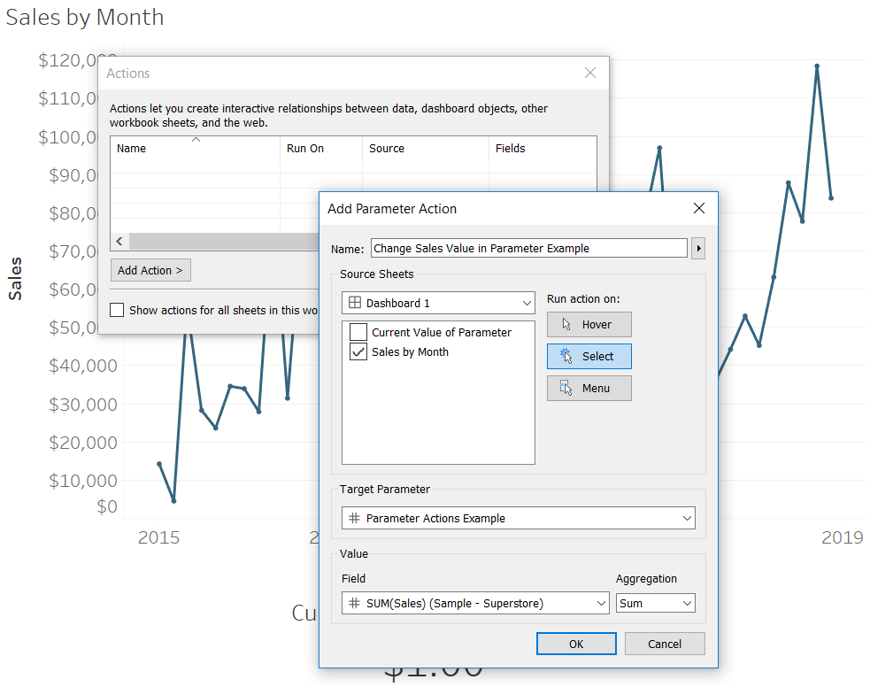
Zen Master Ryan Sleeper identifies three creative ways to use Tableau’s parameter actions. Ryan explains how to use Tableau’s parameter dashboard actions, using parameter actions to highlight selections within a visualisation and to change date parts with a click of a button.
Read More8 Alternatives to Default Tableau Legends
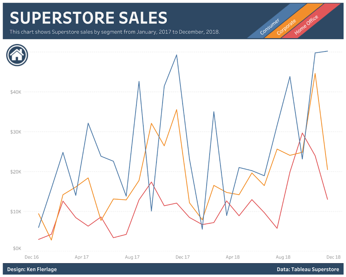
Tableau Zen Master Ken Flerlage highlights eight alternatives to the regular default Tableau legend. The post includes how to integrate the legend into text, custom images, putting the legend into a tooltip and so much more to make your visualisations clearer for the user.
Read MoreTableau 2019.3 beta now available
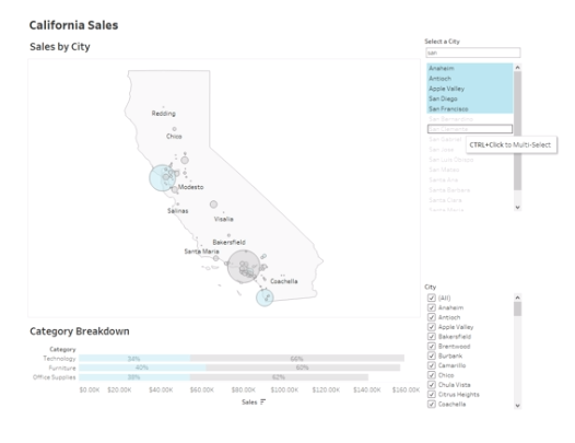
Tableau’s 2019.3 beta is now available for Tableau users. In the 2019.3 beta, there are three new features to try out, which includes the AI-powered Explain Data, Tableau Catalog and Project McKinley as Ryan McShane explains about the new features in the 2019.3 beta.
There are enhancements in the beta, including embedding in Ask Data, connecting to/join published data sources in Prep Builder and enhanced security.
Read MoreMaking geospatial analysis easy with two new spatial functions; MakePoint and MakeLine
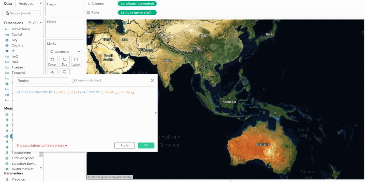
Tableau’s Lead Product Manager for Maps and Spatial Analysis, Kent Marten looks at the two new spatial functions that make analysing location data easier and help elevate your maps to the next level with MakePoint and MakeLine.
Read MoreCreating, not designing: The four goals of every information experience
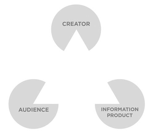
Tableau Zen Masters Mike Cisneros and Lilach Manheim argue as data analysts and visualisers that we should not be designing, but creating visualisations. They mention the four goals that are essential of every information experience by using the delta design philosophy on Tableau’s main blog.
Read MoreOvercoming the vector map learning curve
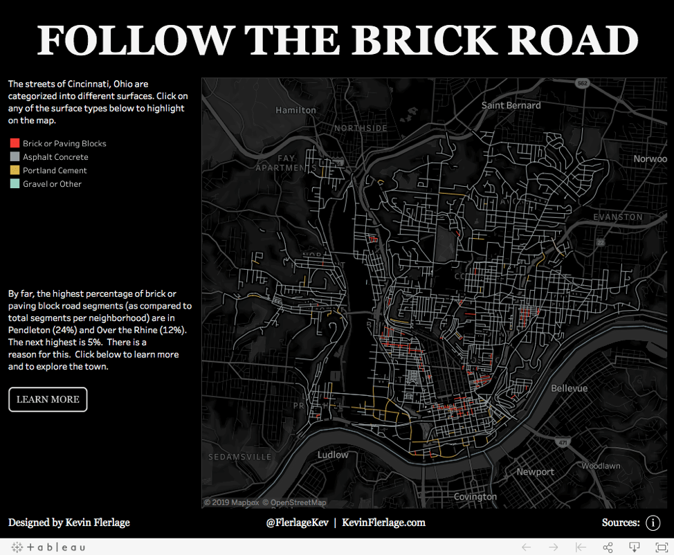
Kevin Flerlage showcases one of the newest features from the release of Tableau Desktop 2019.2, vector tile mapping. We all love a good map right? Kevin overcomes the vector map learning curve to create some engaging map-related vizzes, using this new feature from the previous beta.
Read More3 Ways to Make Splendid Slope Graphs in Tableau
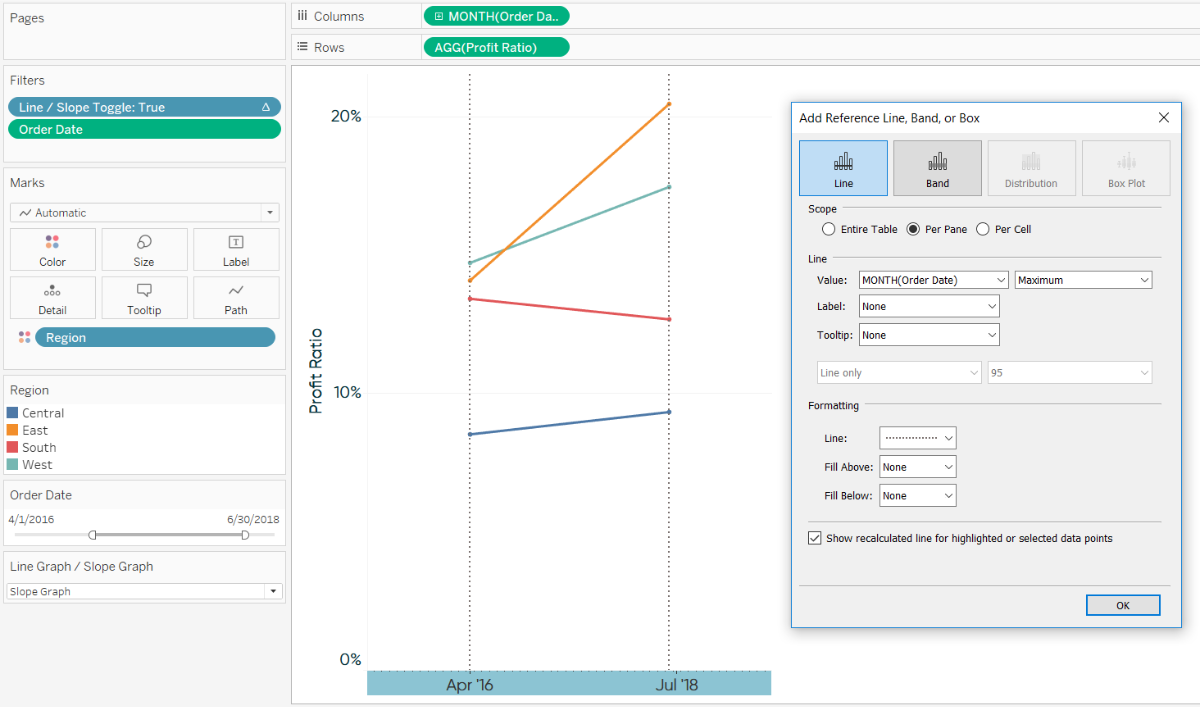
Tableau Zen Master Ryan Sleeper outlines three different ways of making your slope graphs splendid. It includes making the graphs dynamic-based on a date range filter, adding a slope graph toggle and adding vertical lines to connect slope graphs.
Read MoreUsing Set Actions to show/hide distribution
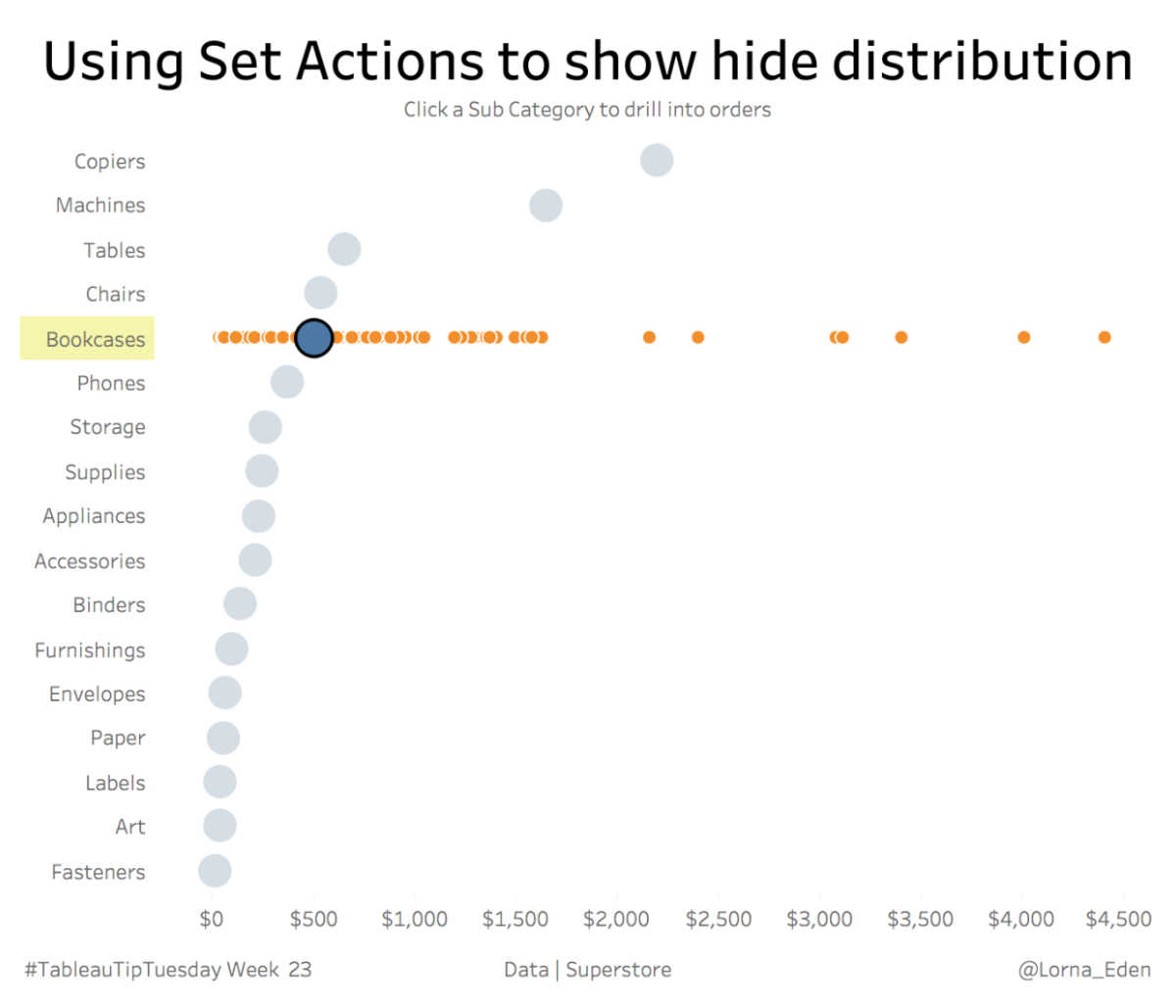
Jisc’s Lorna Eden shows us a Set Actions tip that takes you through how to use set actions to show and hide distribution of your underlying data.
Read MoreHow to Build an Overlapping Bar Chart in Tableau
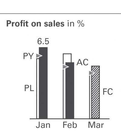
Four Tableau Zen Masters in one newsletter? The fourth Zen Master to be featured is Unifund’s Jeffrey Shaffer who has written an excellent post on how to build overlapping bar charts in Tableau, which builds on his most recent visualisation “Bar Hopping: Theme and Variations on a Bar Chart”.
This was a very kind response to a question I raised to Jeffrey on a LinkedIn thread helping use Tableau to be IBCS compliant.
Read MorePimping your Tableau Control Charts
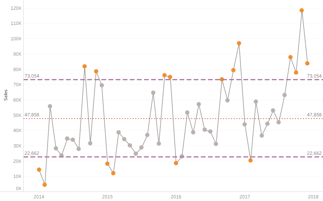
If you already know about creating a control chart, then Promatix’s Chris Dickinson has a blog post that will pimp your control charts in Tableau, taking these charts to the next level by giving a level of control to the user.
Read MoreTableau 2019.2 Released
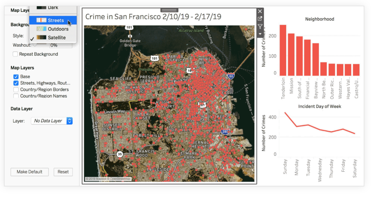
Tableau 2019.2 was released very recently. This article will allow you to explore the extensive new features including parameter actions, vector maps, show/hide dashboard containers, customisable reference line tooltips and much more…
Read MoreHow visual analytics helps audit and risk professionals shorten time to insight
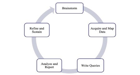
Joe Oringel, the Managing Director of Visual Risk IQ elaborates on how they have helped finance and internal audit professionals utilise Tableau effectively in this recent article.
Read MoreTips for creating mobile dashboards with new automatic layouts for Tableau
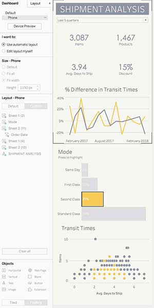
Recently, Tableau introduced a faster way to mobilize your dashboards to users on their phone with the automatic mobile layouts feature. Bridget Winds Cogley talks through how to make the most of this brilliant new capability.
Read MoreQuick Tableau Tip – How do you add ‘+/-‘ OR ‘▲/▼’ to labels?
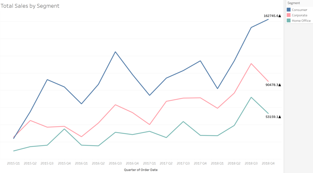
Sara Hamdoun from the Data School, shows us this simple yet neat tip for indicating whether a number is positive or negative. In this example, she uses the Sample – EU Superstore data set to analyse the total number of sales sold in each segment during each quarter.
Read MoreHow to Setup a Basic Drill Down With Set Actions
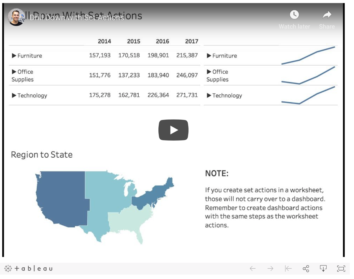
Andy Kriebel, from The Information Lab, shows us a handy tip to take you through how to set up basic drill down view using the new set actions feature in this video.
Read MoreShowing now versus then? Consider a Comet chart
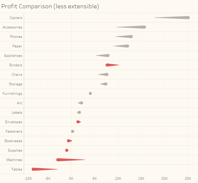
This ‘How to’ from Steve Wexler (co-author of The Big Book of Dashboards), explores how a measure for one period can be compared with a previous period – a common requirement – using a comet chart – is that a thing?
Read MoreHow to Make Unit Histograms / Wilkinson Dot Plots in Tableau
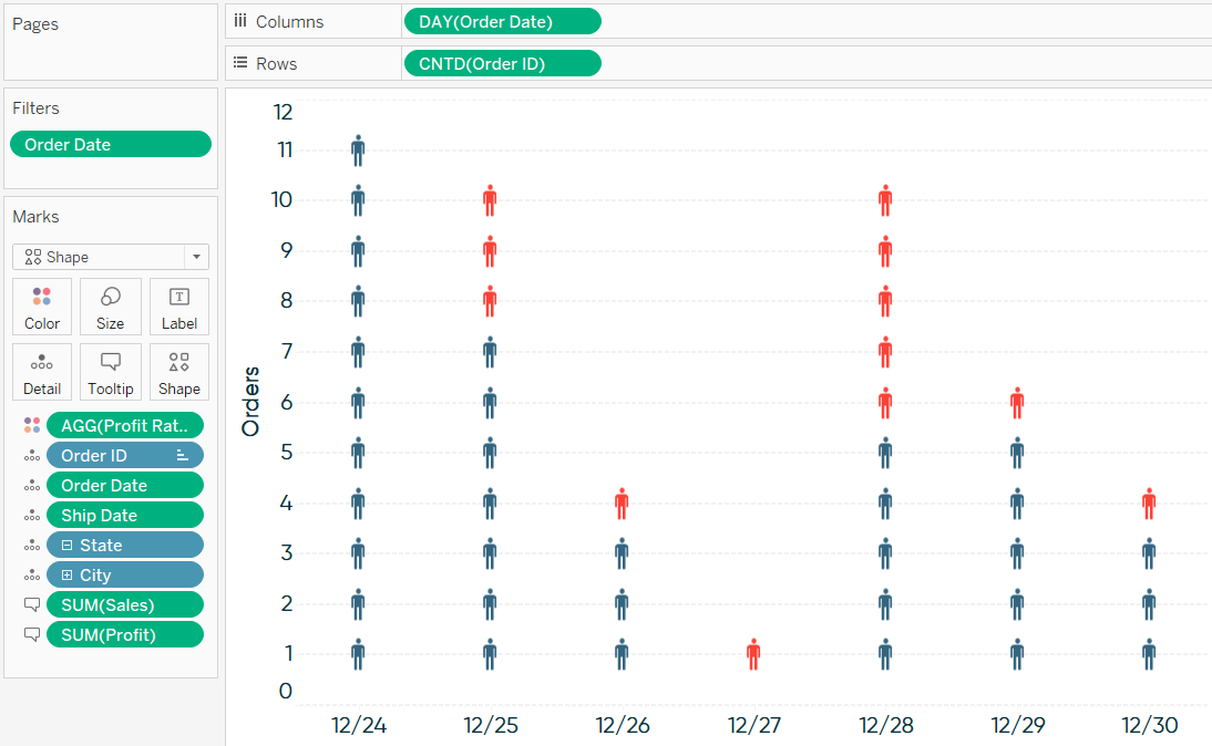
Tableau Zen Master, Ryan Sleeper, explains how Unit histograms, or Wilkinson dot plots, show distributions of individual data points instead of bucketing them into bins like traditional histograms.
Read MoreNow in beta: Vector maps, parameter actions and new Ask Data functionality
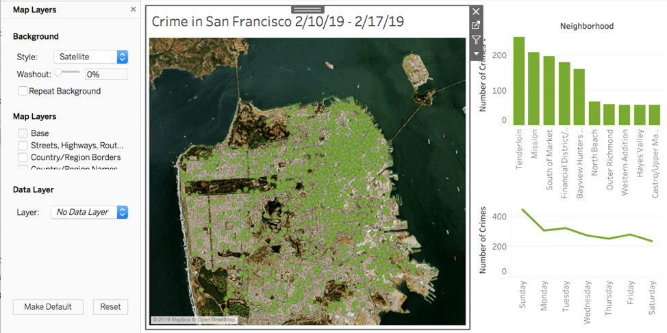
The newest version of Tableau (2019.2) beta was released in March. They’re revving up the way you interact and tell stories with your data. Emily Chengives a quick overview of the highlights:
Read MoreCreating a Date Scaffold in Tableau

Tableau Zen Master, Ken Flerlage, spends a lot of time answering questions on the Tableau Community Forum and one common problem he sees is missing dates. For instance, you may want your visualization to always show all twelve months of the year, regardless of whether or not there is data for all twelve months. Quite often, the solution to these problems is to use a date scaffold. So, in this blog, he shows you how to create and use a date scaffold in Tableau.
Read MoreHow to Automatically Change Date Granularity Based on Days in Range
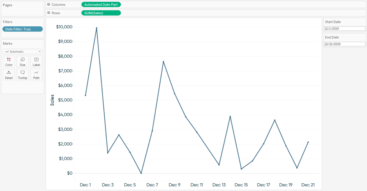
Zen Master, Ryan Sleeper, shows how to automatically change the date granularity to the most appropriate date part based on the number of days in a selected date range. This post shows how to change the date part of a line graph from day, to week, to month, based on if there are 30 or fewer, 90 or fewer, or more than 90 days on the view, respectively
Read MoreCreating a Selection Panel with Set Actions
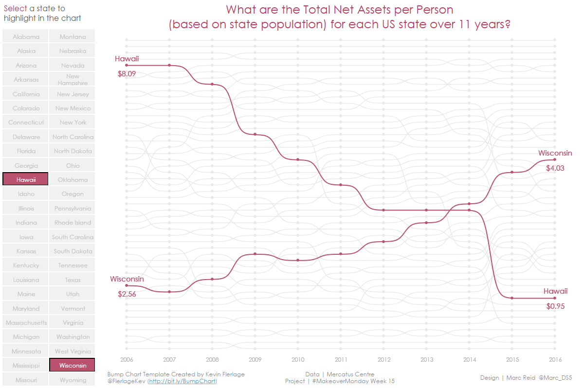
datavis.blog looks at the relatively new feature of Set Actions. MakeoverMonday recently ran an article on “Ranking the States by Fiscal Condition” They created a bump chart showing the total net assets per person for each state based on each state’s population. The curvy bump chart was created using Kevin Flerlage’s excellent Excel template.
This post will focus on the selection panel to the left of the bump chart that allows you to select a state (or states) and have that state highlighted in the bump chart, which was created with a couple of formulas and a set action.
Read More3 Ways to Make Magnificent Maps in Tableau
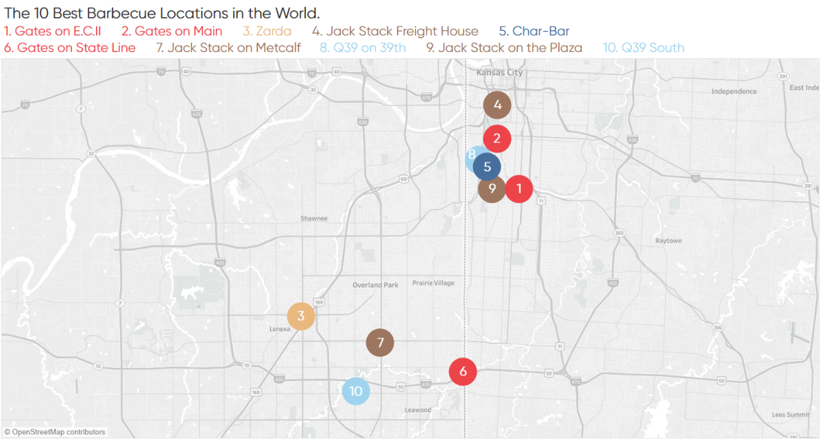
Maps are one of the most effective chart types in Tableau and are also among the easiest chart types to create.
Ryan Sleeper‘s post uses a map of his top 10 favourite barbecue restaurants to share three ways to take your Tableau maps to the next level. Tips include a formatting trick, instructions for how to unlock additional map styles, and how to create a dual-axis map using a combination of generated and custom coordinates.
Read MoreIt’s Okay to Break the Rules, Sometimes

Ken Flerlage‘s blog on medium.com gives us an insight into a Zen Master who doesn’t always believe in sticking to a set of rules when it comes to data visualisation.
He explains ‘In high school, I learned the rules for writing essays. Having mastered them, I realised that they were not so much rules as guideposts. Knowing this, he began to explore and experiment with the boundaries and gained a better understanding of when it was okay to wander outside of them’.
Read MoreTableau Assistant Directory
Rebecca Roland has made a directory of free websites and tools you can use to enhance your work. Some require a sign up so do have your email and PW at the ready. You’ll find a variety of icons, images, text, shapes and colours! What more could you possibly need?
Read More3 More Ways to Overcome the Excel Barrier to Tableau Adoption
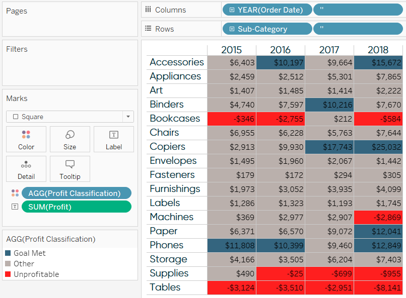
Tableau Zen Master, Ryan Sleeper, talks us through how moving business users from a spreadsheet mentality to data visualisation is just as relevant as its always been.
Read More8 analytic concepts to express with Tableau set actions
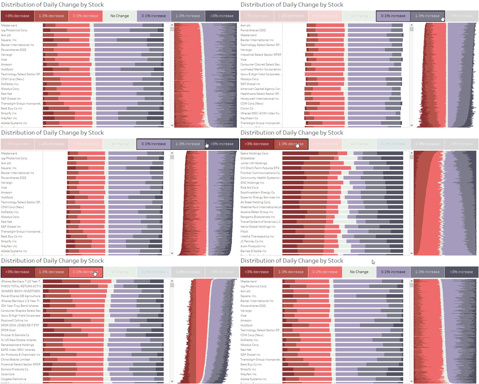
Released in Tableau 2018.3, the set actions feature extends the interactivity in Tableau, allowing for deeper, more diverse comparisons through user selections and opportunities to see your data in a new light.
Now you can provide richer analysis, more flexible exploration, and simpler user experiences for your stakeholders. Bethany Lyons, Product Manager at Tableau writes an excellent introduction on how to bring powerful new comparisons to viz audiences with set actions.
Read MoreLearn more about Tableau Prep Conductor, a new Add-on for 2019.1
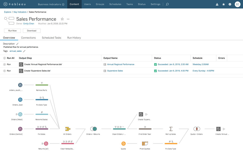
Organisations are seeking to become more data-driven, providing more people with access to wider sets of data so they can create better insights, quicker., It’s more important than ever that everyone is working with the right data.
Thats the philosophy behind Tableau Prep Conductor being released as part of their 2019.1 data management add-on.
Read MoreTableau Tips: How to Convert a Reference Line into a Level of Detail Expression
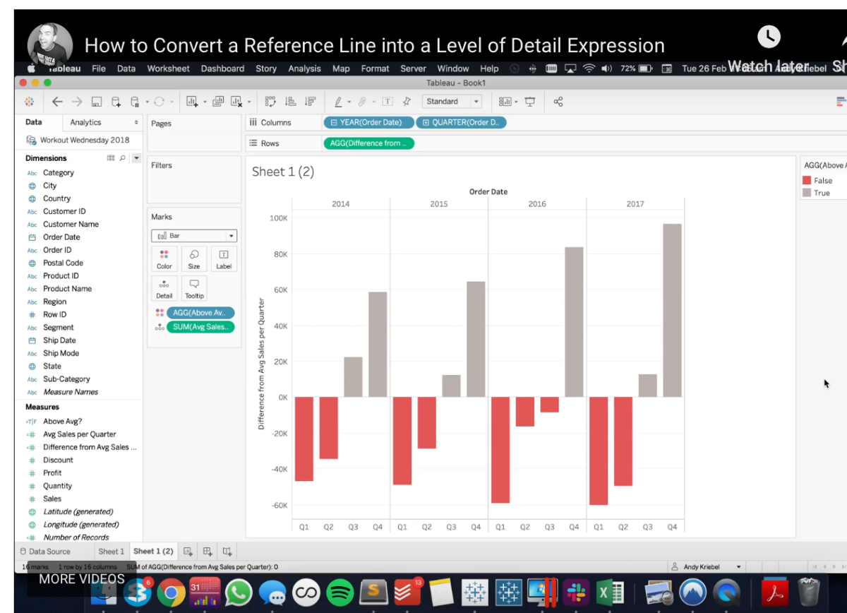
This ‘how to’ video by Andy Kriebel builds upon a previous tip: How to Convert a Reference Line into a Table Calculation. In this tip, instead of using table calcs, it will show you how to convert a reference line into a LOD.
Read MoreHow to Show Current and Prior Period Dates on the Same Axis in Tableau
Ryan Sleepers posts are always great, and in this edition of Tableau Bites he gets 2 slots!
Dates can be tricky to work with in Tableau. This one explains how to compare the performance of a selected date range to the performance of the date range immediately preceding it. For example, if you choose this week as the current date range, you want to see this week’s data in addition to last week’s data so you can do an easy period-over-period analysis.
Read MoreCustom Tableau Server Admin Views
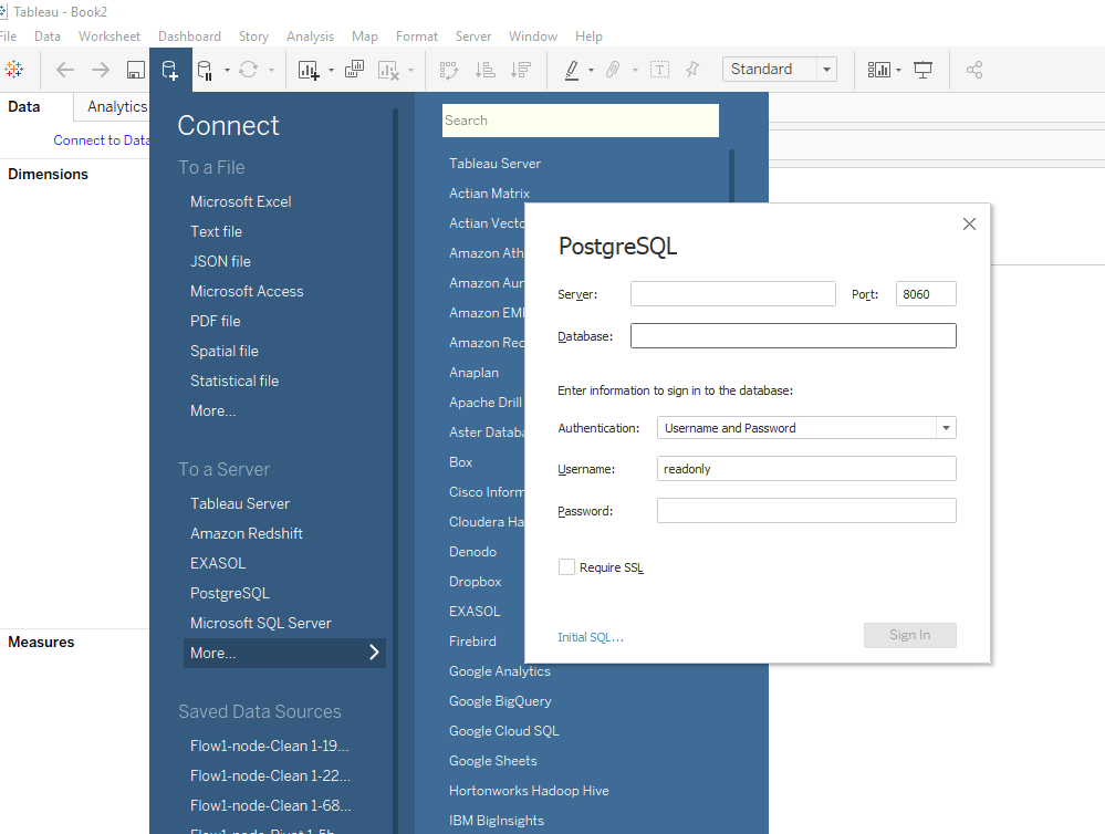
Tableau server guru, Jonothan MacDonald, explains how to build a custom view of tableau server admin.
You can customise the Tableau Server admin views for monitoring usage and data server statistics. For this, you need access to the underlying Postgres database that contains a lot of useful information about the Tableau server usage.
Read MoreTableau 2019.1 Released – See whats new…
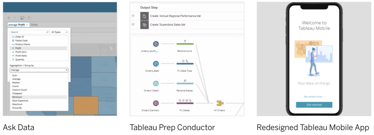
Explore the newest features in Tableau 2019.1 including Ask Data, Prep Conductor and more
Read Moreeverydaydashboards.com
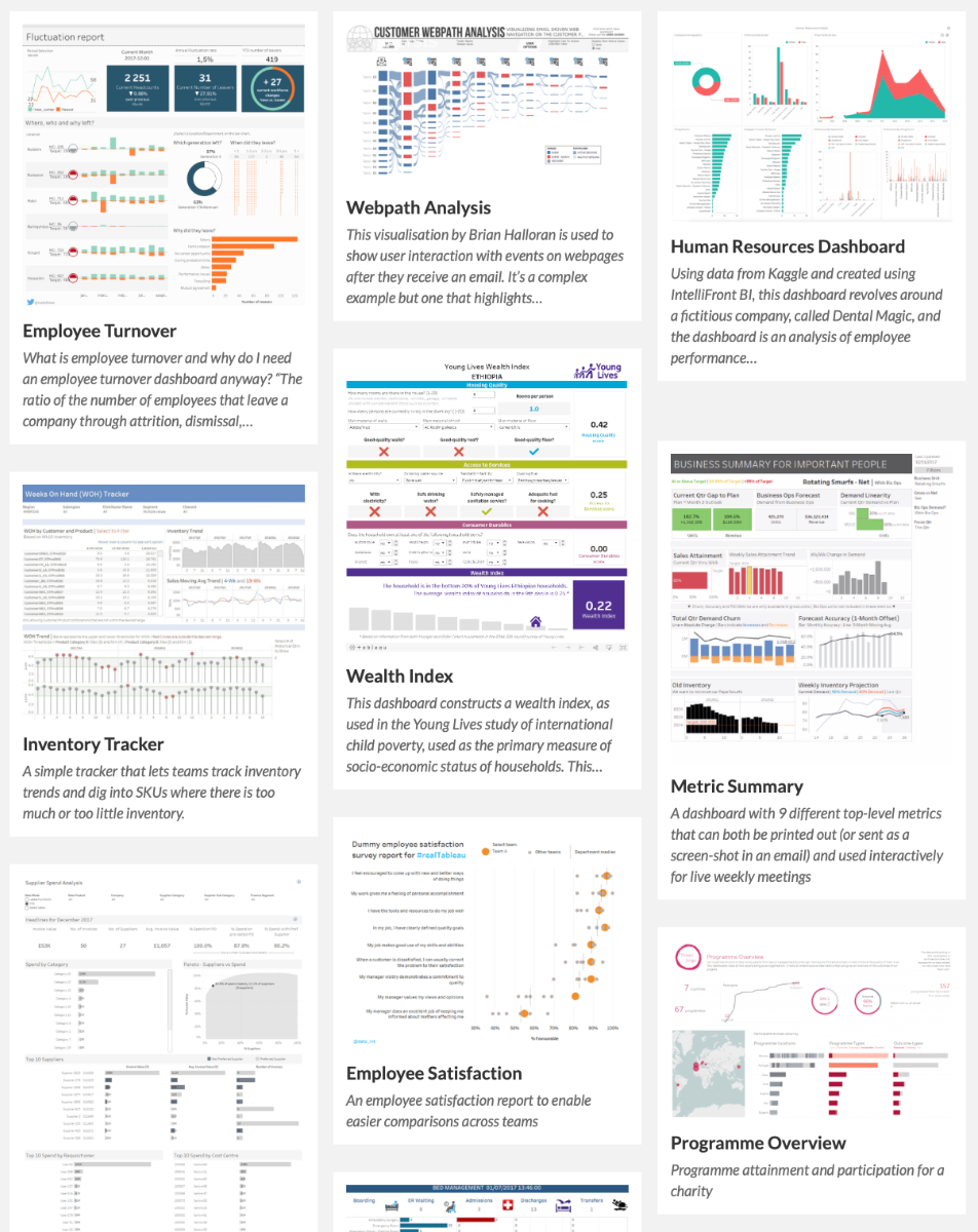
This site is all about sharing real life dashboards. Dashboards made by real Tableau users. The purpose isn’t to show off clever charts, or amazingly designed infographics from fun personal projects. Instead they want to share what Tableau users are creating for work, with real dashboards for real users.
Read MoreWhy do you visualize data? Ways to discuss with Stakeholders.

Ryan Sleeper talks about his favourite question to ask when presenting on Tableau and data visualisation: Why do you visualise data? He then gives insight into discussing data visualisation with Stakeholders.
Read MoreWant to see who is using your viz?

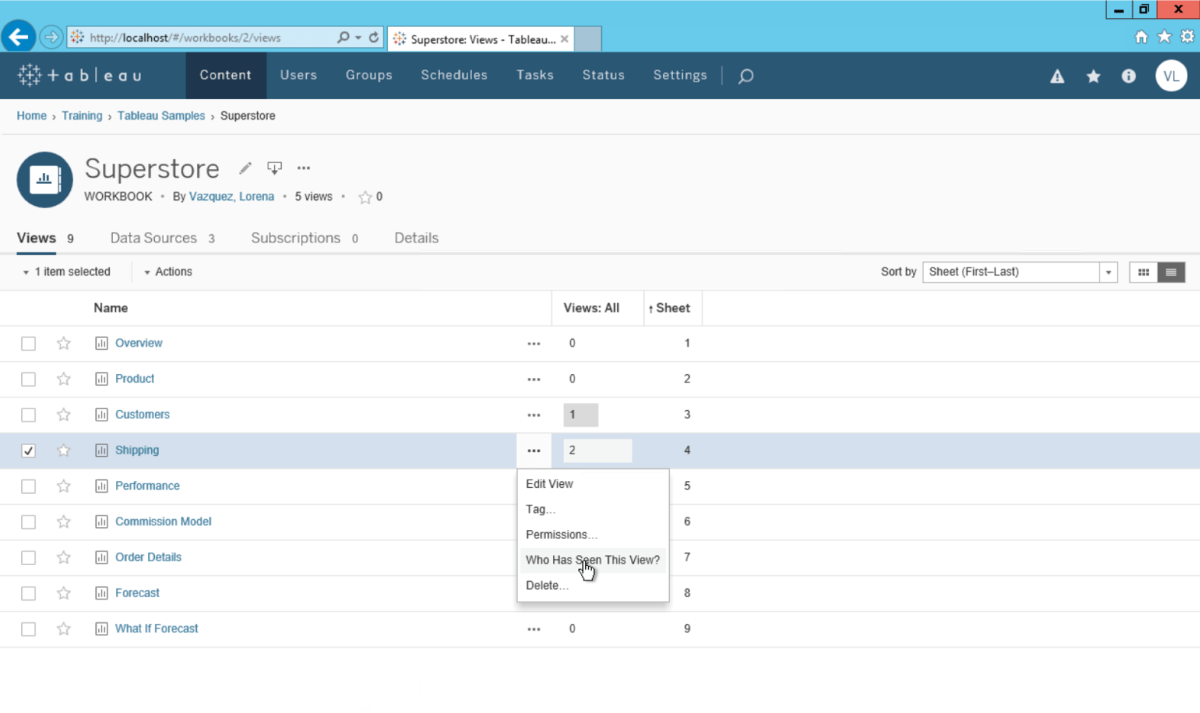
Lorena Merary Vazquez shows several methods on Tableau Server to see who is looking at dashboards and published data sources. She also introduces us to an open library of custom Tableau Server dashboards, kindly hosted by Mark Jackson.
Read MoreHow to make a Pareto Chart
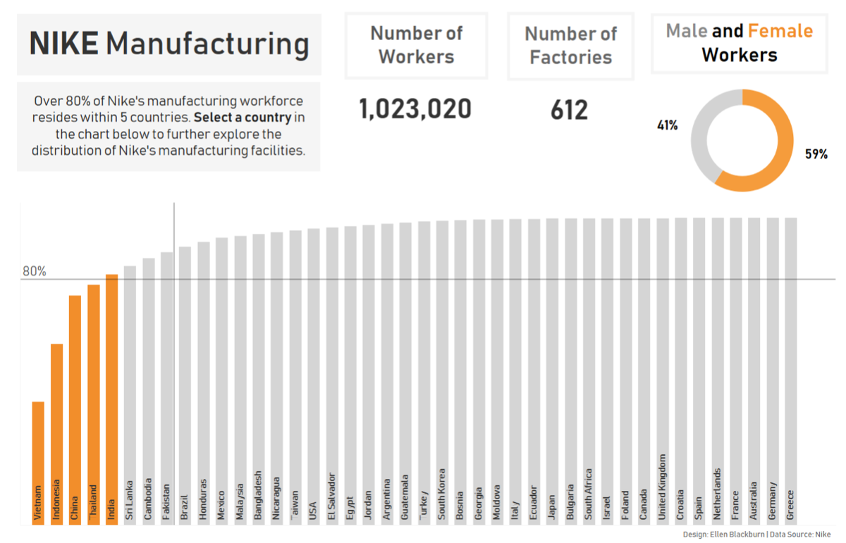
Ellen Blackburn talks us through her preferred method of creating a Pareto Chart. The Pareto principle (or the 80/20 rule) dictates that 80% of the effects come from 20% of the cause.
Read MoreQuick Tip – How to create extra space between your bars
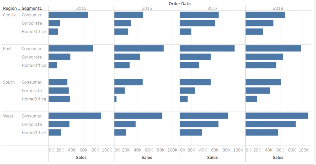
Nils Macher addresses the question: Have you ever had the issue that you want to create extra space between bars which belong to a different category? It is really difficult to see which bars belong to which region. The last row for each segment is really close to the first row of the following segment.
Read MoreQuick Tip -The One-Click Trick to Creating Headers for Single-Measure Tables
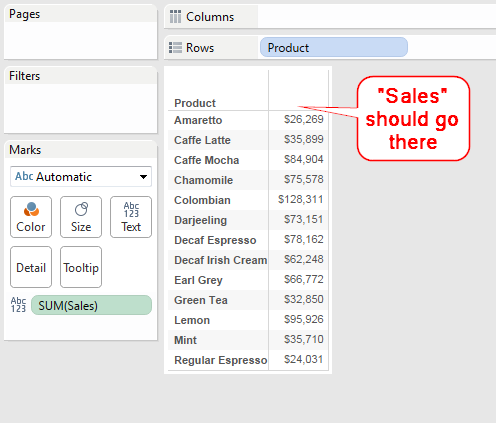
This is a guest post by Tableau Zen Master Jonathan Drummey on the Tableau blog. This post first appeared on Jonathan’s blog, Drawing with Numbers. Here’s the problem: In a single-measure table, I want the name of the measure column as a header.
Read MoreWant to see who is using your viz?
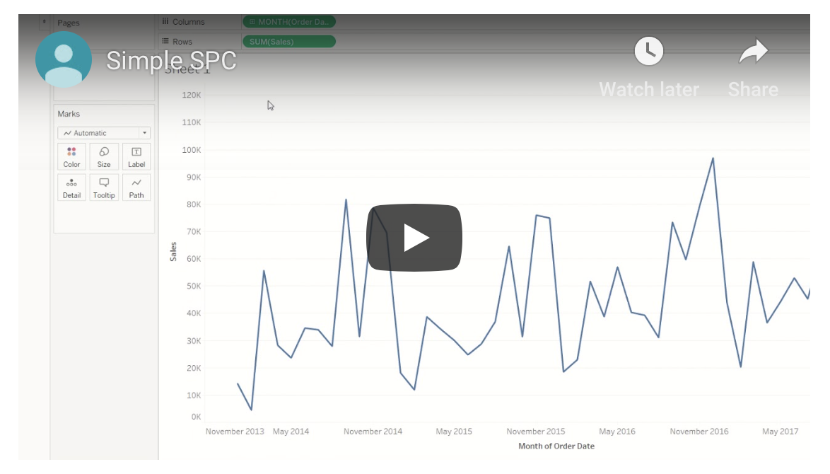
Chris Dickson has written an excellent series of blogs, taking us from the simple to some complex variations of control charts. All aimed at helping us answer “Is this normal??”.
Read MoreOne Click Zoom IN and OUT on a Map
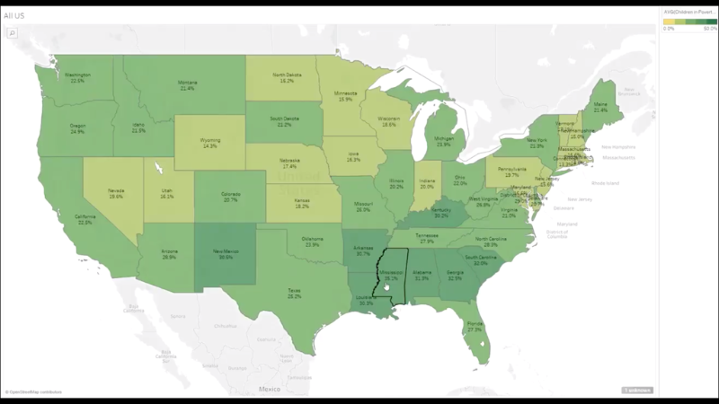
This is a great Tableau post from Shinichiro Murakami and a simple use case for unioning a data source to itself. Now, why would you want to do that….? Shin walks through the steps to produce this great end-user experience.
Read MoreHow to Show Top 10 Lists in Tableau Tooltips
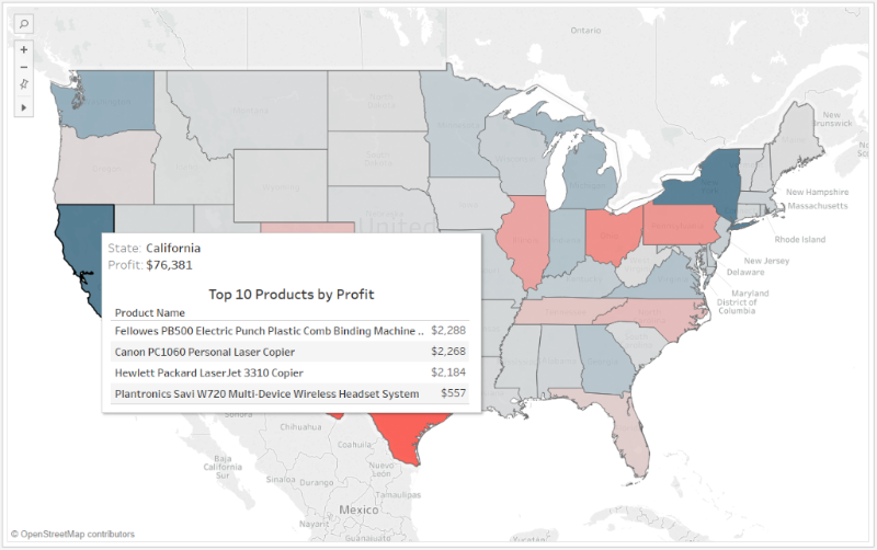
Ryan Sleeper combines action filters, context filters and Viz in Tooltips in this simple How to…part of a series that helps you get the most out of text in Tableau.
Read MoreBeyond “Show Me” Part 1: It’s All About the X & Y
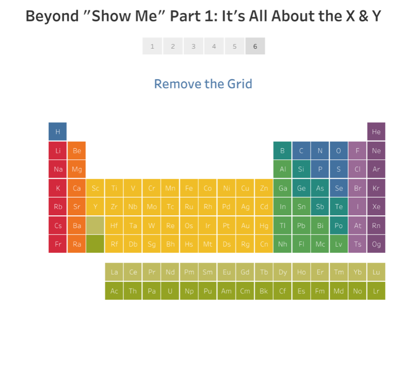
This is part 1 of a 2 part series on going beyond the charts available in the “Show Me” panel in Tableau by Ken Flerlage. He goes into detail about just how versatile the simple XY (or scatter) plot can be.
Read MoreWhats New in Tableau Prep
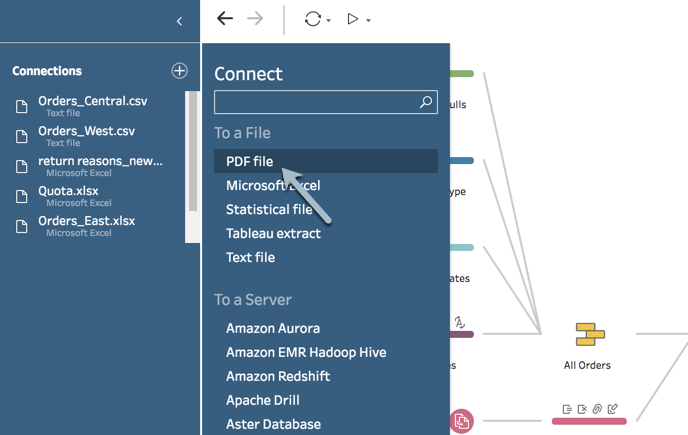
Data prep is becoming more versatile each month. The latest release (2018.3) allows you to clean and track your changes in every step, apply wild card unions and connect to PDF files.
Now is a great time to start working with this tool if you haven’t already. Why? Because they have just announced that from next year, we will be able to schedule Data Prep workflows. And THAT is a game changer.
Read MoreFinding public datasets just got easier…
Google has launched a new type of search engine designed specifically around helping people find data. Simply called “Dataset Search,” the tool provides easier access to millions of datasets across thousands of data repositories on the web. Its in Beta, but well worth checking out if you haven’t already.
Read MoreFunctionality comparison – Tableau Desktop vs Tableau Web Editor
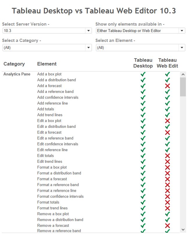
If you need to understand what your users can do with web edit – and what they can’t – this great resource created by Andrew Pick is the place to start. And it covers versions 9.0 through to 2018.2!
Read MoreDo not miss this Tableau Reference Guide
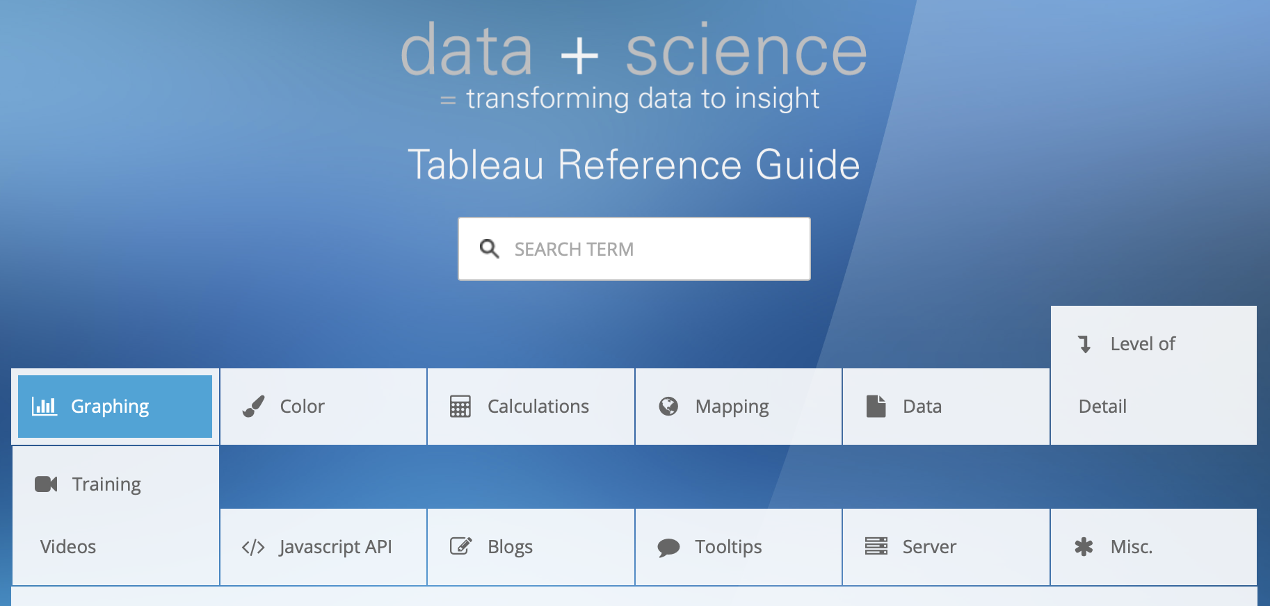
Here is a “bonus track” for this edition of Tableau Bites.
BEWARE. This is a massive reference library provided by Jeffrey Shaffer and includes links to posts on Graphing, Color, Calculations and much more….by some of the masters as well as lesser-known Tableau authors.
Stick it in your bookmarks and come back often!
Read MoreNew to Tableau Prep? Start with these five fundamentals

Annie Worman of Tableau talks through 5 easy to perform actions that you can do with Tableau Prep – the “new” tool from Tableau that has already had several releases. If you have a desktop license, then you can also get hold of this tool as part of your subscription. Learn how to Pivot, Group and Replace, Join and Union, Aggregate and Filter.
Read MoreExample use cases of Tableau calculations
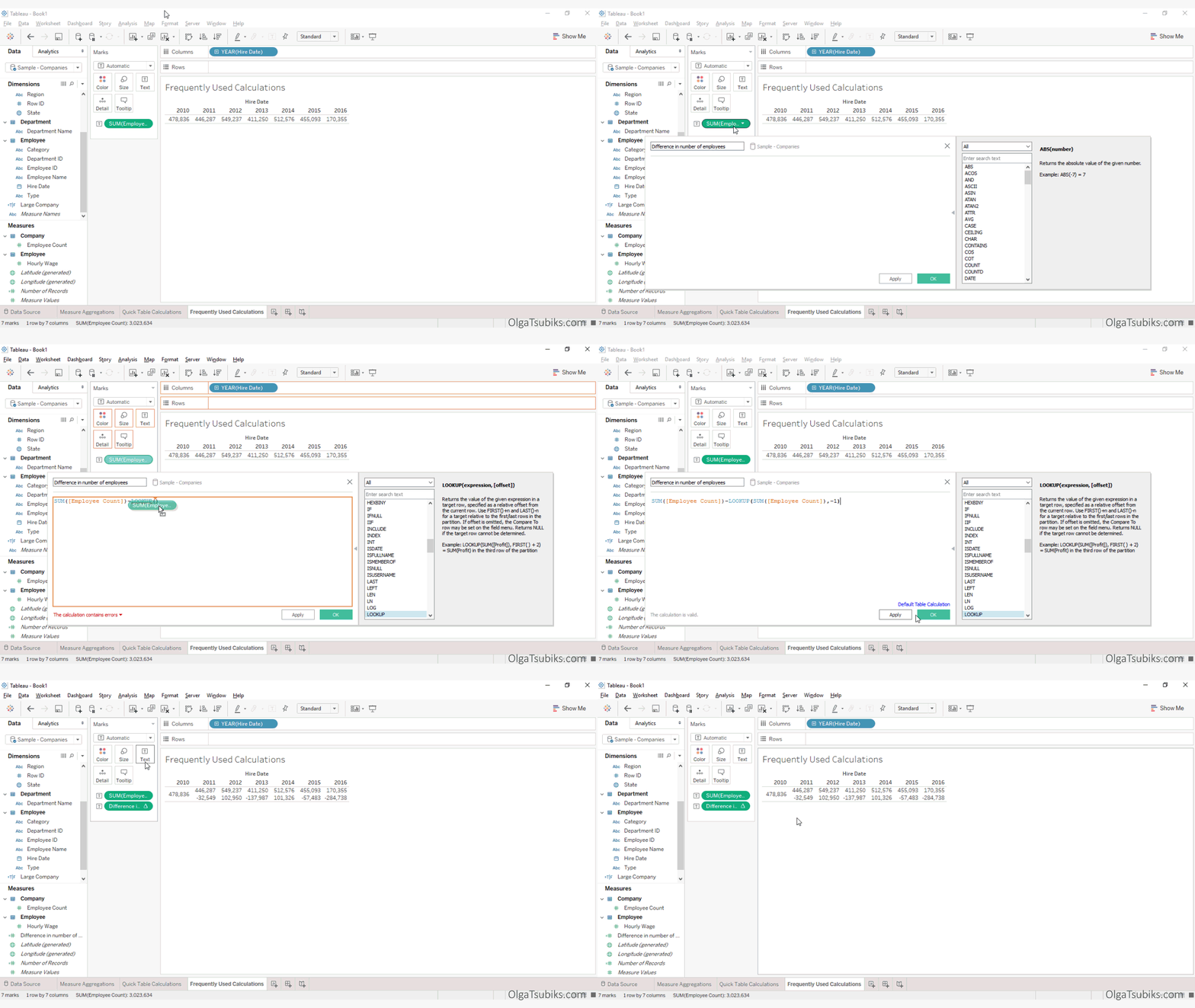
Olga Tsubiks introduces and provides example use cases of 10 frequently used Tableau Calculations. This is part of her guide to help get Tableau Certified and is a great resource.
Read MoreAn alternative to treemaps
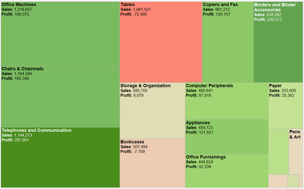
I am a fan of Treemaps, for specific use-cases, but they can be over-used. Elizabeth Ricks illustrates some pros and cons of using Treemaps, plus some possible alternatives.
Read MoreData Literacy, part 3: Analysing the fitness of averages
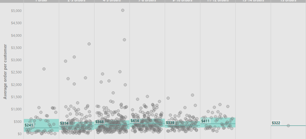
Lilach Manheim walks through an example of the process for analysing fitness of averages and provides some ways of not “aggregating away” the insights.
Read MoreUnderstand and execute the fundamentals like a Zen Master

Ryan Sleeper uses data from his blog posts to remind us that doing the fundamentals, well, is really what it takes to master Tableau. He then points us to 5 of his favourite Tableau tactics.
Read MoreThe Spawning Of The Tadpole Chart
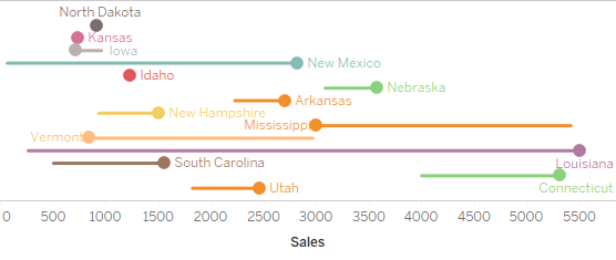
Mark Edwards talks through various incarnations of a design for a tadpole chart. This can be a great way to visualise period-over-period changes for multiple members in a dimension.
Read MorePrepare survey data for analysis with three easy steps
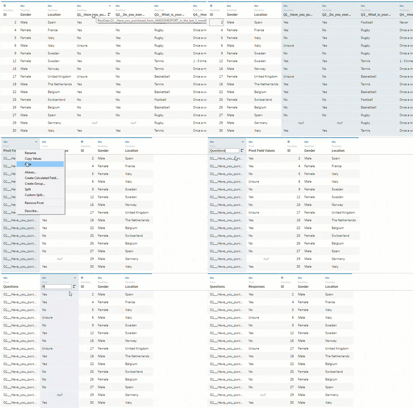
Typically, survey data is formatted so that each row corresponds to an individual respondent and a column for each question.
Archana Ganeshalingam, a Product Consultant at Tableau, talks us through some simple steps we can perform within Tableau to help reshape the data to make it easier to analyse.
Read MoreThe Barclays Gender Pay Gap

…or, “Breaking News: Senior executives are paid more than junior positions”. Jeffrey Shaffer talks about the dangers of using averages to draw conclusions from the data and gives some great examples that can be used if you need to argue the point.
Read MoreUsing PowerPoint for Tableau Graphics
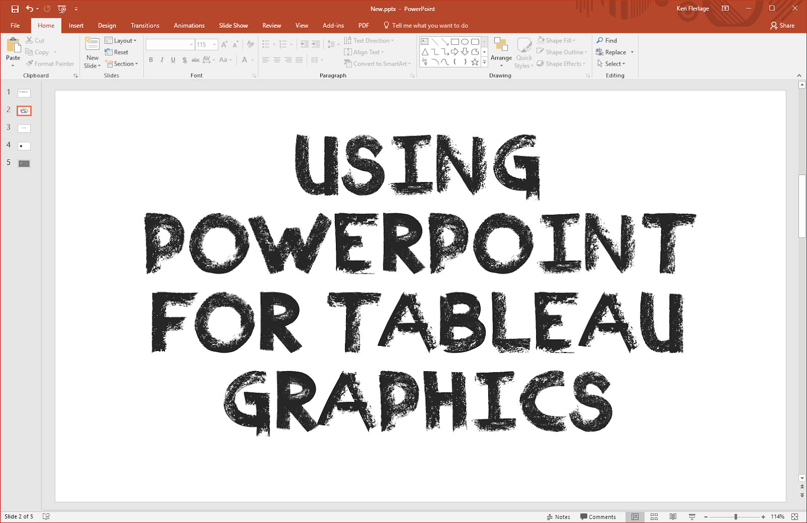
Ken Flerlage points to an older post from Josh Tapley that gave him inspiration to use Powerpoint as a quick and easy graphics tool for some of his fantastic Tableau visualisations.
Read MoreHow to create a cross database Union

Joshua Milligan talks us through a neat workaround to create a cross-database Union – which is currently not supported in Tableau – by using Joins and the MAX function.
Even if you don’t have a need, its a great reminder of how MIN/MAX functions can be used to get a desired outcome.
Read MoreHow to build a Sankey diagram without any data prep beforehand
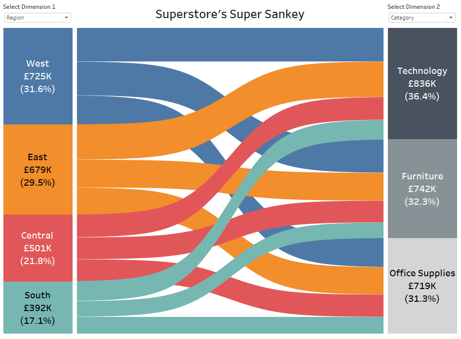
Sankey diagrams show the proportional “flow” (or make up) of one dimension from (or within) another.
Ian Baldwin of The Information Lab takes us through his 20 step process to create a Sankey without having to prepare the data before getting into Tableau – which would normally increase the data set as a bi-product. Well worth the effort in my opinion.
Read MoreTen Questions with The Data Duo

Michael Sandberg interviews the Data Duo, Pooja Gandhi and Adam Crahen, and pulls their top 3 favourite Tableau tips from each of them. The Data Duo have created more than 325 visualisations on Tableau Public (see the gallery at the end of the blog), so they certainly know what they are talking about.
Read MoreQuiz : Most Dangerous Countries for Mass Shootings
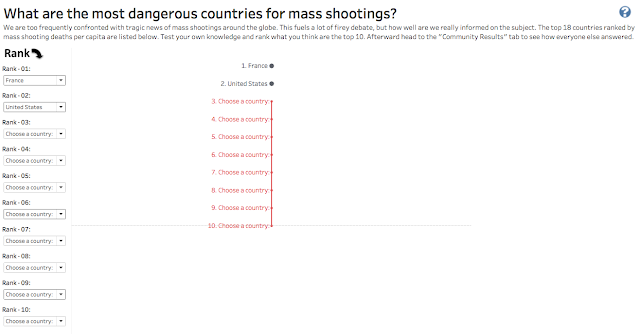
Mark Jackson chooses this hot topic to introduce a very interesting use of Google Sheets to collect and display data directly through Tableau.
Yes, this provides you with the capability to collect data from users and display that through Tableau Server or Public – which is a feature I hear a lot of requests for, under the guise of “can I write data back from Tableau?”. The viz has been kept simple for this under-the-hood hack, but think about how you can apply this in your organisation.
Read MoreCreating a Button to Reset Filters in a Dashboard on Tableau Desktop
I often get asked, “How do I clear all my filters” on a dashboard in Tableau Desktop. This simple approach can be used to clear a selection of filters as well “all”. This use-case came up on a client project recently so thought you may also find it useful. Tableau knowledge base article.
Read MoreIntro-Style Dashboard with Cross-Dashboard Navigation

Ryan Sleeper has a series of posts about improving the User Interface on dashboards. This tip covers two approaches for guiding your user from a landing page through various additional “data story points”. Simple but effective approaches that anyone can use.
Read MoreKeep It Simple Stupid

Tom Pilgrem of the Information Lab’s data school applies KISS to 3 key aspects of dashboard design. It’s always good to be reminded of the basics and how to apply them, to make sure your dashboard design is following good practice principles.
Read MoreTable Calculations – Custom Sorts, Part Three
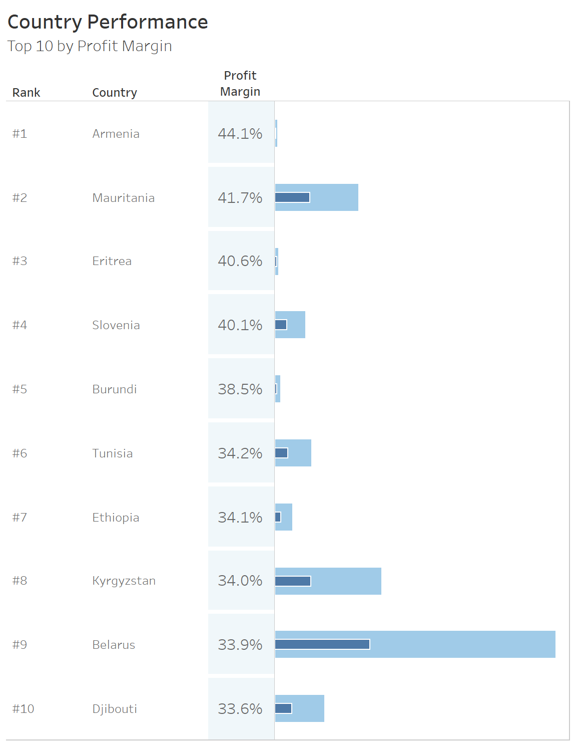
In this post, Robert Curtis examines sorting on Discrete Measures and adds a few twists to present a bullet-in-bullet chart sorted based on user interaction. This technique also works when you want to sort dimensions on a field that is a blend-derived calculated measure – which are not available in the ‘sort’ menu. You can then just ‘hide’ the discrete pill header from the view if you don’t want to show it in your viz.
Read MoreHow to use spatial binning for complex point distribution maps
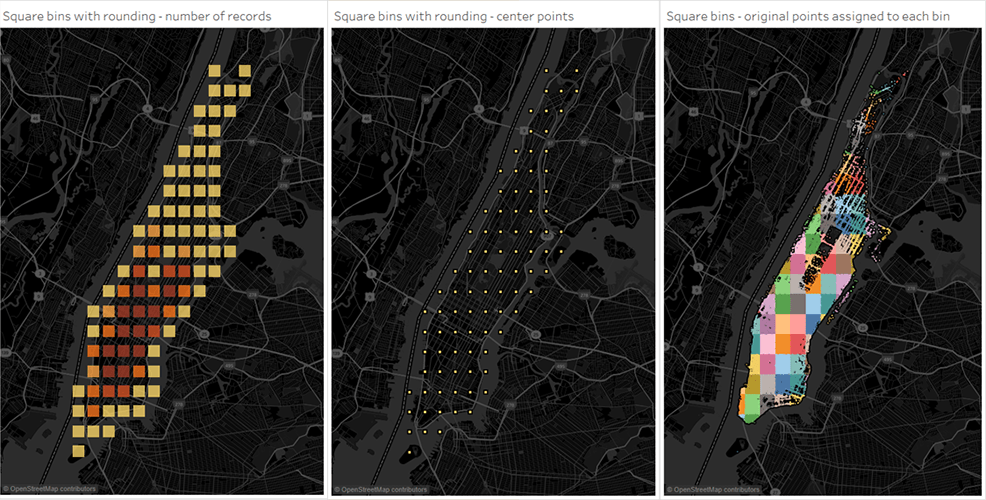
In my training sessions, I warn people about using filled maps for data insights due to the possible issues of visual skewing.
In this article Sarah Battersby shows you how to overcome this with either square or hexagonal representation of geographical data. A great read, and its easier than you may think!
Read MoreViz in tooltips by example
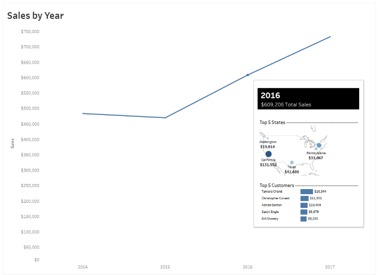
What better way to see possibly the most popular new feature of any Tableau launch, Viz in Tooltips, than to see it showcased by Pooja Gandhi. Now in 10.5 – you should upgrade now just for this fantastic feature.
Read MoreMore Viz in Tooltip examples
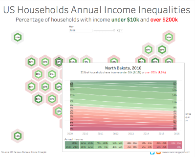
If that example has inspired you, then take a look at the Viz in Tooltip gallery on Tableau public for more excellent examples.
Read MoreAnother 10 tips for Viz in Tooltips
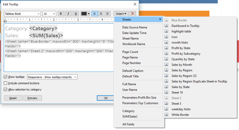
This new features warrants 3 slots! Jeffrey Shaffer gives you a whole bunch of ways to use Viz in tooltips to your advantage. Be sure to follow the link to his earlier article.
Read MoreHow to Use INDEX() for Easier Top N Tableau Filters

Another great tip from Ryan Sleeper. This one helps you quickly dictate which rows you want to show when there are multiple filters in play on a worksheet.
Read MoreComparing a target group with the entire population
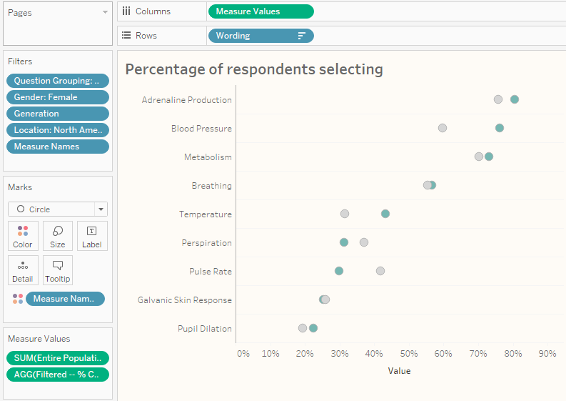
Steve Wexler talks through how to visualise both filtered and non-filtered results in the same view. This has many use cases and is well worth reading through his example using survey data.
Read MoreLOD – The Exclude Calculation
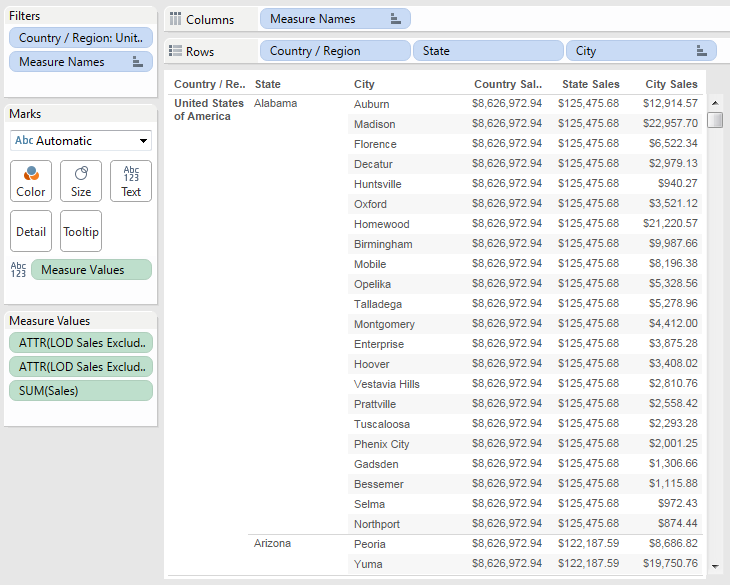
Another great Deep Dive article by Robert Curtis, this time on using the ‘Exclude’ Level Of Detail expression.
Read MoreMS Office Server Plugin
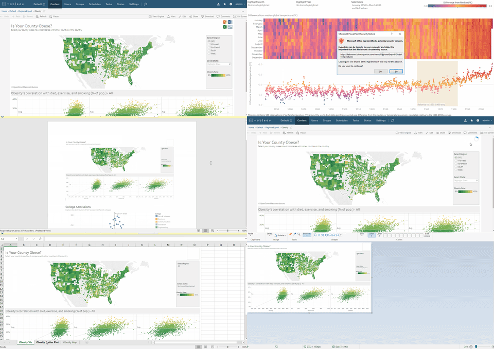
Alex Ross provides a tool and steps for a server-side plug-in for those users that insist they need to export.
Read MoreEngaging reluctant stakeholders in the data design process

Graceful Robot, aka Emma Cosh, talks us through her techniques for getting the right information from 3 different types of stakeholders.
Read MoreThe dos and don’ts of dashboards
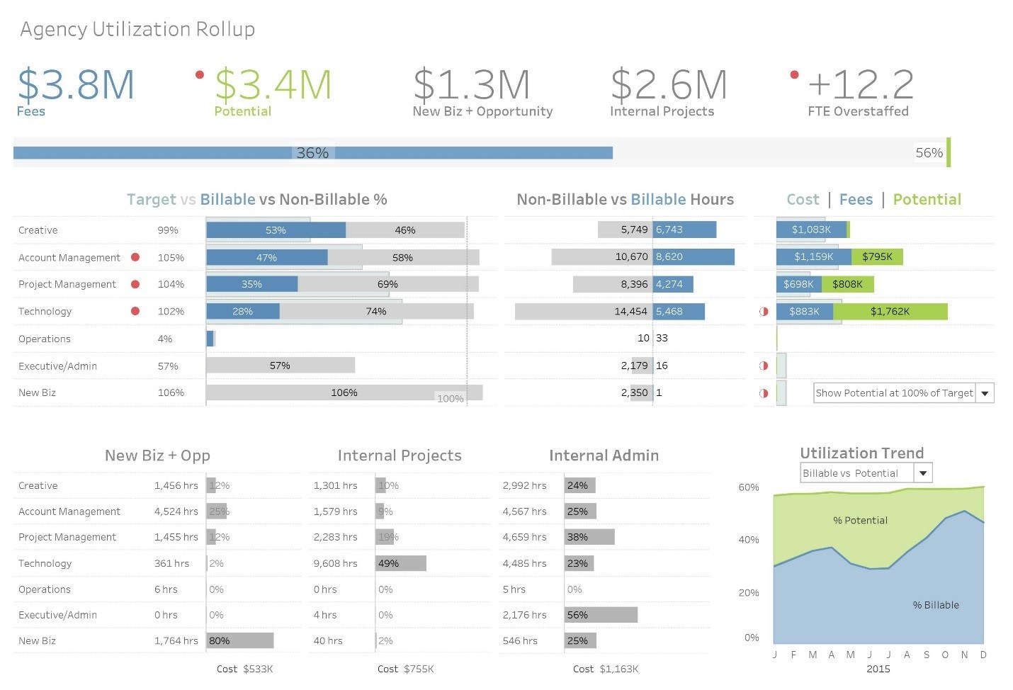
Post by Tableau. A dashboard is your go-to tool for communicating insights about a particular set of data. Building a great dashboard takes more than just putting all of your insights onto a canvas.
Read More3 Types of Data Visualizations
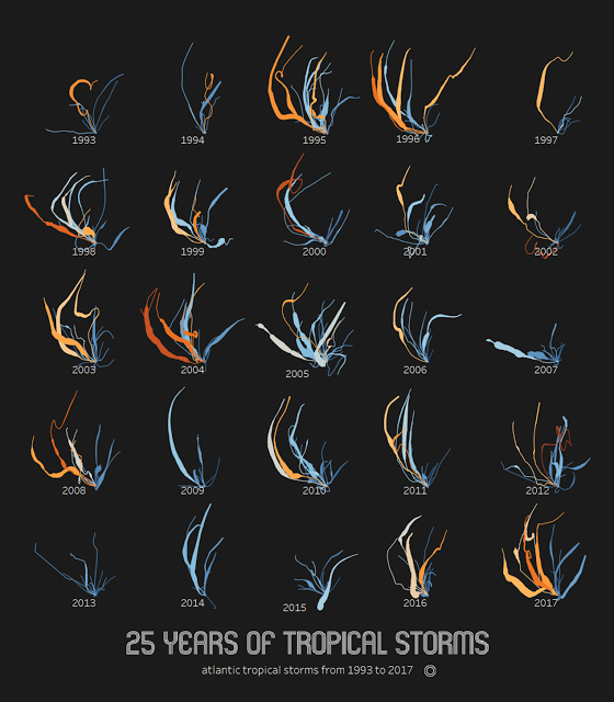
Differentiating between different advanced visualisation types, Adam McCann provides good examples of how Data art, Infographics and Dashboards can be used.
Read MoreHow to Make Performance Indicator Titles

Ryan Sleeper shows a simple but effective way to conditionally colour a dashboard object based on whether the performance improved or declined.
Read MoreHow to talk in ‘Tablish’: Lesson 2
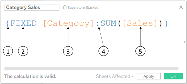
Joe Macari turns the Fixed LOD into plain English to help us apply in practice.
Read MoreHow to add Big Ass Numbers, simply
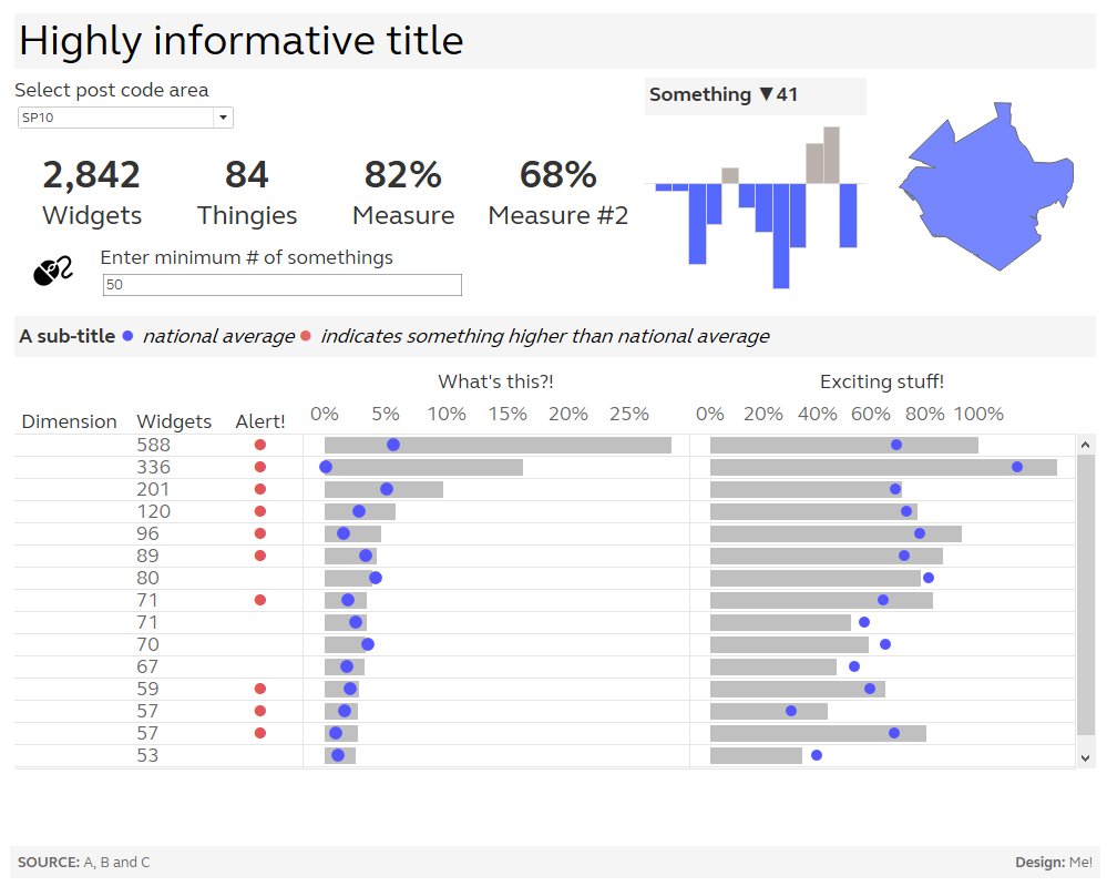
Charlie Hutcheson’s blog introduces us to #RealTableau (recently initiated by Chris Love) and shows how to quickly add BAN’s to a dashboard.
Read MoreHow to take the “screaming cats” out of stacked bar and area charts
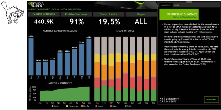
Steve Wexler, co-author of the BBOD, talks through some issues with, and good uses of the stacked bar chart, and provides a workbook example.
Read MoreWhat to name your Tableau Server?

Paul Banoub talks through server naming factors that that help him sleep better at night as a server administrator.
Read MoreThe Information is Beautiful Awards 2017
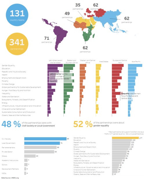
A huge congratulations to Chloe Tseng, founder of the Viz for Social Good, and all that contributed, winning a silver for the community prize. Take a look at some of the fantastic Tableau visualisations this project has inspired here.
You can see the full list of winners here.
Read MoreHighlighting Data Points in a Custom Date Range

From a series of tips by Ryan Sleeper to help improve the user experience of your dashboards by helping guide your end users.
Read MoreCreating a sheet selector with dashboard actions instead of parameters
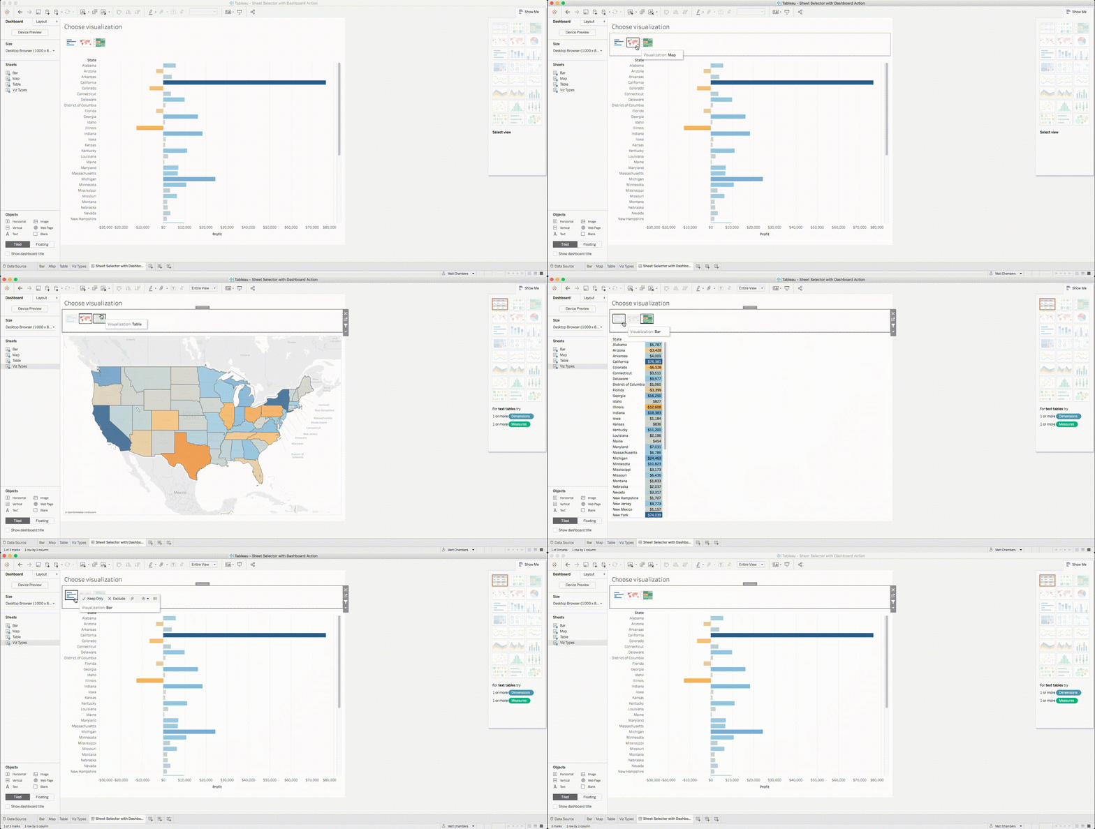
Matt Chambers talks through 2 alternatives for creating a sheet selector without using parameters, providing different user experiences. I love the join type of 1=1.
Read MoreAdding arc reference lines to a scatter plot
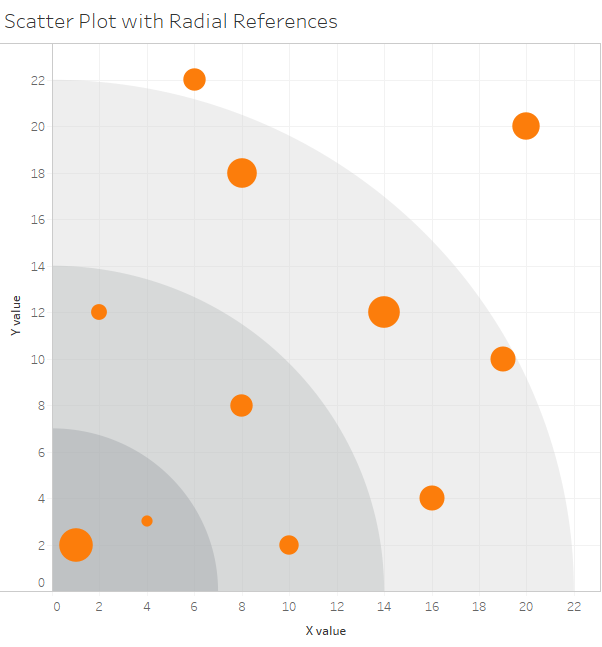
Alexander Mou talks through using a combination of union and polygons to create this effective type of visualisation.
Read MoreDeveloping a Tableau Centre of Excellence

Simon Beaumont has pulled together an excellent resource package, in Tableau Public of course, to help others get the most from their Tableau deployments and analysts.
Read MoreThe Tableau Foundation Annual report….updated weekly…
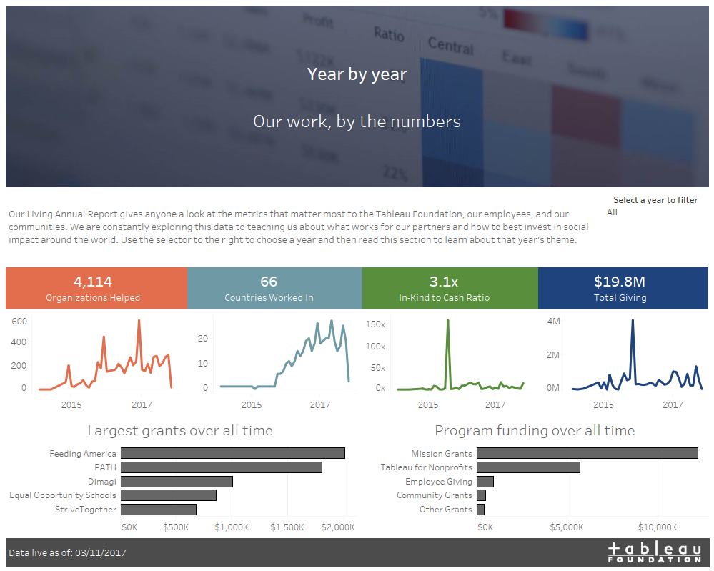
This Living Annual Report shows the work the Tableau Foundation has done so far and shares what they’ve learned along the way. Introduced by Neal Myrick.
Read MoreLoom Art in Tableau
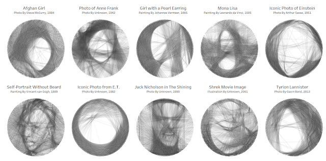
Just because you can. Ken Flerlage uses Bézier curves to create visualisations based on images. Although you’re unlikely to use this extreme example, its good to see how this can be done.
Read MoreTips for Designing Mobile-Friendly Dashboards
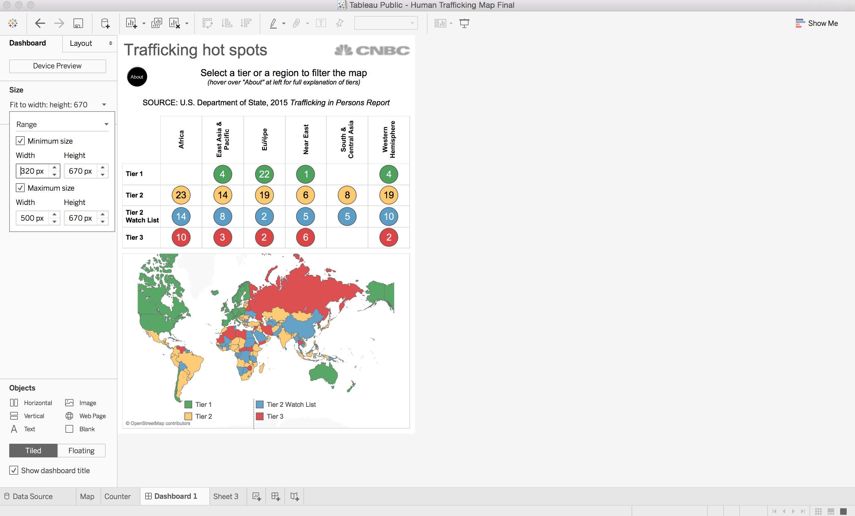
Here are some useful pointers for you to consider, to help improve user engagement and wider adoption. Dash Davidson.
Read More7 tips and tricks for dashboards
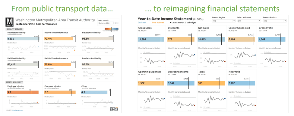
Seven best practices you can apply right now to make your dashboards more effective. Andy Cotgreave.
Read MoreThe Need for Speed: How to build Tableau visualisations quickly
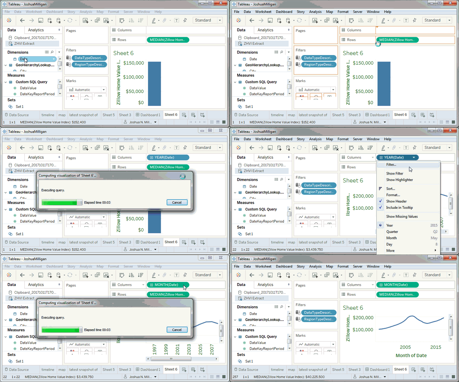
Josh Milligan is an Iron Viz competition finalist and knows a thing or two about building quickly.
Read MoreExplore the viz that reigned supreme at Iron Viz 2017

The annual contest held at the global conference produced 3 great finalists and visualisations. All produced in 20 minutes…. Nancy Matthew.
Read More10.5 Beta – 10 tips for Viz in Tooltips
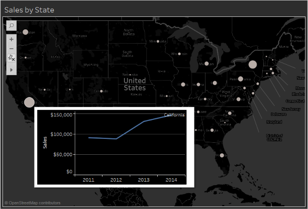
This long awaited new feature is currently in beta. Here are 10 ideas how to use once it is released. Jeffrey A. Shaffer.
Read MoreIn Tableau development – the next generation data preparation layer
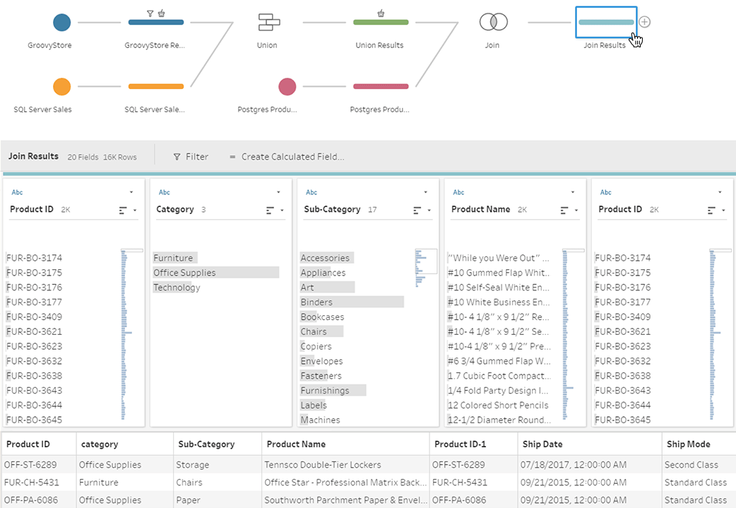
Take a peek at how Project Maestro will assist the data preparation and workflow into Tableau. Tableau.
Read MoreEnd-of-Line Trend Indicator without Dual Axis
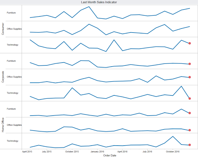
This tip can provide an effective visual aid if you’re already using dual axis for something else.
Read MoreHow to “Split-up” a long Bar Chart
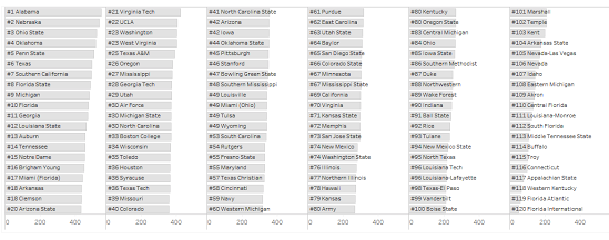
Every so often, an Analyst might run across a situation where they need to compare values among a very long list of categories. This approach avoids the dreaded scroll bar.
Read MoreLetting the formatting blend in
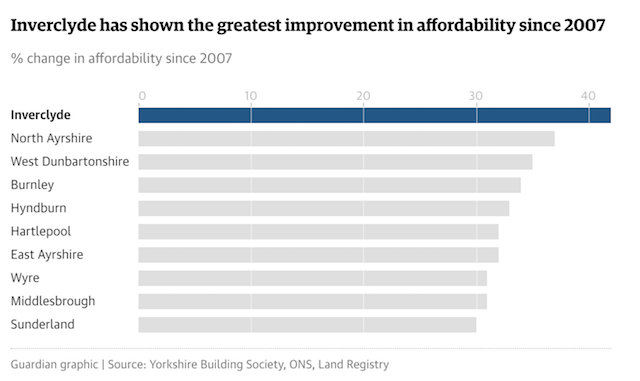
Another snippet of best practice. This series is full of little ideas that make a difference.
Read MoreTableau example: Obesity in America
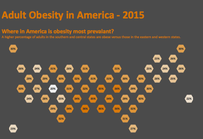
A nice example for dynamic info graphics and relevant for #TCC17 attendees perhaps…
Read MoreTableau 10.4 feature: using Linear Geometries

Using London Bus Routes to show how this new feature can add customised detail to map views.
Read MoreHow to make dynamic Tooltips

In this post, Ryan Sleeper shares how to make dynamic tooltips, allowing you to show different information for each mark.
Read More10 Tips when given someone else’s work
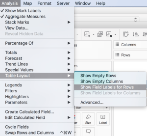
It’s always difficult picking up someone else’s work to continue, and this article by Bridget Cogley gives some Tableau specific tips.
Read MoreIteration is the best way to find insights

Andy Cotgreave tells us there is simply no way you can open a dataset and know, ahead of that exploration, how best to display it.
Read More5 key learnings for data designers

The Tableau Research and Design team present their initial findings from an eye-tracking study.
Read MoreVizzes About Vizzes
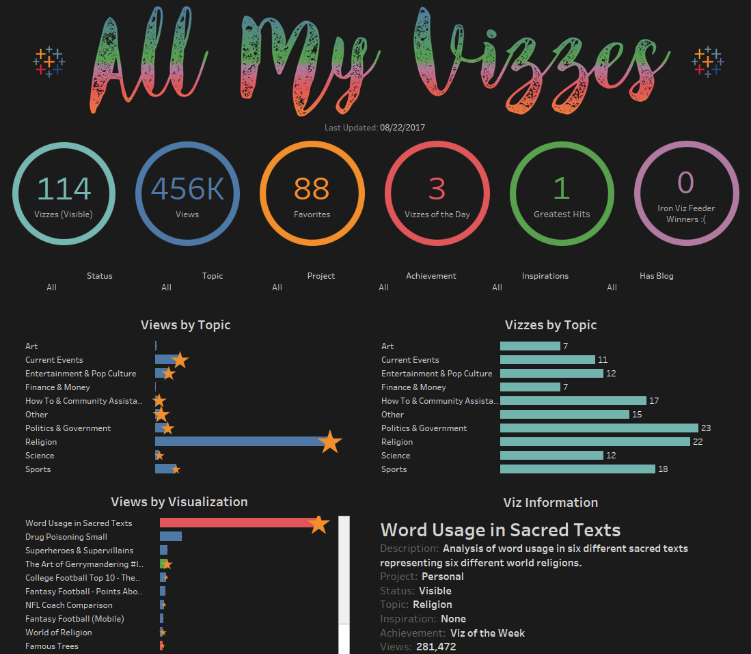
Ken Flerlage has been posting Tableau Public dashboards for a while now and thought he’d summarise some off them. Some interesting samples of work – don’t forget to browse the top ones!
Read MoreTableau 10.4 – out now!
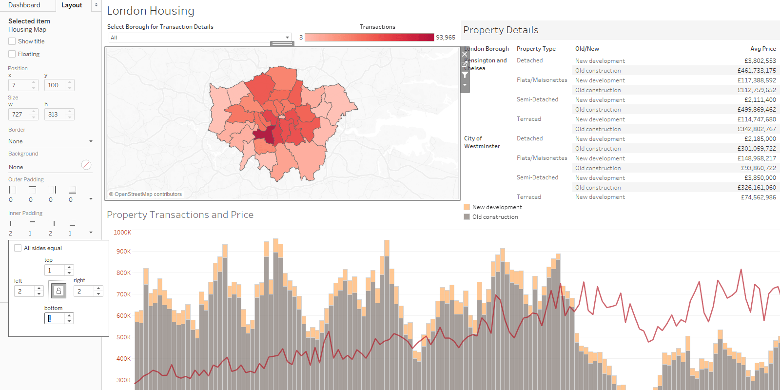
Just in case you missed it, the latest version was released this month. Take a look at some of the new features.
Read MoreHow to map circle routes in Tableau 10.4
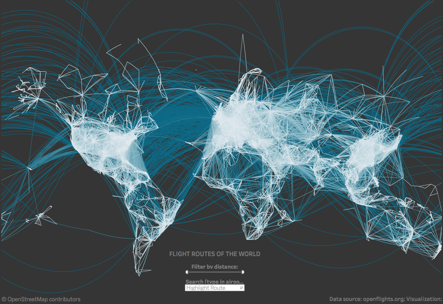
The spatial file connector now also supports linear geographies allowing infrastructure networks to be easily plotted.
Read MoreHow to dynamically display the Top N vs Other

Ryan Sleeper shows how to dynamically group everything outside the Top N into “Others” to maintain 100% of the data in a visualisation.
Read MoreTwo approaches to benchmarking with Tableau
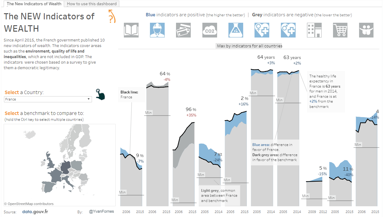
Yvan Fornes tells how to perform benchmark analysis against the total population, or a subset of the data.
Read MoreContainers: My approach in 9 tips
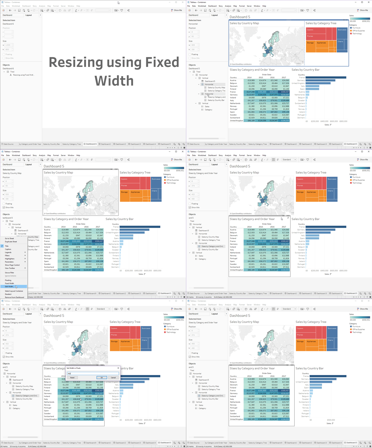
Elena Hristozova tells us she used to hate Tableau’s dashboard containers. These tips are intended to help you learn to love them.
Read MoreHow to shade between 2 lines
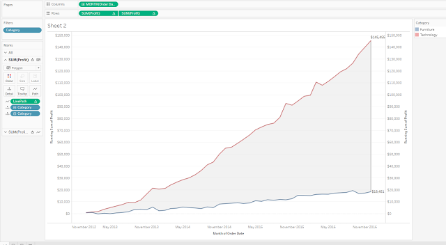
Rody Zakovich provides several ways to shade between two lines Tableau.
Read MoreSharpen your analysis with tooltip selection
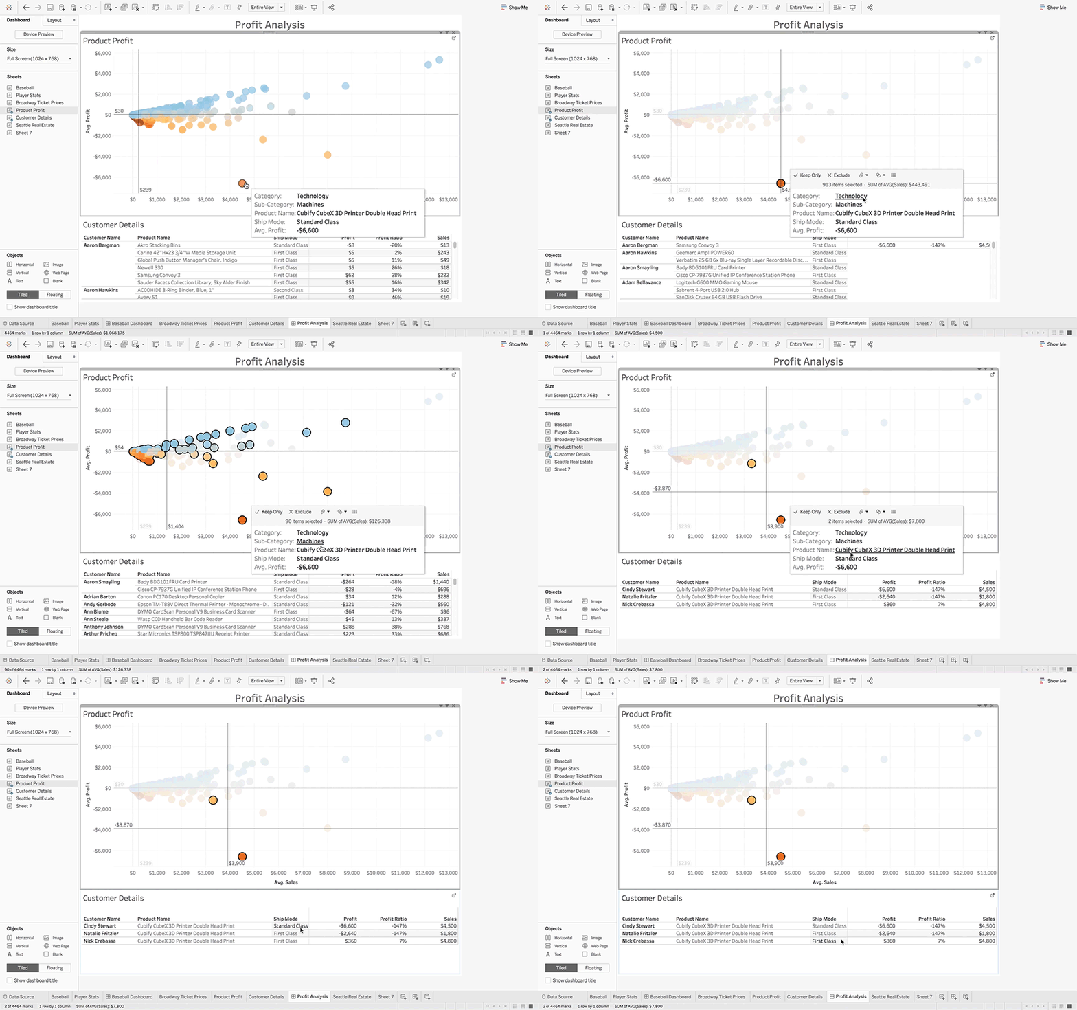
Up until v10.3, tooltips just provided information. Now users can make selections and filters straight from the tooltip, in the flow.
Read MoreTableau 10: A radical overhaul aims to keep Tableau at the forefront of the pack

If your organisation is still wondering whether to upgrade to Tableau 10, this independent overview of the latest features maybe of interest.
Read MoreA new way to visualize an income statement
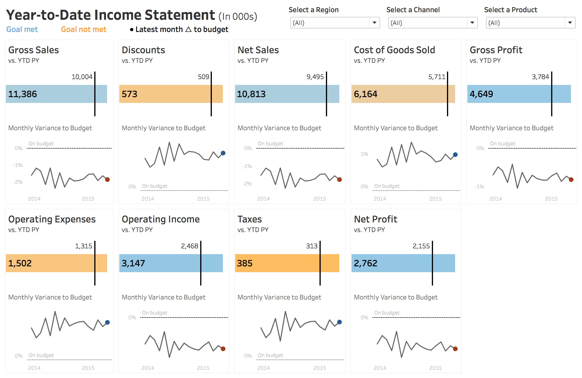
Andy Kriebel suggests an alternative approach to convert those “Excel” look-a-like Tableau reports for finance.
Read More10 ways to add value to your dashboards with maps
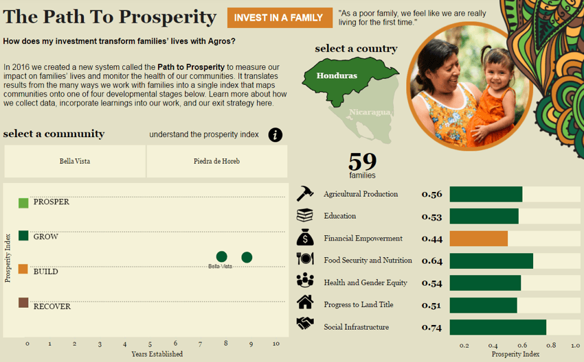
Sarah Battersby shares tips for improving the analytic and aesthetic value of maps in your dashboards.
Read MoreRedesigning a circular timeline
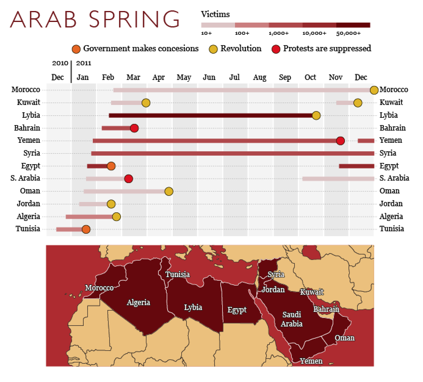
Visualisation guru and author Alberto Cairo talks about improving circular visualisations.
Read MoreOrganizations struggle with time to value for BI
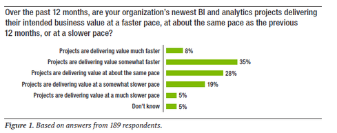
Short summary of a TDWI research paper that highlights the obstacles analytics projects face and suggests best practices for overcoming those challenges. Leads to a link where you can download the 48 page white paper for free.
Read MoreTableau acquires natural-language query startup cleargraph

Tableau stated that they would be developing “natural language” search capabilities last year. It will be interesting to see how this develops.
Read MoreSteve Adams

Hi, I’m Steve Adams and I am a self-confessed analyst! Starting out over 25 years ago as an accountant, I became the Finance Director of a EUR 6B turnover company, delivering business analytics and performance management solutions. Since 2007 I have been consulting internationally in a wide range of industries.
I’m an agile BI practitioner. Visual analytics is an art form which I teach, study and enjoy.
For reporting, I believe that transparency and clarity of message are critical and I am a keen follower of the SUCCESS formula of the IBCS® (International Business Communication Standards). I am an IBCS® Certified Consultant.
My software weapon of choice is clearly Tableau and I am a Tableau Qualified Associate, consultant and trainer.
Get one, regular newsletter with everything you need to know about Tableau
Join enthusiasts who get the best Tableau articles straight into their inbox for free.
Subscribe